Note
Access to this page requires authorization. You can try signing in or changing directories.
Access to this page requires authorization. You can try changing directories.
Important
Starting on 21 September 2023 you won’t be able to create new Metrics Advisor resources. As of 31 March 2026 the Metrics Advisor portal has been disabled. The Metrics Advisor service is being retired no later than 1 October 2026.
We recommend the following alternatives:
- Azure Monitor, as an official Azure 3P product, anomaly detection and analysis capabilities are provided through multiple interfaces.
- The Open-Source Anomaly Detector, this open-source project provides the same anomaly detection capabilities used by Kensho, Azure Metrics Advisor, and Azure Anomaly Detector in the backend.
What is an incident?
When there are anomalies detected on multiple time series within one metric at a particular timestamp, Metrics Advisor will automatically group anomalies that share the same root cause into one incident. An incident usually indicates a real issue, Metrics Advisor performs analysis on top of it and provides automatic root cause analysis insights.
This will significantly remove customer's effort to view each individual anomaly and quickly finds the most important contributing factor to an issue.
An alert generated by Metrics Advisor may contain multiple incidents and each incident may contain multiple anomalies captured on different time series at the same timestamp.
Paths to diagnose an incident
Diagnose from an alert notification
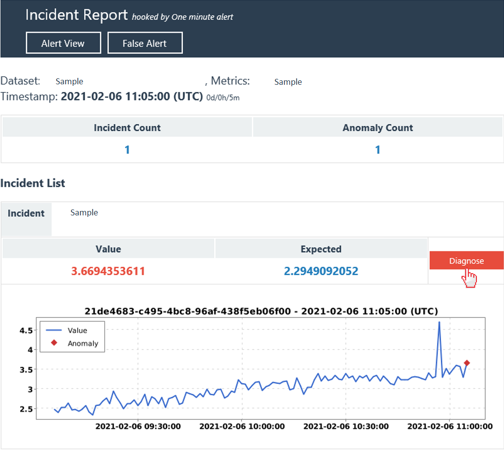
If you've configured a hook of the email/Teams type and applied at least one alerting configuration. Then you will receive continuous alert notifications escalating incidents that are analyzed by Metrics Advisor. Within the notification, there's an incident list and a brief description. For each incident, there's a "Diagnose" button, selecting it will direct you to the incident detail page to view diagnostic insights.

Diagnose from an incident in "Incident hub"
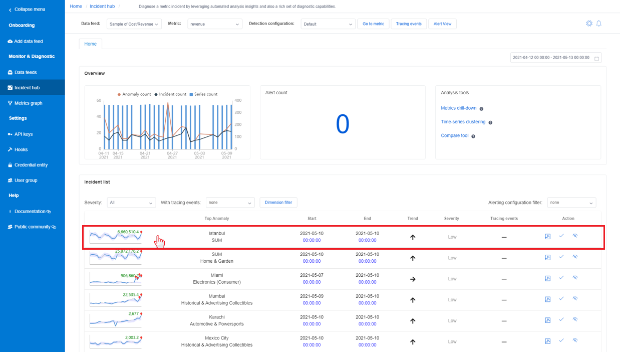
There's a central place in Metrics Advisor that gathers all incidents that have been captured and make it easy to track any ongoing issues. Selecting the Incident Hub tab in left pane will list out all incidents within the selected metrics. Within the incident list, select one of them to view detailed diagnostic insights.

Diagnose from an incident listed in metrics page
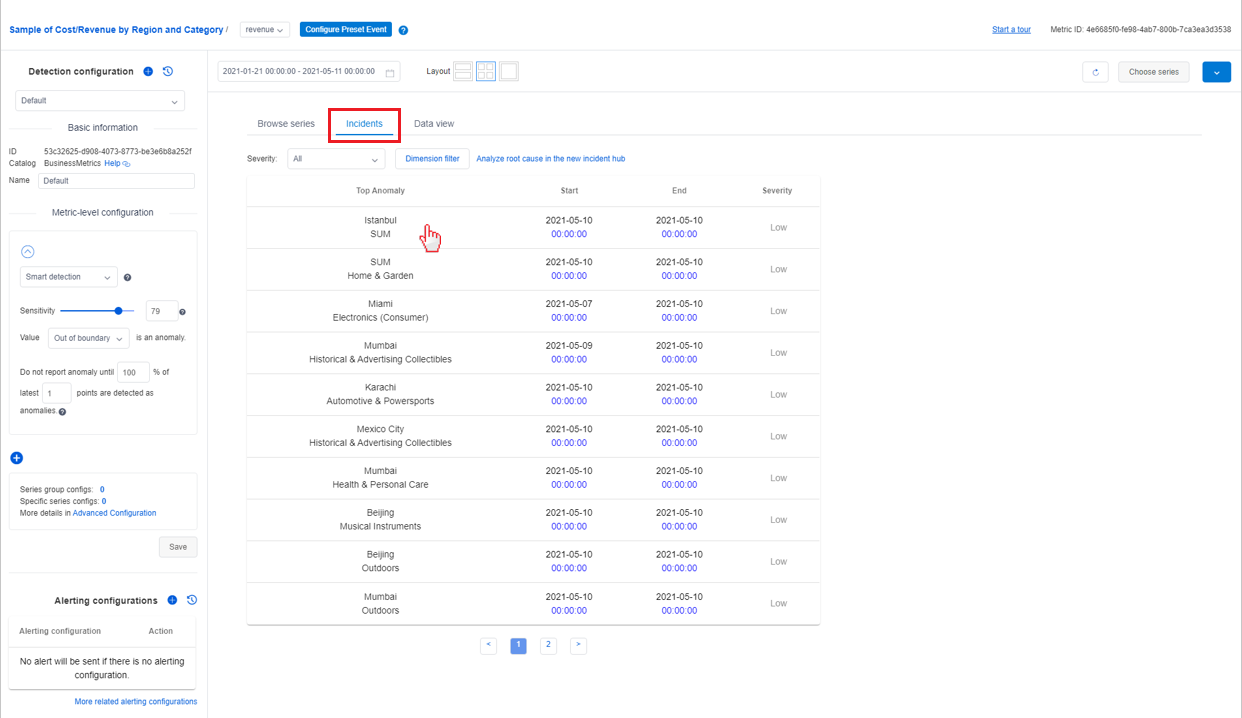
Within the metrics detail page, there's a tab named Incidents which lists the latest incidents captured for this metric. The list can be filtered by the severity of the incidents or the dimension value of the metrics.
Selecting one incident in the list will direct you to the incident detail page to view diagnostic insights.

Typical diagnostic flow
After being directed to the incident detail page, you're able to take advantage of the insights that are automatically analyzed by Metrics Advisor to quickly locate root cause of an issue or use the analysis tool to further evaluate the issue impact. There are three sections in the incident detail page which correspond to three major steps to diagnosing an incident.
Step 1: Check summary of current incident
The first section lists a summary of the current incident, including basic information, actions & tracings, and an analyzed root cause.
Basic information includes the "top impacted series" with a diagram, "impact start & end time", "incident severity" and "total anomalies included". By reading this, you can get a basic understanding of an ongoing issue and the impact of it.
Actions & tracings, this is used to facilitate team collaboration on an ongoing incident. Sometimes one incident may need to involve cross-team members' effort to analyze and resolve it. Everyone who has the permission to view the incident can add an action or a tracing event.
For example, after diagnosing the incident and root cause is identified, an engineer can add a tracing item with type of "customized" and input the root cause in the comment section. Leave the status as "Active". Then other teammates can share the same info and know there's someone working on the fix. You can also add an "Azure DevOps" item to track the incident with a specific task or bug.
Analyzed root cause is an automatically analyzed result. Metrics Advisor analyzes all anomalies that are captured on time series within one metric with different dimension values at the same timestamp. Then performs correlation, clustering to group related anomalies together and generates root cause advice.

For metrics with multiple dimensions, it's a common case that multiple anomalies will be detected at the same time. However, those anomalies may share the same root cause. Instead of analyzing all anomalies one by one, leveraging Analyzed root cause should be the most efficient way to diagnose current incident.
Step 2: View cross-dimension diagnostic insights
After getting basic info and automatic analysis insights, you can get more detailed info on abnormal status on other dimensions within the same metric in a holistic way using the "Diagnostic tree".
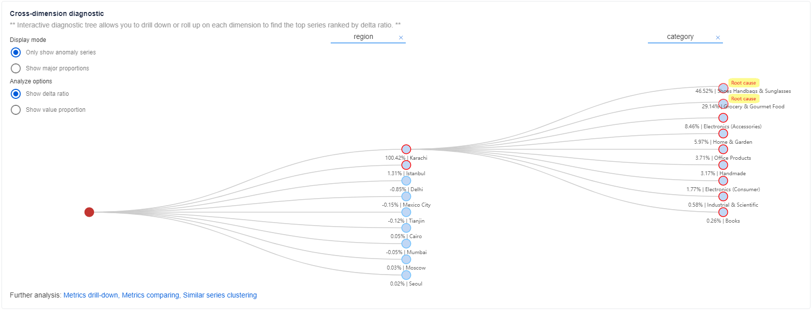
For metrics with multiple dimensions, Metrics Advisor categorizes the time series into a hierarchy, which is named the Diagnostic tree. For example, a "revenue" metric is monitored by two dimensions: "region" and "category". Despite concrete dimension values, there needs to have an aggregated dimension value, like "SUM". Then time series of "region" = "SUM" and "category" = "SUM" will be categorized as the root node within the tree. Whenever there's an anomaly captured at "SUM" dimension, then it could be drilled down and analyzed to locate which specific dimension value has contributed the most to the parent node anomaly. Select each node to expand and see detailed information.

To enable an "aggregated" dimension value in your metrics
Metrics Advisor supports performing "Roll-up" on dimensions to calculate an "aggregated" dimension value. The diagnostic tree supports diagnosing on "SUM", "AVG", "MAX","MIN","COUNT" aggregations. To enable an "aggregated" dimension value, you can enable the "Roll-up" function during data onboarding. Please make sure your metrics is mathematically computable and that the aggregated dimension has real business value.

If there's no "aggregated" dimension value in your metrics
If there's no "aggregated" dimension value in your metrics and the "Roll-up" function is not enabled during data onboarding. There will be no metric value calculated for "aggregated" dimension, it will show up as a gray node in the tree and could be expanded to view its child nodes.
Legend of diagnostic tree
There are three kinds of nodes in the diagnostic tree:
- Blue node, which corresponds to a time series with real metric value.
- Gray node, which corresponds to a virtual time series with no metric value, it's a logical node.
- Red node, which corresponds to the top impacted time series of the current incident.
For each node abnormal status is described by the color of the node border
- Red border means there's an anomaly captured on the time series corresponding to the incident timestamp.
- Non-red border means there's no anomaly captured on the time series corresponding to the incident timestamp.
Display mode
There are two display modes for a diagnostic tree: only show anomaly series or show major proportions.
- Only show anomaly series mode enables customer to focus on current anomalies that captured on different series and diagnose root cause of top impacted series.
- Show major proportions enables customer to check on abnormal status of major proportions of top impacted series. In this mode, the tree would show both series with anomaly detected and series with no anomaly. But more focus on important series.
Analyze options
Show delta ratio
"Delta ratio" is the percentage of current node delta compared to parent node delta. Here’s the formula:
(real value of current node - expected value of current node) / (real value of parent node - expected value of parent node) * 100%
This is used to analyze the major contribution of parent node delta.
Show value proportion
"Value proportion" is the percentage of current node value compared to parent node value. Here’s the formula:
(real value of current node / real value of parent node) * 100%
This is used to evaluate the proportion of current node within the whole.
By using "Diagnostic tree", customers can locate root cause of current incident into specific dimension. This significantly removes customer's effort to view each individual anomalies or pivot through different dimensions to find the major anomaly contribution.
Step 3: View cross-metrics diagnostic insights using "Metrics graph"
Sometimes, it's hard to analyze an issue by checking abnormal status of one single metric, but need to correlate multiple metrics together. Customers are able to configure a Metrics graph, which indicates the relationship between metrics. Refer to How to build a metrics graph to get started.
Check anomaly status on root cause dimension within "Metrics graph"
By using the above cross-dimension diagnostic result, the root cause is limited to a specific dimension value. Then use the "Metrics graph" and filter by the analyzed root cause dimension to check anomaly status on other metrics.
For example, if there's an incident captured on "revenue" metrics. The top impacted series is at global region with "region" = "SUM". By using cross-dimension diagnostic, the root cause has been located on "region" = "Karachi". There's a pre-configured metrics graph, including metrics of "revenue", "cost", "DAU", "PLT(page load time)" and "CHR(cache hit rate)".
Metrics Advisor will automatically filter the metrics graph by the root cause dimension of "region" = "Karachi" and display anomaly status of each metric. By analyzing the relation between metrics and anomaly status, customers can gain further insights of what is the final root cause.

Auto related anomalies
By applying the root cause dimension filter on the metrics graph, anomalies on each metric at the timestamp of the current incident will be autorelated. Those anomalies should be related to the identified root cause of current incident.
