Note
Access to this page requires authorization. You can try signing in or changing directories.
Access to this page requires authorization. You can try changing directories.
Azure Monitor provides a set of views in the Azure portal that combine performance and log data collected from your Kubernetes cluster to help you analyze its health and performance. This article describes the different views available and how to interact with and interpret the data they present.
Multi-cluster view
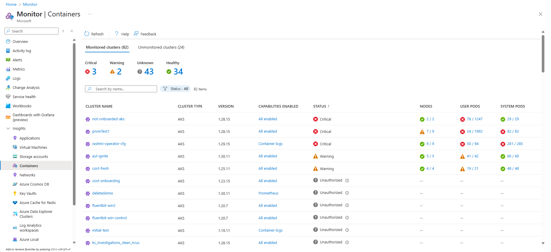
To open the multi-cluster view, select Containers from the Insights section of the Monitor menu in the Azure portal. This view shows the health status of all monitored Kubernetes clusters deployed across resource groups in your subscriptions. This view allows you to quickly identify clusters that are in a critical or unhealthy state and also helps you to enable and configure monitoring for all clusters in your environment. See Enable monitoring for AKS clusters for details.
Note
Azure Stack (Preview) and Non-Azure (Preview) are no longer supported in this view.
Select the Nodes column to open the Nodes tab in the single-cluster view for that cluster. Open the Controllers tab for the cluster with an appropriate filter by selecting the User pods or System pods column.
The following table describes the different health statuses displayed in this view. Health state calculates the overall cluster status as the worst of the three states. If any of the three states is Unknown, the overall cluster state shows Unknown.
| Status | Description |
|---|---|
| Healthy | No issues are detected for the VM, and it's functioning as required. |
| Warning | One or more issues are detected that must be addressed or the health condition could become critical. |
| Critical | One or more critical issues are detected that must be addressed to restore normal operational state as expected. |
| Unauthorized | User doesn't have required permissions to read data in the workspace or Data Collection Rule collecting the data. |
| Not found | Either the workspace, the resource group, or subscription that contains the workspace was deleted. |
| Enable recording rules | Enable Prometheus recording rules to unlock higher performance data and Prometheus visualizations. |
| Misconfigured | Something went wrong. |
| Error | An error occurred while attempting to read data from the workspace. |
| No data | Data hasn't reported to the workspace for the last 30 minutes. |
| Unknown | If the service wasn't able to make a connection with the node or pod, the status changes to an Unknown state. |
| Pending | Monitoring configuration for Arc-enabled clusters typically takes around 5 minutes. If the cluster is disconnected from Azure, this process may be delayed. |
| Pending for X hours | Monitoring configuration for the Arc-enabled cluster is taking longer than expected. |
| Failed | Monitoring configuration for the Arc-enabled cluster was unsuccessful. |
The following table provides a breakdown of the calculation that controls the health states for a monitored cluster on the multi-cluster view.
| Monitored cluster | Status | Availability |
|---|---|---|
| User pod | Healthy Warning Critical Unknown |
100% 90 - 99% <90% Not reported in last 30 minutes |
| System pod | Healthy Warning Critical Unknown |
100% N/A 100% Not reported in last 30 minutes |
| Node | Healthy Warning Critical Unknown |
>85% 60 - 84% <60% Not reported in last 30 minutes |
Single cluster view
To open the single cluster view, either select a cluster from the multi-cluster view or select Monitor from a cluster's menu. This view provides multiple tabs that allow you to drill down on the health and performance of the selected cluster.
Options
| Option | Description |
|---|---|
| Visualization | Allows you to select which data source is used to populate the view. Managed Prometheus visualizations is the preferred setting which uses Prometheus metrics stored in an Azure Monitor workspace. These are enabled when you enable Managed Prometheus for the cluster. Log Analytics visualizations uses performance data stored in a Log Analytics workspace. You may not be collecting this data if you aren't collect performance data in your logging profile. This option won't be available if Managed Prometheus isn't enabled for the cluster. |
| Refresh | Refreshes the data in the view. |
| Monitor settings | Opens the monitoring configuration settings for the cluster. See Enable monitoring for AKS clusters for details. |
| View Grafana | Displays a list of any Managed Grafana instances for linked to the Azure Monitor workspace for the cluster. You can either open dashboards for the instance or view the instance's configuration. |
| Recommended alerts | Configure recommended alerts for the cluster. See Create recommended alerts for Kubernetes clusters for details. |
| View all clusters | Open the multi-cluster view. |
Filtering data
Each of the tabs in the single-cluster view provides options to filter the data presented. Each tab has a filter for Time range of the collected. The Nodes, Controllers, and Containers tabs allow you to add a filter data or by node or namespace by selecting Add Filter.
Overview tab
The Overview tab provides a set of tiles showing the health and performance of that cluster. Several of these tiles may be disabled if you haven't enabled certain features of monitoring. In this case, the tile will offer an option to launch the onboarding process for the cluster. See Enable Kubernetes monitoring using the Azure portal for details.
Nodes, Controllers, and Containers tabs
The Nodes, Controllers, and Containers tabs display a list of these resources for the cluster. The tabs will be disabled if you aren't collecting performance data for the cluster. In this case, the tab will offer an option to launch the onboarding process for the cluster. See Enable Kubernetes monitoring using the Azure portal for details.
Status
The icons in the Status field indicate the online status of item as described in the following table.
| Icon | Status |
|---|---|
| Waiting or Paused | |
| Last reported running but hasn't responded in more than 30 minutes | |
| Successfully stopped or failed to stop | |
| Failed state |
Select metric
The Nodes, Controllers, and Containers tabs include an option to select the metric that's used for the values in the view.
To review memory utilization, in the Metric dropdown list, select Memory RSS or Memory working set. Memory RSS is supported only for Kubernetes version 1.8 and later. Otherwise, you view values for Min % as NaN %, which is a numeric data type value that represents an undefined or unrepresentable value.
Memory working set shows both the resident memory and virtual memory (cache) included and is a total of what the application is using. Memory RSS shows only main memory, which is nothing but the resident memory. This metric shows the actual capacity of available memory.
- Resident memory, or main memory, is the actual amount of machine memory available to the nodes of the cluster.
- Virtual memory is reserved hard disk space (cache) used by the operating system to swap data from memory to disk when under memory pressure, and then fetch it back to memory when needed.
Select metric calculation
The percentile selector defines how the metric is aggregated over the selected time range. The title of the aggregated column will change to match the selected option.
Trend column
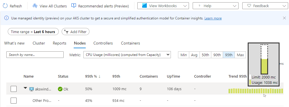
When you hover over the bar graph under the Trend column, each bar shows either CPU or memory usage, depending on which metric is selected, within a sample period of 15 minutes. After you select the trend chart through a keyboard, use the Alt+Page up key or Alt+Page down key to cycle through each bar individually. You get the same details as if you hovered over the bar.
In the next example, for the first node in the list, aks-nodepool1-, the value for Containers is 25. This value is a rollup of the total number of containers deployed.
Property pane
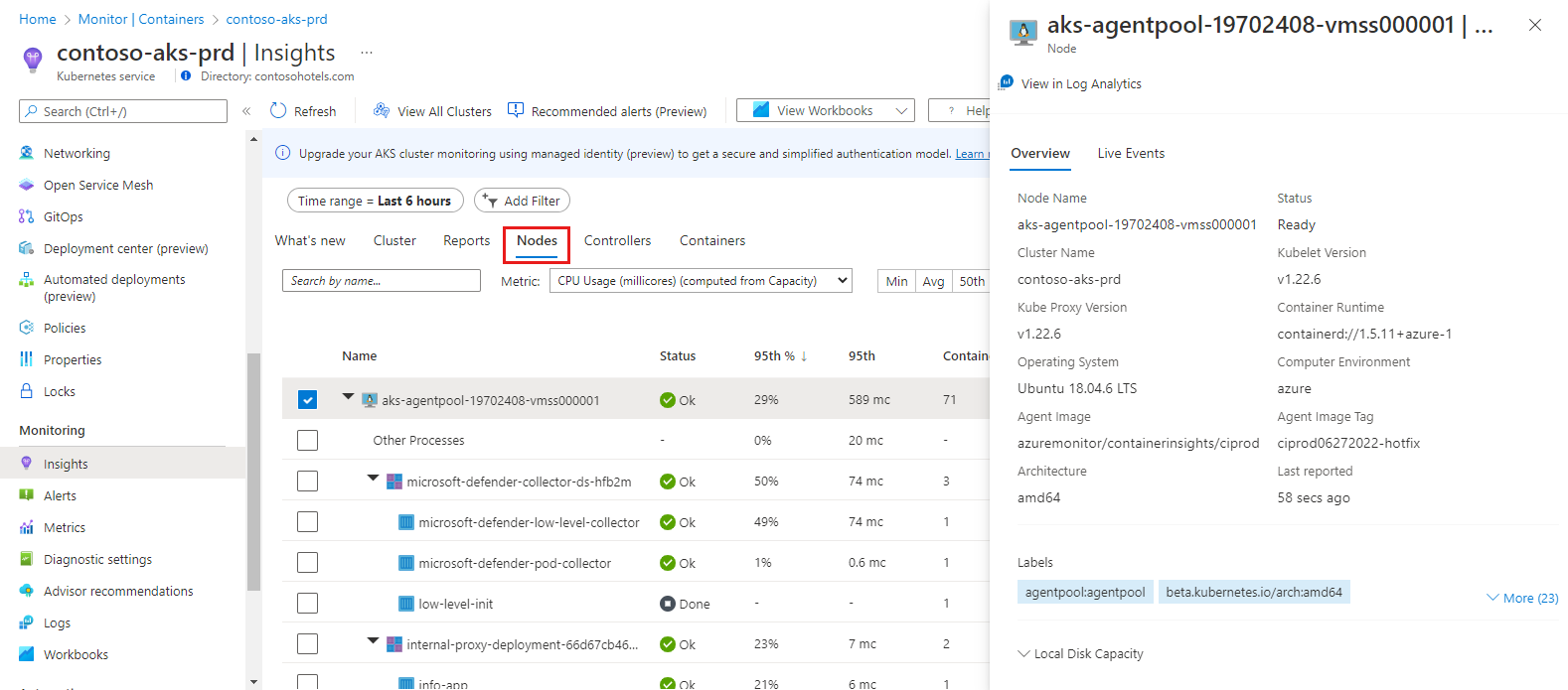
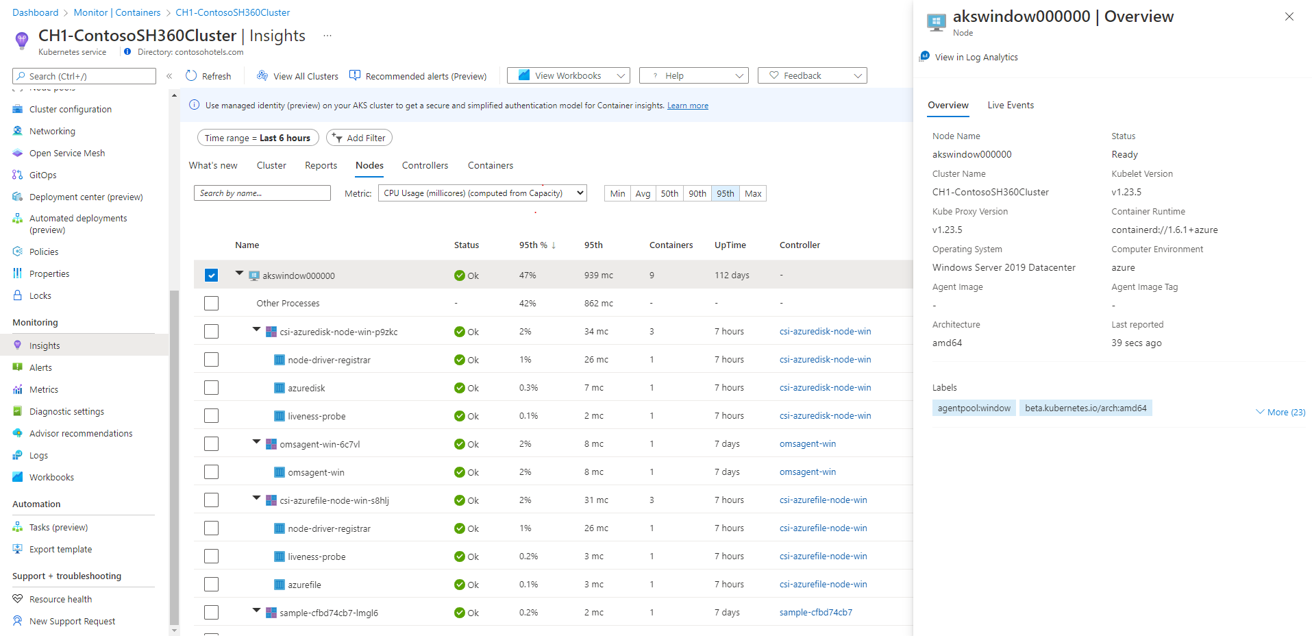
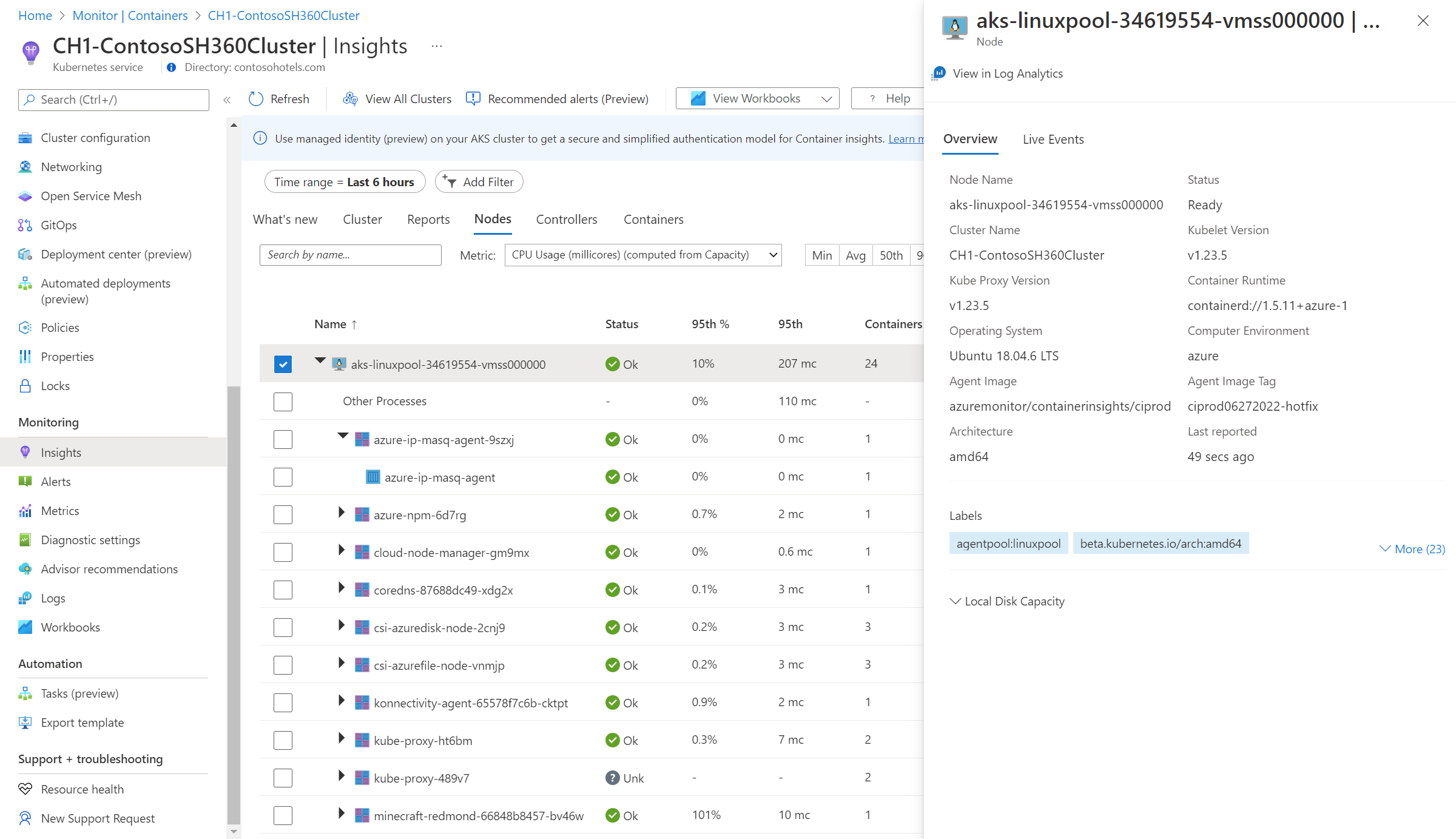
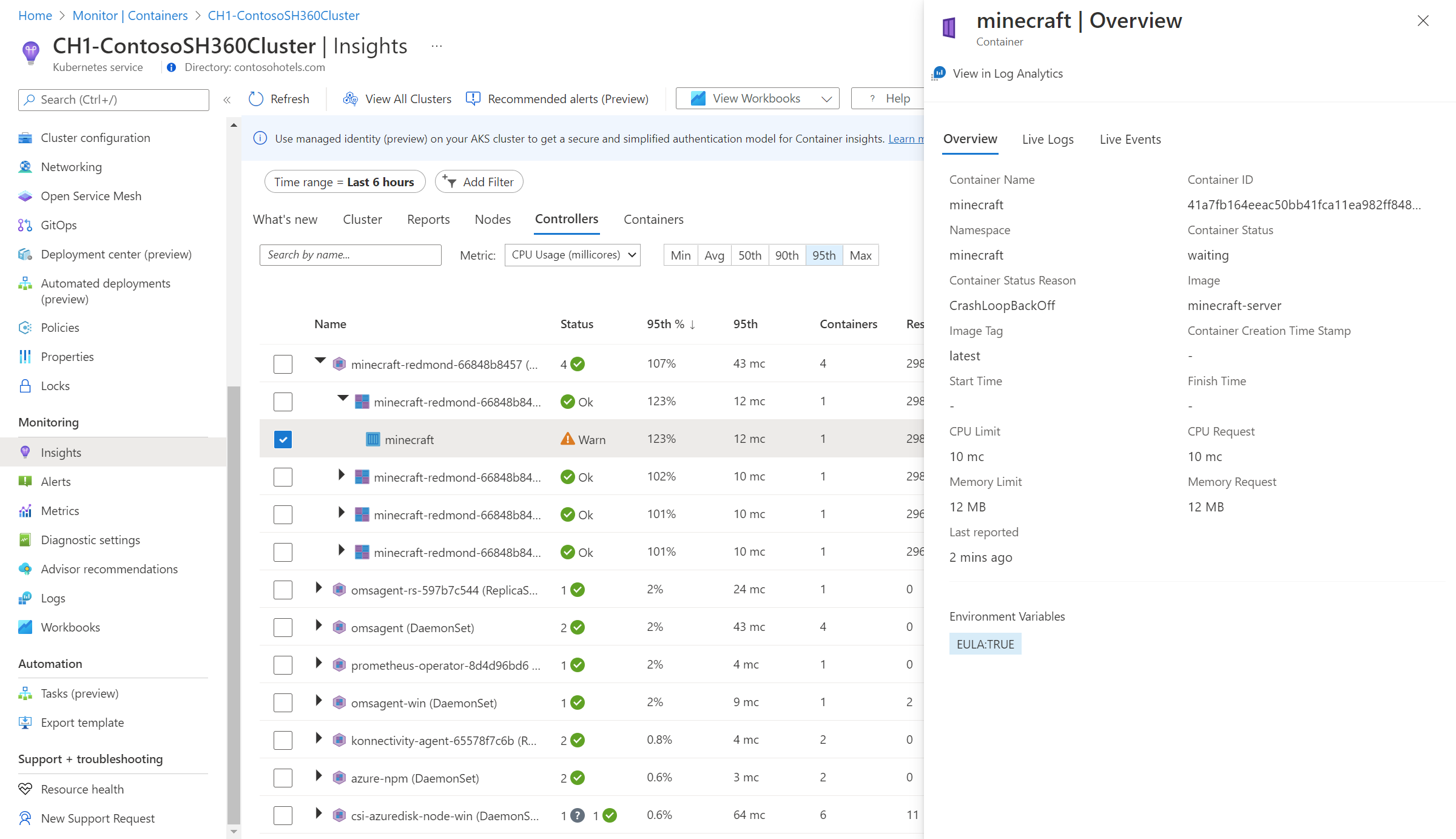
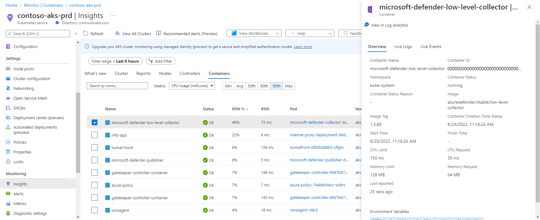
Select any item to open a property pane that shows the properties of the item selected. When a Linux node is selected, the Local Disk Capacity section also shows the available disk space and the percentage used for each disk presented to the node. From this pane, you also can view Kubernetes container logs (stdout/stderror), events, and pod metrics by selecting the Live Events tab at the top of the pane. For more information about this feature, see How to view Kubernetes logs, events, and pod metrics in real time.
View log data
To view log data for the selected resource based on predefined log searches, select View Events in Log Analytics from the property pane. For more information on this data and log queries, see How to query container logs.
Nodes tab
The following table describes the columns in the Nodes tab.
| Column | Description |
|---|---|
| Name | The name of the host. |
| Status | Kubernetes view of the node status. |
| Min %, Avg %, 50th %, 90th %, 95th %, Max % | Average node percentage based on percentile during the selected duration. |
| Min, Avg, 50th, 90th, 95th, Max | Average nodes' actual value based on percentile during the time duration selected. The average value is measured from the CPU/Memory limit set for a node. For pods and containers, it's the average value reported by the host. |
| Containers | Number of containers. |
| Uptime | Represents the time since a node started or was rebooted. |
| Controller | Only for containers and pods. It shows which controller it resides in. Not all pods are in a controller, so some might display N/A. |
| Trend Min %, Avg %, 50th %, 90th %, 95th %, Max % | Bar graph trend represents the average percentile metric percentage of the controller. |
The row hierarchy in the Nodes tab follows the Kubernetes object model. Expand a node to view its pods. If more than one container is grouped to a pod, they're displayed as the last row in the hierarchy. You also can view how many non-pod-related workloads are running on the host if the host has processor or memory pressure.
Windows Server containers are shown after all the Linux-based nodes in the list. When you expand a Windows Server node, you can view one or more pods and containers that run on the node. After a node is selected, the properties pane shows version information.
Azure Container Instances virtual nodes that run the Linux OS are shown after the last AKS cluster node in the list. When you expand a Container Instances virtual node, you can view one or more Container Instances pods and containers that run on the node. Metrics aren't collected and reported for nodes, only for pods.
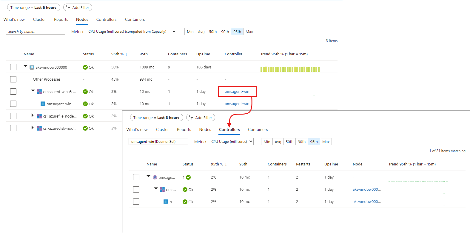
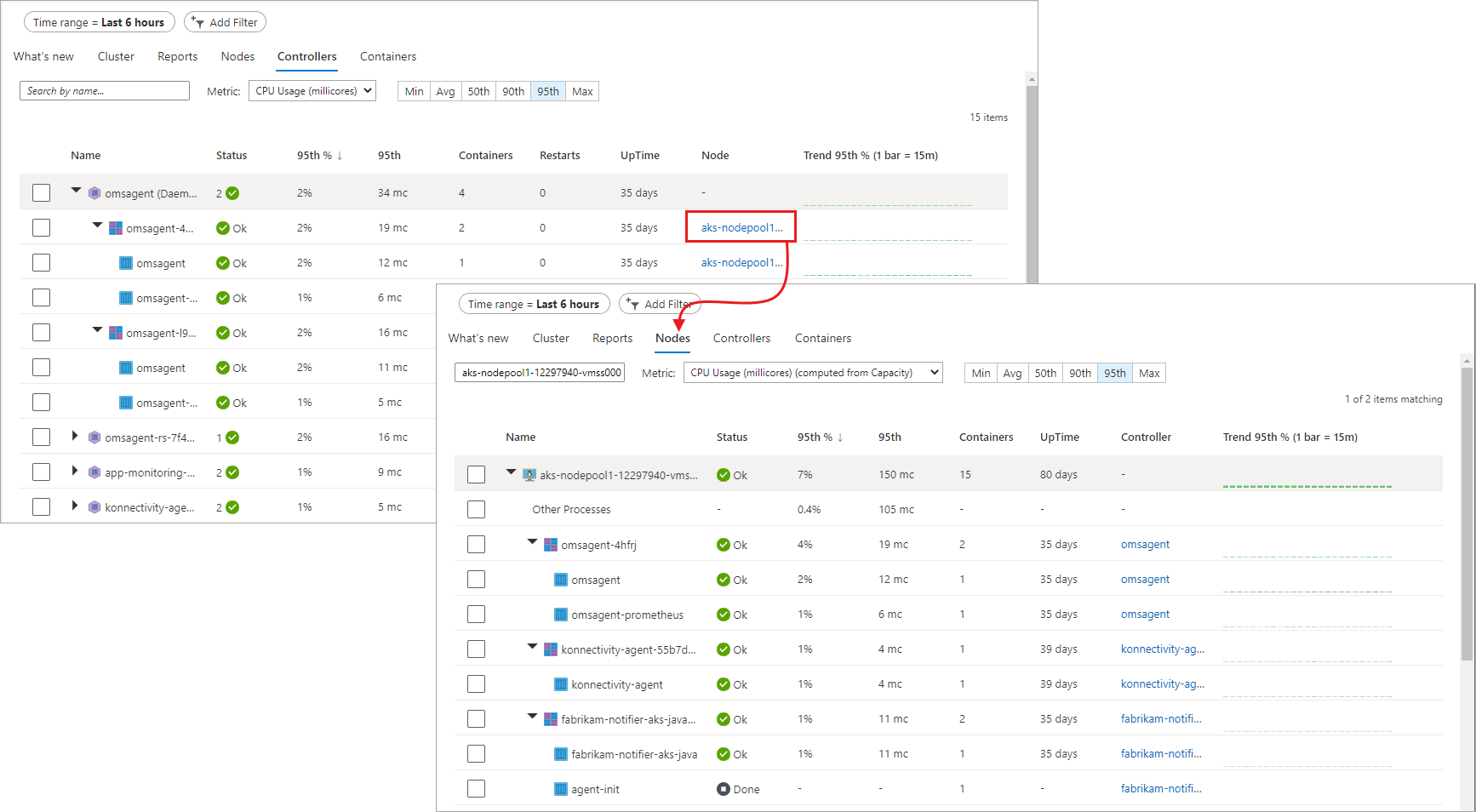
From an expanded node, you can drill down from the pod or container that runs on the node to the controller to view performance data filtered for that controller. Select the value under the Controller column for the specific node.
The Other processes entry view is intended to help you clearly understand the root cause of the high resource usage on your node. This information helps you to distinguish usage between containerized processes versus noncontainerized processes. These are noncontainerized processes that run on your node and include the following:
- Self-managed or managed Kubernetes noncontainerized processes
- Container run-time processes
- Kubelet
- System processes running on your node
- Other non-Kubernetes workloads running on node hardware or a VM
The value of other processes is Total usage from CAdvisor - Usage from containerized process.
Controllers tab
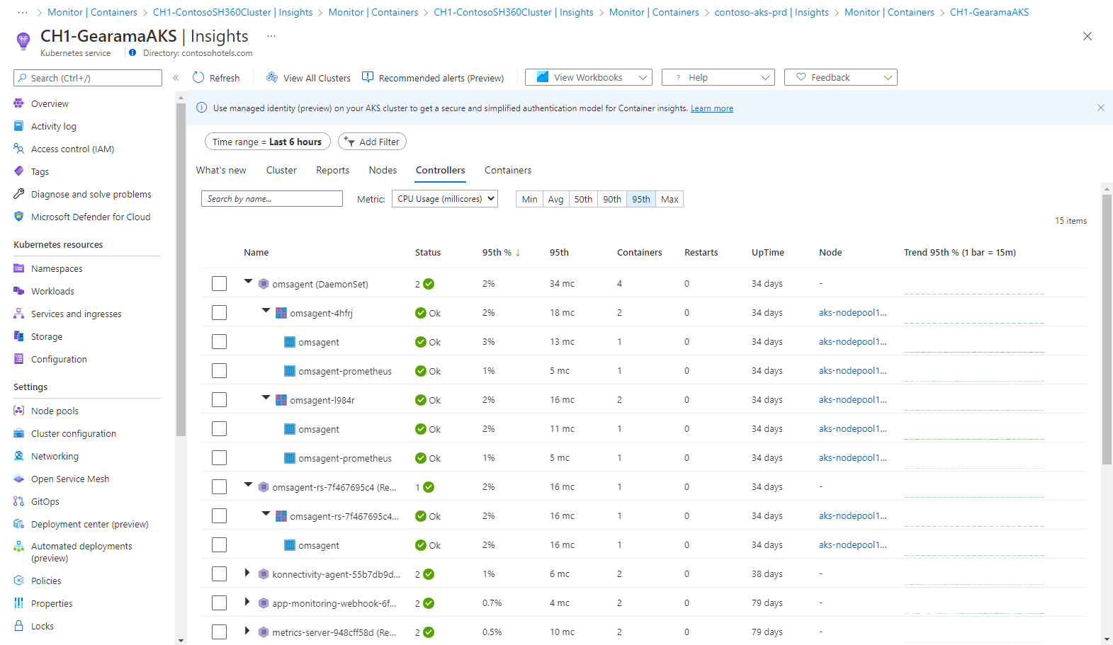
The Controllers tab lets you view the performance health of your controllers, virtual node controllers, and virtual node pods not connected to a controller.
The row hierarchy starts with a controller. When you expand a controller, you view one or more pods. Expand a pod, and the last row displays the container grouped to the pod. From an expanded controller, you can drill down to the node it's running on to view performance data filtered for that node. Container Instances pods not connected to a controller are listed last in the list.
Select the value under the Node column for the specific controller.
The following table describes the columns in the Controllers tab.
| Column | Description |
|---|---|
| Name | The name of the controller. |
| Status | The rollup status of the containers after it's finished running. The status icon displays a count based on what the pod provides. It shows the worst two states. When you hover over the status, it displays a rollup status from all pods in the container. If there isn't a ready state, the status value displays (0). |
| Min %, Avg %, 50th %, 90th %, 95th %, Max % | Rollup average of the average percentage of each entity for the selected metric and percentile. |
| Min, Avg, 50th, 90th, 95th, Max | Rollup of the average CPU millicore or memory performance of the container for the selected percentile. The average value is measured from the CPU/Memory limit set for a pod. |
| Containers | Total number of containers for the controller or pod. |
| Restarts | Rollup of the restart count from containers. |
| Uptime | Represents the time since a container started. |
| Node | Only for containers and pods. It shows which controller it resides in. |
| Trend Min %, Avg %, 50th %, 90th %, 95th %, Max % | Bar graph trend represents the average percentile metric of the controller. |
Containers tab
The Containers tab lets you view the performance health of your containers.
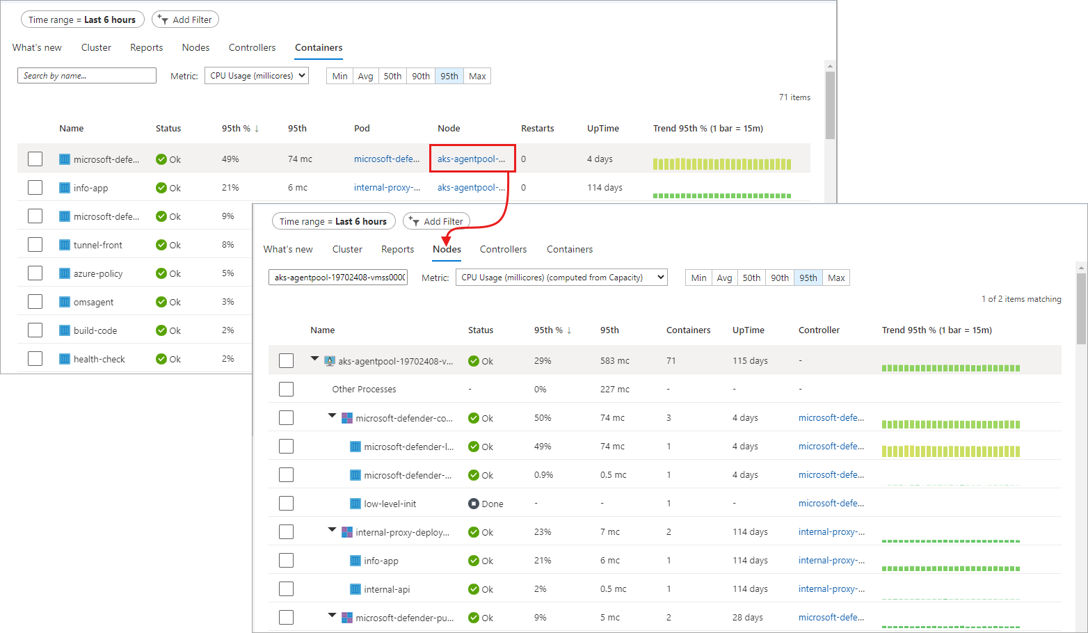
From a container, you can drill down to a pod or node to view performance data filtered for that object. Select the value under the Pod or Node column for the specific container.
The following table describes the columns in the Containers tab.
| Column | Description |
|---|---|
| Name | The name of the container. |
| Status | Status of the container. |
| Min %, Avg %, 50th %, 90th %, 95th %, Max % | The rollup of the average percentage of each entity for the selected metric and percentile. |
| Min, Avg, 50th, 90th, 95th, Max | The rollup of the average CPU millicore or memory performance of the container for the selected percentile. The average value is measured from the CPU/Memory limit set for a pod. |
| Pod | Container where the pod resides. |
| Node | Node where the container resides. |
| Restarts | Represents the time since a container started. |
| Uptime | Represents the time since a container was started or rebooted. |
| Trend Min %, Avg %, 50th %, 90th %, 95th %, Max % | Bar graph trend represents the average percentile metric percentage of the container. |
Next steps
- See Create performance alerts with Container insights to learn how to create alerts for high CPU and memory utilization to support your DevOps or operational processes and procedures.
- See Log query examples to see predefined queries and examples to evaluate or customize to alert, visualize, or analyze your clusters.
