Note
Access to this page requires authorization. You can try signing in or changing directories.
Access to this page requires authorization. You can try changing directories.
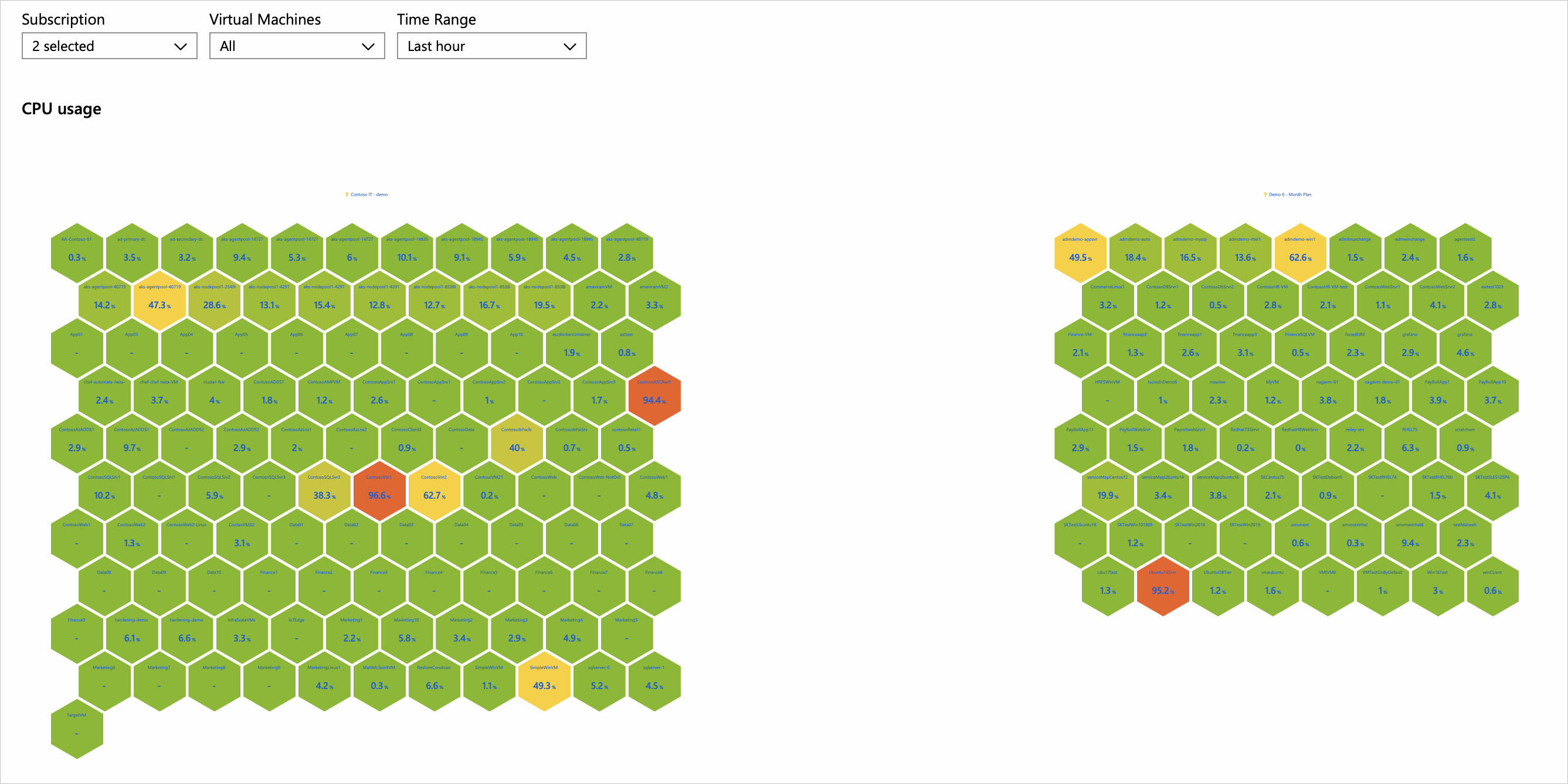
Azure Workbooks honeycomb visualizations provide high-density views of metrics or categories that can optionally be grouped as clusters. They're useful for visually identifying hotspots and drilling in further.
The following image shows the CPU utilization of virtual machines across two subscriptions. Each cell represents a virtual machine. The color/label represents its average CPU utilization. Red cells are hot machines. The virtual machines are clustered by subscription.
Add a honeycomb
Switch the workbook to edit mode by selecting Edit.
Select Add > Add query to add a log query control to the workbook.
For Data source, select Logs. For Resource type, select Log Analytics. For Resource, point to a workspace that has a virtual machine performance log.
Use the query editor to enter the KQL for your analysis.
    Perf
| where CounterName == 'Available MBytes'
| summarize CounterValue = avg(CounterValue) by Computer, _ResourceId
| extend ResourceGroup = extract(@'/subscriptions/.+/resourcegroups/(.+)/providers/microsoft.compute/virtualmachines/.+', 1, _ResourceId)
| extend ResourceGroup = iff(ResourceGroup == '', 'On-premises computers', ResourceGroup), Id = strcat(_ResourceId, '::', Computer)
Run the query.
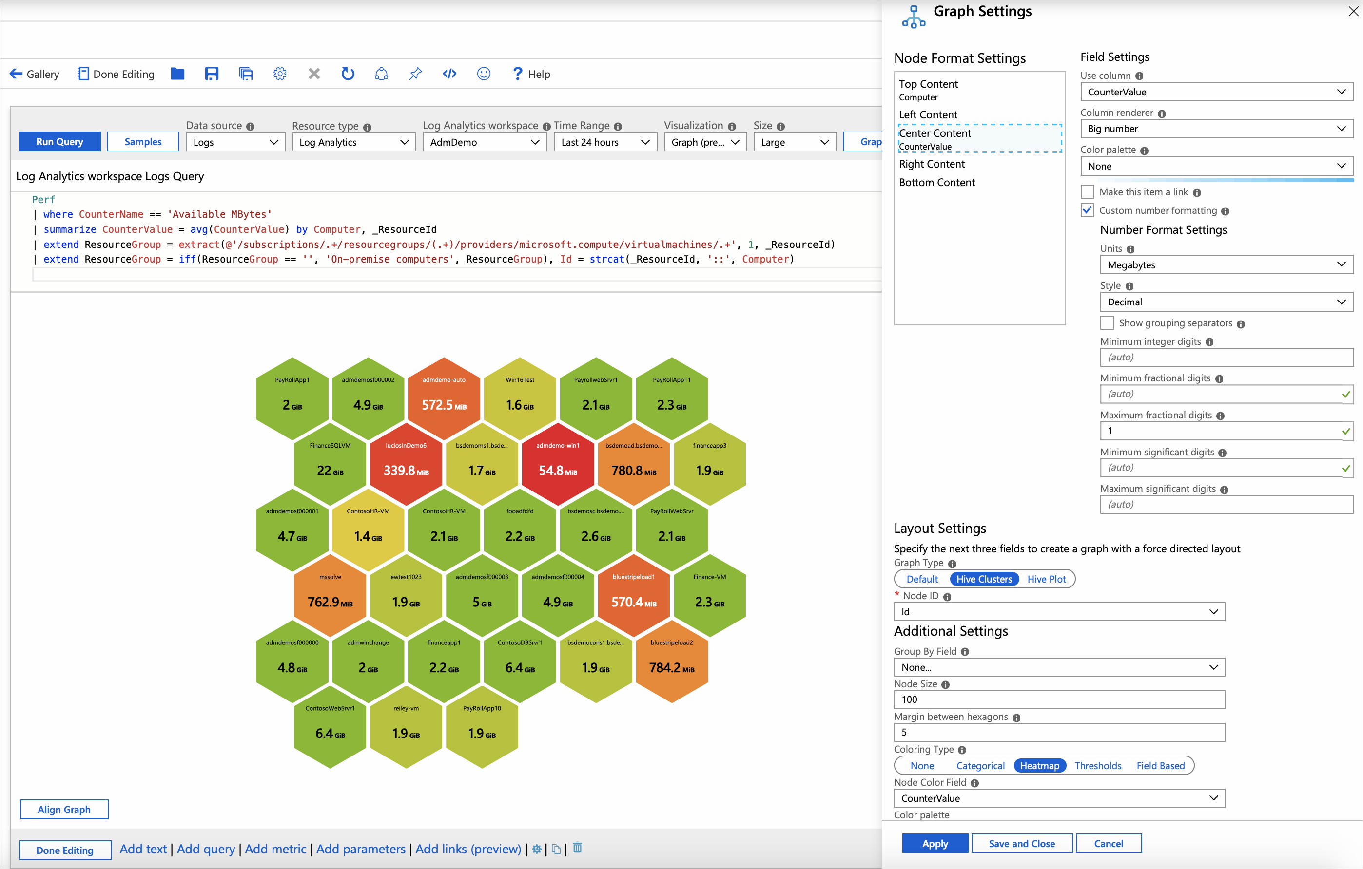
Set Visualization to
Graph.Select Graph Settings.
- In Node Format Settings at the top, set:
- Top Content
- Use column:
Computer - Column renderer:
Text
- Use column:
- Center Content
- Use column:
CounterValue - Column renderer:
Big Number - Color palette:
None - Select the Custom number formatting checkbox.
- Units:
Megabytes - Maximum fractional digits:
1
- Use column:
- Top Content
- In Layout Settings at the bottom, set:
- Graph Type:
Hive Clusters - Node ID:
Id - Group By Field:
None - Node Size: 100
- Margin between hexagons:
5 - Coloring Type:
Heatmap - Node Color Field:
CounterValue - Color palette:
Red to Green - Minimum value:
100 - Maximum value:
2000
- Graph Type:
- In Node Format Settings at the top, set:
Select Save and Close at the bottom of the pane.
Honeycomb layout settings
| Setting | Description |
|---|---|
Node ID |
Selects a column that provides the unique ID of nodes. The value of the column can be a string or a number. |
Group By Field |
Select the column to cluster the nodes on. |
Node Size |
Sets the size of the hexagonal cells. Use with the Margin between hexagons property to customize the look of the honeycomb chart. |
Margin between hexagons |
Sets the gap between the hexagonal cells. Use with the Node size property to customize the look of the honeycomb chart. |
Coloring Type |
Selects the scheme to use to color the node. |
Node Color Field |
Selects a column that provides the metric on which the node areas will be based. |
Node coloring types
| Coloring type | Description |
|---|---|
None |
All nodes have the same color. |
Categorical |
Nodes are assigned colors based on the value or category from a column in the result set. In the preceding example, the coloring is based on the column Kind of the result set. Supported palettes are Default, Pastel, and Cool tone. |
Heatmap |
In this type, the cells are colored based on a metric column and a color palette. Color coding provides a simple way to highlight metrics spread across cells. |
Thresholds |
In this type, cell colors are set by threshold rules, for example, CPU > 90% => Red, 60% > CPU > 90% => Yellow, CPU < 60% => Green. |
Field Based |
In this type, a column provides specific RGB values to use for the node. Provides the most flexibility but usually requires more work to enable. |
Node format settings
You can specify what content goes to the different parts of a node: top, left, center, right, and bottom. You're free to use any of the renderers supported by workbooks like text, big numbers, spark lines, and icons.
Next steps
- Learn how to create a composite bar renderer in workbooks.
- Learn how to import Azure Monitor log data into Power BI.

