Note
Access to this page requires authorization. You can try signing in or changing directories.
Access to this page requires authorization. You can try changing directories.
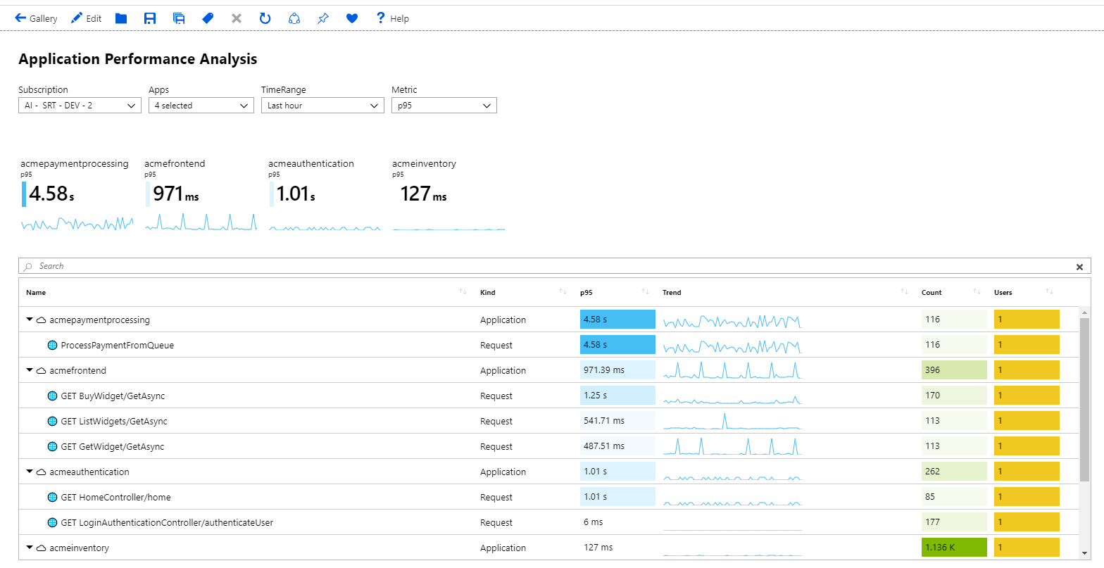
Tiles are a useful way to present summary data in workbooks. The following example shows a common use case of tiles with app-level summary on top of a detailed grid.
Workbook tiles support showing items like a title, subtitle, large text, icons, metric-based gradients, spark lines or bars, and footers.
Add a tile
Switch the workbook to edit mode by selecting the Edit toolbar button.
Select Add > Add query to add a log query control to the workbook.
For Query type, select Logs. For Resource type, select, for example, Application Insights, and select the resources to target.
Use the query editor to enter the KQL for your analysis.
requests
| summarize Requests = count() by appName, name
| top 7 by Requests desc
Set Size to Full.
Set Visualization to Tiles.
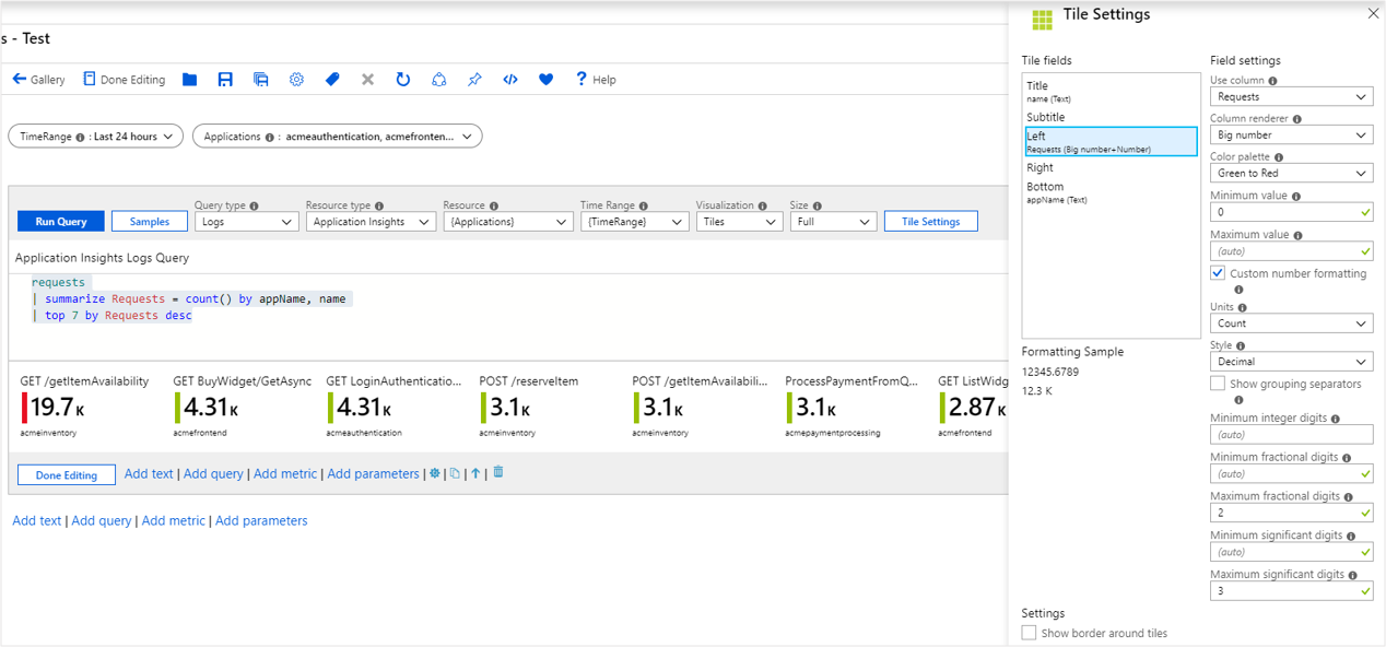
Select the Tile Settings button to open the Tile Settings pane:
- In Title, set:
- Use column:
name
- Use column:
- In Left, set:
- Use column:
Requests - Column renderer:
Big Number - Color palette:
Green to Red - Minimum value:
0
- Use column:
- In Bottom, set:
- Use column:
appName
- Use column:
- In Title, set:
Select the Save and Close button at the bottom of the pane.
The tiles in read mode:
Spark lines in tiles
Switch the workbook to edit mode by selecting Edit on the toolbar.
Add a time range parameter called
TimeRange.- Select Add > Add parameters.
- In the parameter control, select Add Parameter.
- In the Parameter name field, enter
TimeRange. For Parameter type, chooseTime range picker. - Select Save at the top of the pane and then select Done Editing in the parameter control.
Select Add > Add query to add a log query control under the parameter control.
For Query type, select Logs. For Resource type, select, for example, Application Insights, and select the resources to target.
Use the query editor to enter the KQL for your analysis.
let topRequests = requests
| summarize Requests = count() by appName, name
| top 7 by Requests desc;
let topRequestNames = topRequests | project name;
requests
| where name in (topRequestNames)
| make-series Trend = count() default = 0 on timestamp from {TimeRange:start} to {TimeRange:end} step {TimeRange:grain} by name
| join (topRequests) on name
| project-away name1, timestamp
Select Run Query. Set
TimeRangeto a value of your choosing before you run the query.Set Visualization to Tiles.
Set Size to Full.
Select Tile Settings:
- In Tile, set:
- Use column:
name
- Use column:
- In Subtile, set:
- Use column:
appNAme
- Use column:
- In Left, set:
- Use column:
Requests - Column renderer:
Big Number - Color palette:
Green to Red - Minimum value:
0
- Use column:
- In Bottom, set:
- Use column:
Trend - Column renderer:
Spark line - Color palette:
Green to Red - Minimum value:
0
- Use column:
- In Tile, set:
Select Save and Close at the bottom of the pane.
Tile sizes
You have an option to set the tile width in the tile settings:
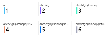
fixed(default)The default behavior of tiles is to be the same fixed width, approximately 160 pixels wide, plus the space around the tiles.
autoEach title shrinks or grows to fit their contents. The tiles are limited to the width of the tiles' view (no horizontal scrolling).
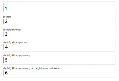
full sizeEach title is always the full width of the tiles' view, with one title per line.
Next steps
- Tiles also support the composite bar renderer. To learn more, see Composite bar documentation.
- To learn more about time parameters like
TimeRange, see Workbook time parameters documentation.


