Note
Access to this page requires authorization. You can try signing in or changing directories.
Access to this page requires authorization. You can try changing directories.
A selection control with a dropdown list. You can allow selection of only a single item or multiple items. You can also optionally include a description with the items.
UI sample
The DropDown element has different options that determine its appearance in the portal.
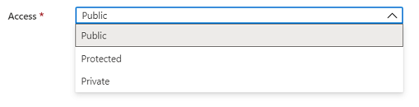
When only a single item is allowed for selection, the control appears as:
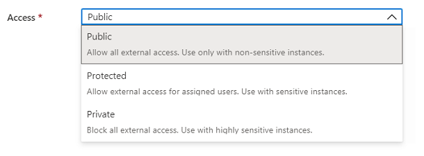
When descriptions are included, the control appears as:
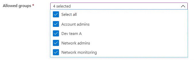
When multi-select is enabled, the control adds a Select all option and checkboxes for selecting more than one item:
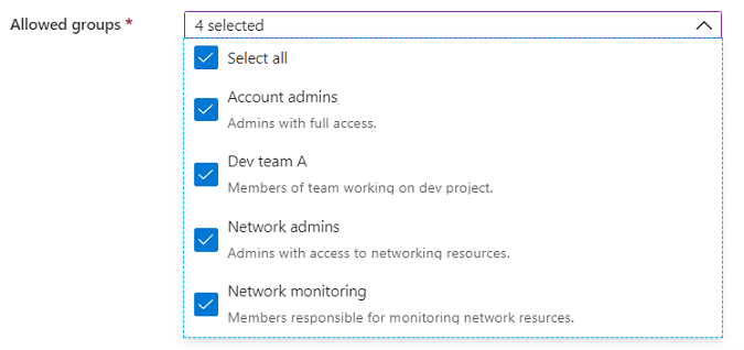
Descriptions can be included with multi-select enabled.
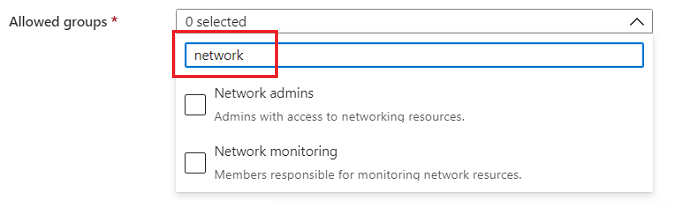
When filtering is enabled, the control includes a text box for adding the filtering value.
Schema
{
  "name": "element1",
  "type": "Microsoft.Common.DropDown",
  "label": "Example drop down",
  "placeholder": "",
  "defaultValue": ["Value two"],
  "toolTip": "",
  "multiselect": true,
  "selectAll": true,
  "filter": true,
  "filterPlaceholder": "Filter items ...",
  "multiLine": true,
  "defaultDescription": "A value for selection",
  "constraints": {
    "allowedValues": [
      {
        "label": "Value one",
        "description": "The value to select for option 1.",
        "value": "one"
      },
      {
        "label": "Value two",
        "description": "The value to select for option 2.",
        "value": "two"
      }
    ],
    "required": true
  },
  "visible": true
}
Sample output
"two"
Remarks
- Use
multiselectto specify whether users can select more than one item. - By default,
selectAllistruewhen multi-select is enabled. - The
filterproperty enables users to search within a long list of options. - The label for
constraints.allowedValuesis the display text for an item, and its value is the output value of the element when selected. - If specified, the default value must be a label present in
constraints.allowedValues. If not specified, the first item inconstraints.allowedValuesis selected. The default value isnull. constraints.allowedValuesmust have at least one item.- To emulate a value not being required, add an item with a label and value of
""(empty string) toconstraints.allowedValues. - The
defaultDescriptionproperty is used for items that don't have a description. - The
placeholderproperty is help text that disappears when the user begins editing. If theplaceholderanddefaultValueare both defined, thedefaultValuetakes precedence and is shown.
Example
In the following example, the defaultValue is defined using the values of the allowedValues instead of the labels. The default value can contain multiple values when multiselect is enabled.

{
  "name": "element1",
  "type": "Microsoft.Common.DropDown",
  "label": "Example drop down",
  "placeholder": "",
  "defaultValue": [{"value": "one"}, {"value": "two"}],
  "toolTip": "Multiple values can be selected",
  "multiselect": true,
  "selectAll": true,
  "filter": true,
  "filterPlaceholder": "Filter items ...",
  "multiLine": true,
  "defaultDescription": "A value for selection",
  "constraints": {
    "allowedValues": [
      {
        "label": "Value one",
        "description": "The value to select for option 1.",
        "value": "one"
      },
      {
        "label": "Value two",
        "description": "The value to select for option 2.",
        "value": "two"
      }
    ],
    "required": true
  },
  "visible": true
}
Next steps
- For an introduction to creating UI definitions, see Getting started with CreateUiDefinition.
- For a description of common properties in UI elements, see CreateUiDefinition elements.