Note
Access to this page requires authorization. You can try signing in or changing directories.
Access to this page requires authorization. You can try changing directories.
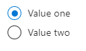
The OptionsGroup control lets users select one option from two or more choices. A user can select only one option.
Note
In the past, this control rendered the options horizontally. Now, the control presents the options vertically as radio buttons.
UI sample
Schema
{
  "name": "element1",
  "type": "Microsoft.Common.OptionsGroup",
  "label": "Some options group",
  "defaultValue": "Value two",
  "toolTip": "",
  "constraints": {
    "allowedValues": [
      {
        "label": "Value one",
        "value": "one"
      },
      {
        "label": "Value two",
        "value": "two"
      }
    ],
    "required": true
  },
  "visible": true
}
Sample output
"two"
Remarks
- The label for
constraints.allowedValuesis the display text for an item, and its value is the output value of the element when selected. - If specified, the default value must be a label present in
constraints.allowedValues. If not specified, the first item inconstraints.allowedValuesis selected by default. The default value isnull. constraints.allowedValuesmust have at least one item.
Next steps
- For an introduction to creating UI definitions, see Getting started with CreateUiDefinition.
- For a description of common properties in UI elements, see CreateUiDefinition elements.