Note
Access to this page requires authorization. You can try signing in or changing directories.
Access to this page requires authorization. You can try changing directories.
This article shows you how to view your query in Excel, by exporting directly from the web UI or importing into Excel.
Prerequisites
- A Microsoft account or a Microsoft Entra user identity to sign in to the help cluster.
View data in Excel
You can use the following options to query data in Excel:
Export the query directly from the web UI.
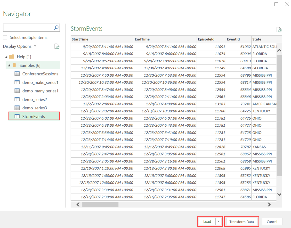
In Azure Data Explorer web UI, run the query and check the results.
Select the Export tab and select Open in Excel.
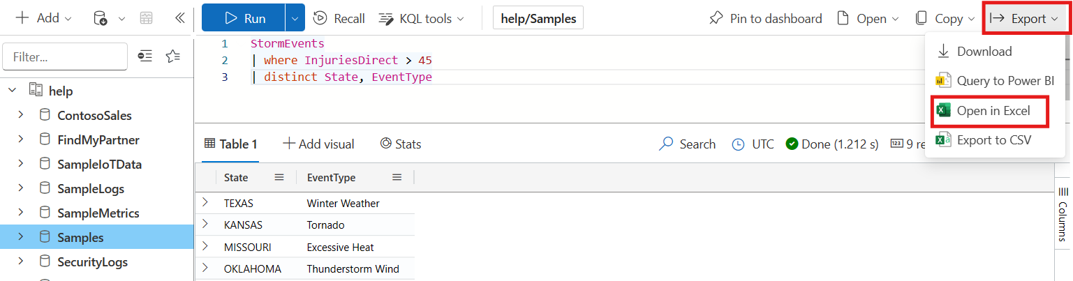
The query is saved as an Excel workbook in the Downloads folder.
Open the downloaded workbook to view your data. Enable editing and enable content if requested in the top ribbon.

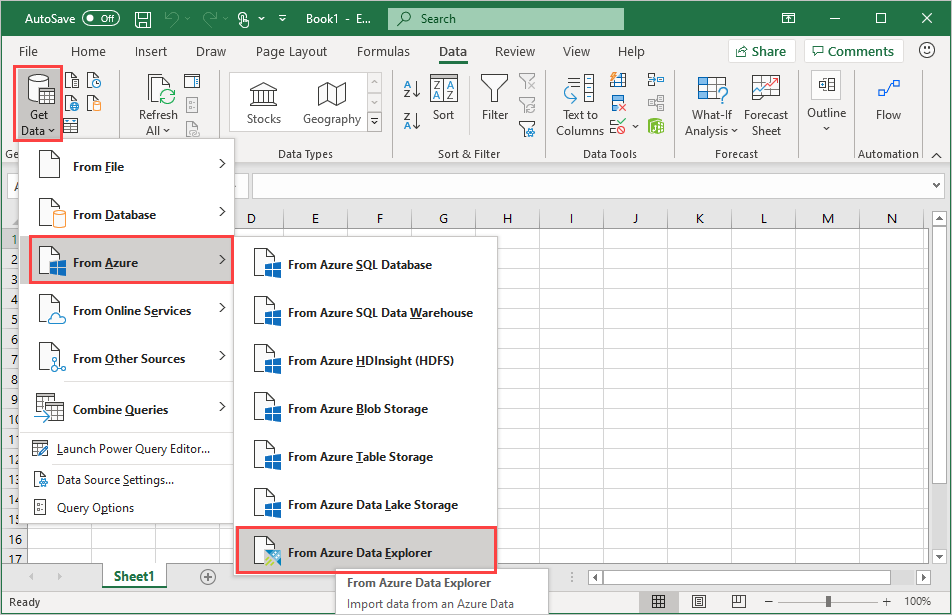
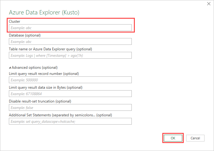
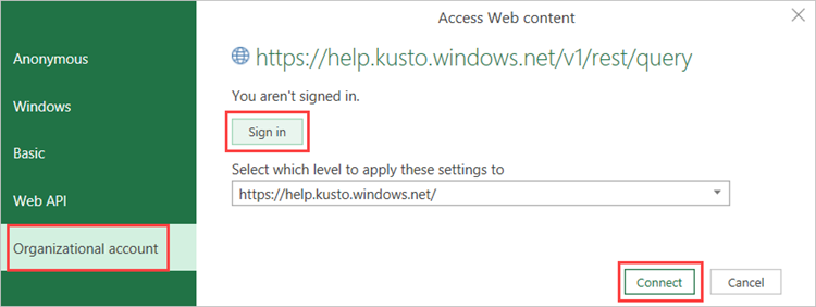
Analyze and visualize data in Excel
Once the data loads to excel and is available in your Excel sheet, you can analyze, summarize, and visualize the data by creating relationships and visuals.
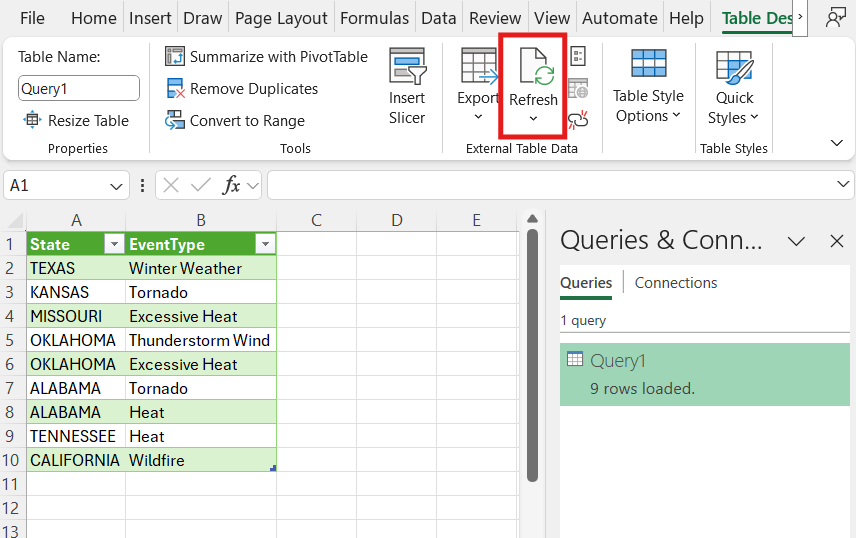
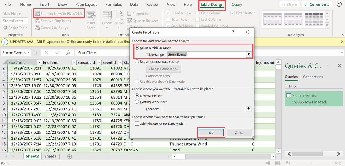
In the Table Design tab, select Summarize with PivotTable. In the Create PivotTable window, select the relevant table, and select OK.
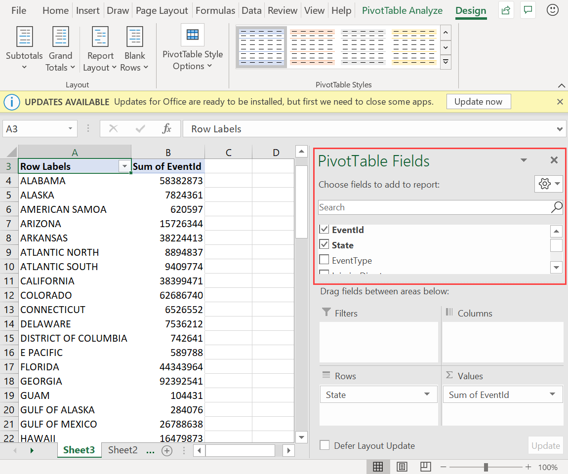
In the PivotTable Fields pane, select the relevant table columns to create summary tables. In the following example, EventId and State are selected.
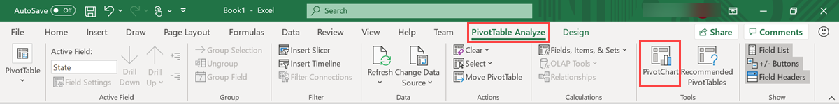
In the PivotTable Analyze tab, select PivotChart to create visuals based on the table.
In the following example, use Event Id, StartTime, and EventType to view additional information about the weather events.
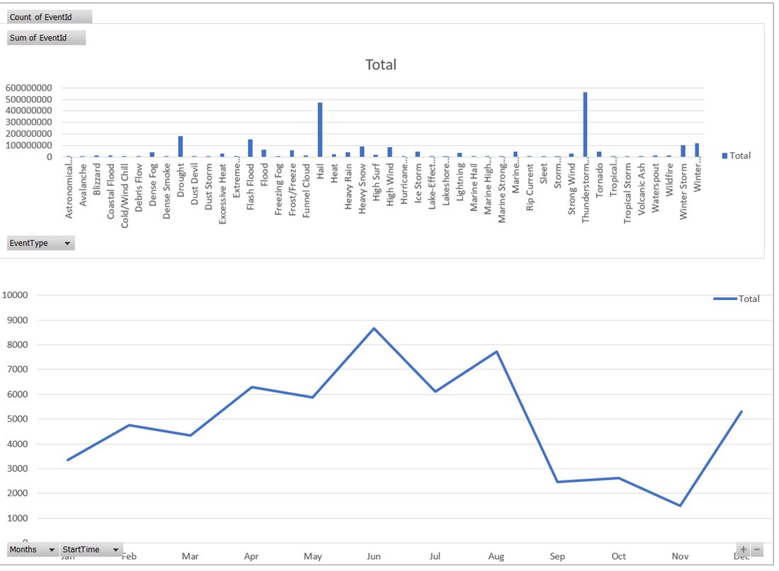
Create full dashboards to monitor your data.
Related content
To learn about other ways to visualize your data, see Visualization integrations overview.