Geospatial visualizations
Geospatial data can be visualized using the render operator in Kusto Desktop Explorer or the Azure Data Explorer web UI. To download Kusto Desktop Explorer, see Kusto.Explorer installation and user interface.
For more information about visualization options, see Data visualization with Azure Data Explorer. For more information about geospatial clustering, see Geospatial clustering.
Visualize points on a map
It's possible to visualize points either using [Longitude, Latitude] columns, or GeoJSON column. The use of a series column is optional. Each point is defined by [Longitude, Latitude] pair, in that order.
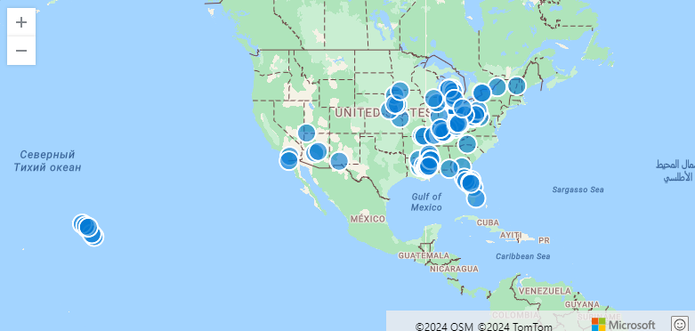
Example: Visualize points on a map
StormEvents
| take 100
| project BeginLon, BeginLat
| render scatterchart with (kind = map)
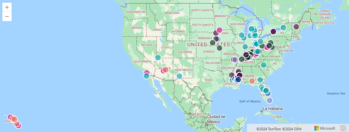
Example: Visualize multiple series of points on a map
To visualize multiple series of points, each point is defined by a [Longitude, Latitude] pair, and the series is defined by a third column. In this example, the series is EventType.
StormEvents
| take 100
| project BeginLon, BeginLat, EventType
| render scatterchart with (kind = map)
Example: Visualize series of points on data with multiple columns
If you have multiple columns in the result, you must specify the columns to be used for xcolumn (Longitude), ycolumn (Latitude), and series.
StormEvents
| take 100
| render scatterchart with (kind = map, xcolumn = BeginLon, ycolumns = BeginLat, series = EventType)
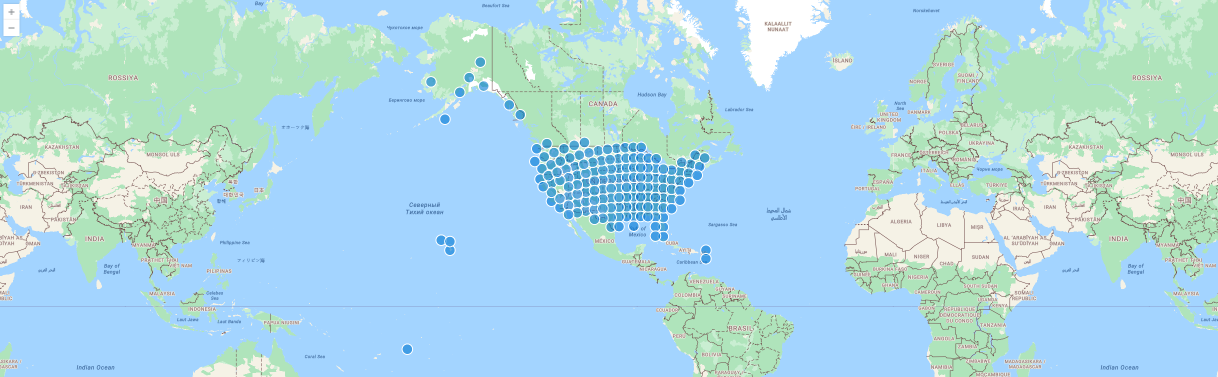
Example: Visualize points on a map defined by GeoJSON dynamic values
In this example, the points are defined by GeoJSON dynamic values.
StormEvents
| project BeginLon, BeginLat
| summarize by hash=geo_point_to_s2cell(BeginLon, BeginLat, 5)
| project geo_s2cell_to_central_point(hash)
| render scatterchart with (kind = map)
Visualization of pies or bubbles on a map
You can visualize pies or bubbles either using [Longitude, Latitude] columns or GeoJSON column. These visualizations can be created with color or numeric axes.
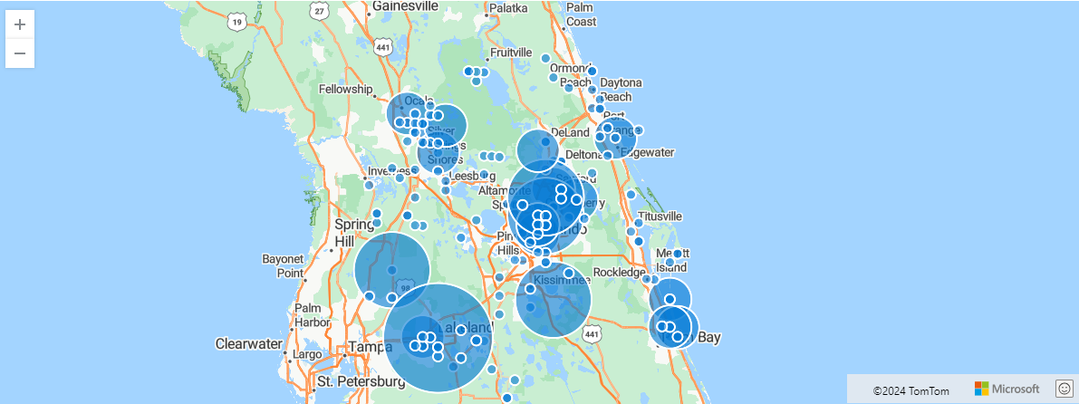
Example: Visualize pie charts by location
The following example shows storm events aggregated by s2 cell. The chart aggregates events in pie charts by location.
StormEvents
| project BeginLon, BeginLat, EventType
| where geo_point_in_circle(BeginLon, BeginLat, real(-81.3891), 28.5346, 1000 * 100)
| summarize count() by EventType, hash = geo_point_to_s2cell(BeginLon, BeginLat)
| project geo_s2cell_to_central_point(hash), EventType, count_
| render piechart with (kind = map) // pie map rendering available only in Kusto Explorer desktop
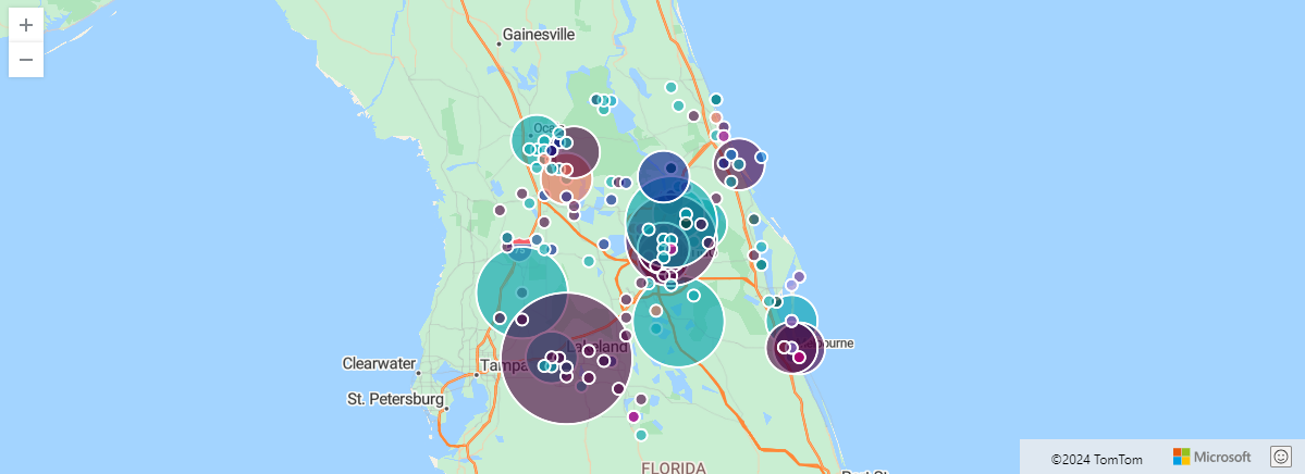
Example: Visualize bubbles using a color axis
The following example shows storm events aggregated by s2 cell. The chart aggregates events in bubble by location. The color-axis ("count") is the same for all events, and this is why bubbles are generated by the render operator.
StormEvents
| project BeginLon, BeginLat, EventType
| where geo_point_in_circle(BeginLon, BeginLat, real(-81.3891), 28.5346, 1000 * 100)
| summarize count() by EventType, hash = geo_point_to_s2cell(BeginLon, BeginLat)
| project geo_s2cell_to_central_point(hash), count_
| extend Events = "count"
| render piechart with (kind = map) // pie map rendering available only in Kusto Explorer desktop
Related content
- Geospatial clustering
- Render operator
- See a use case for geospatial clustering: Data analytics for automotive test fleets
- Learn about Azure architecture for geospatial data processing and analytics