Observação
O acesso a essa página exige autorização. Você pode tentar entrar ou alterar diretórios.
O acesso a essa página exige autorização. Você pode tentar alterar os diretórios.
Azure Synapse是一种集成的分析服务,可加快跨数据仓库和大数据分析系统的见解时间。 数据可视化是能够深入了解数据的关键组成部分。 它有助于人类更容易理解大数据和小型数据。 它还使检测数据组中的模式、趋势和离群值更容易。
在 Azure Synapse Analytics 中使用 Apache Spark 时,有多种内置选项可帮助你可视化数据,包括 Synapse 笔记本图表选项、访问常用开源库以及与 Synapse SQL 和Power BI集成。
笔记本图表选项
使用Azure Synapse笔记本时,可以使用图表选项将表格结果视图转换为自定义图表。 在这里,无需编写任何代码即可可视化数据。
display(df) 函数
该 display 函数允许你将 SQL 查询和 Apache Spark 数据帧和 RDD 转换为丰富的数据可视化效果。
display 函数可用于在 PySpark、Scala、Java、R 和 .NET 中创建的数据帧或 RDD。
若要访问图表选项,请执行以下操作:
magic 命令的输出默认显示在已渲染的
%%sql表视图中。 还可以调用display(df)Spark 数据帧或弹性分布式数据集(RDD)函数来生成呈现的表视图。获得呈现的表视图后,切换到图表视图。
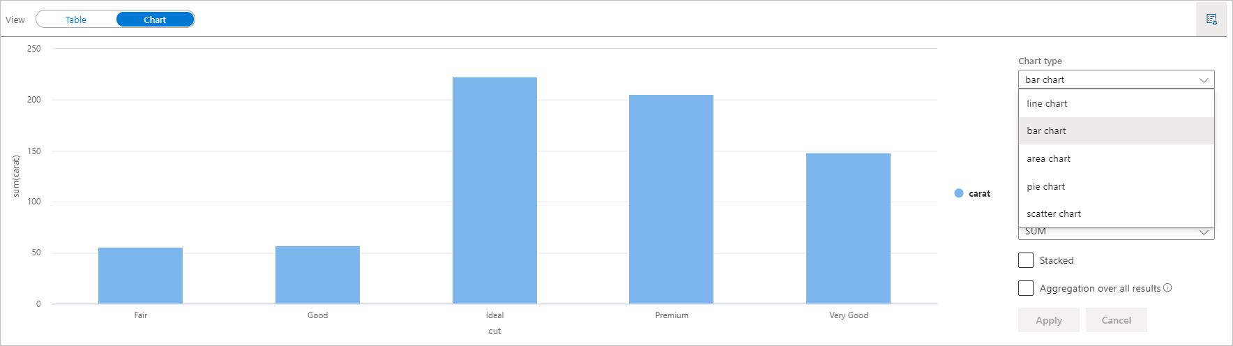
现在可以通过指定以下值来自定义可视化效果:
配置 说明 图表类型 该 display函数支持各种图表类型,包括条形图、散点图、折线图等密钥 指定 x 轴的值范围 价值 指定 y 轴值的值范围 系列组 用于确定聚合运算中的分组 集合体 在可视化效果中聚合数据的方法 注释
默认情况下,
display(df)该函数只接受前 1000 行数据来呈现图表。 请检查所有结果的聚合,然后单击应用按钮,将对整个数据集生成图表。 图表设置发生更改时,将触发 Spark 作业。 请注意,完成计算并呈现图表可能需要几分钟时间。完成后,可以查看最终可视化效果并与之交互!
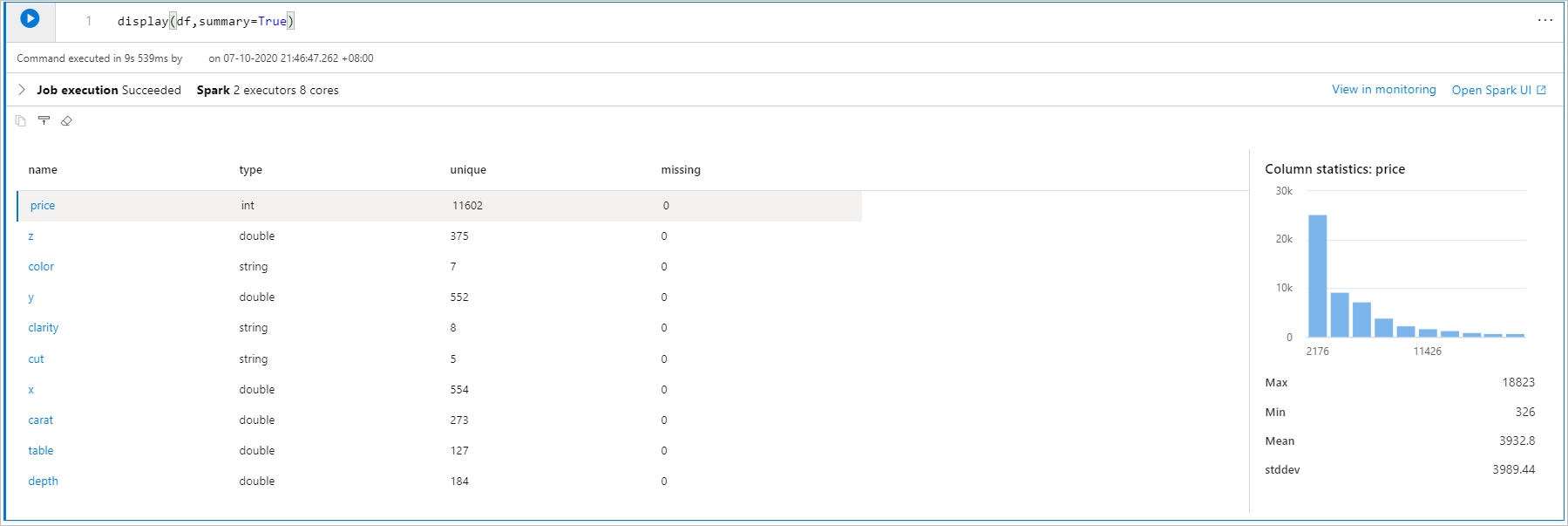
显示(df) 统计信息
可用于 display(df, summary = true) 检查给定 Apache Spark 数据帧的统计信息摘要,其中包括列名、列类型、唯一值以及每个列的缺失值。 还可以选择特定列以查看其最小值、最大值、平均值和标准偏差。
displayHTML() 选项
Azure Synapse Analytics笔记本支持使用 displayHTML 函数的 HTML 图形。
下图是使用 D3.js 创建可视化效果的示例。
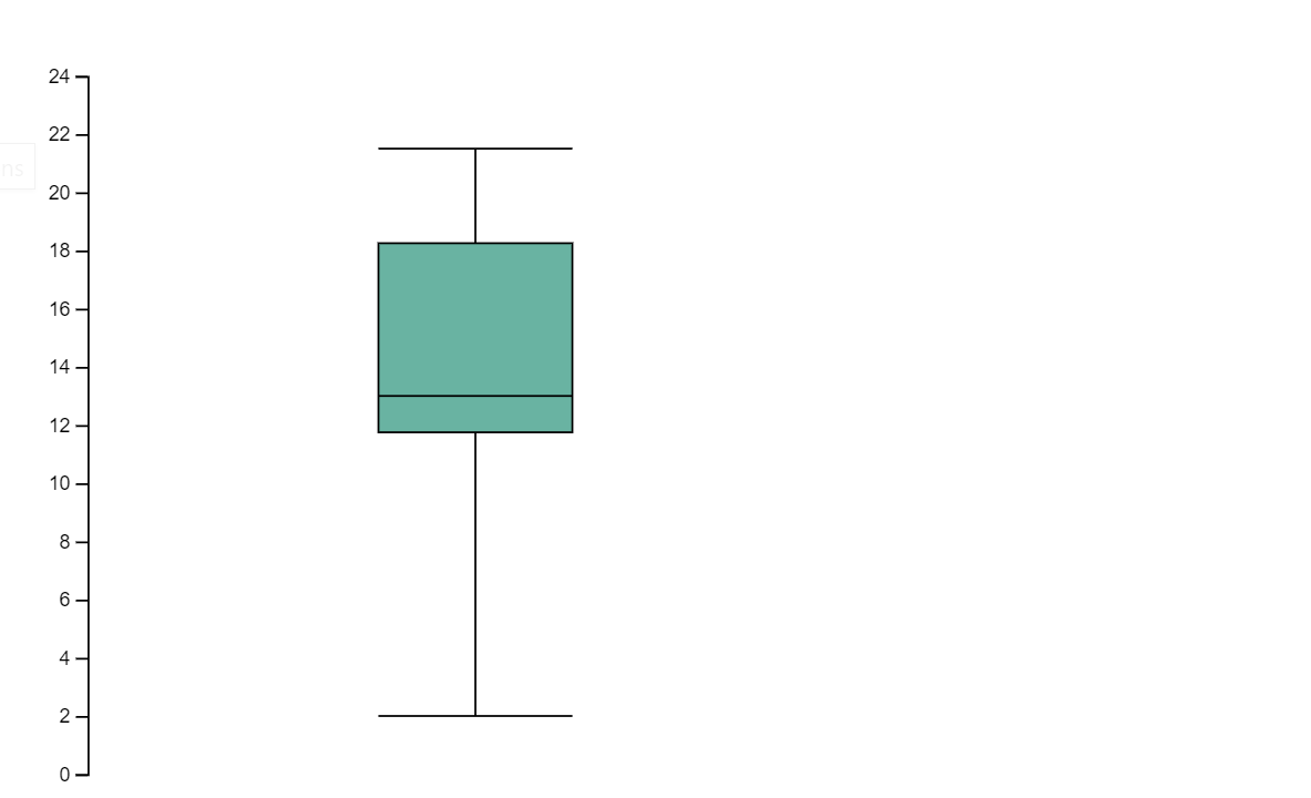
运行以下代码以创建上述可视化效果。
displayHTML("""<!DOCTYPE html>
<meta charset="utf-8">

<!-- Load d3.js -->
<script src="https://d3js.org/d3.v4.js"></script>

<!-- Create a div where the graph will take place -->
<div id="my_dataviz"></div>
<script>

// set the dimensions and margins of the graph
var margin = {top: 10, right: 30, bottom: 30, left: 40},
  width = 400 - margin.left - margin.right,
  height = 400 - margin.top - margin.bottom;

// append the svg object to the body of the page
var svg = d3.select("#my_dataviz")
.append("svg")
  .attr("width", width + margin.left + margin.right)
  .attr("height", height + margin.top + margin.bottom)
.append("g")
  .attr("transform",
        "translate(" + margin.left + "," + margin.top + ")");

// Create Data
var data = [12,19,11,13,12,22,13,4,15,16,18,19,20,12,11,9]

// Compute summary statistics used for the box:
var data_sorted = data.sort(d3.ascending)
var q1 = d3.quantile(data_sorted, .25)
var median = d3.quantile(data_sorted, .5)
var q3 = d3.quantile(data_sorted, .75)
var interQuantileRange = q3 - q1
var min = q1 - 1.5 * interQuantileRange
var max = q1 + 1.5 * interQuantileRange

// Show the Y scale
var y = d3.scaleLinear()
  .domain([0,24])
  .range([height, 0]);
svg.call(d3.axisLeft(y))

// a few features for the box
var center = 200
var width = 100

// Show the main vertical line
svg
.append("line")
  .attr("x1", center)
  .attr("x2", center)
  .attr("y1", y(min) )
  .attr("y2", y(max) )
  .attr("stroke", "black")

// Show the box
svg
.append("rect")
  .attr("x", center - width/2)
  .attr("y", y(q3) )
  .attr("height", (y(q1)-y(q3)) )
  .attr("width", width )
  .attr("stroke", "black")
  .style("fill", "#69b3a2")

// show median, min and max horizontal lines
svg
.selectAll("toto")
.data([min, median, max])
.enter()
.append("line")
  .attr("x1", center-width/2)
  .attr("x2", center+width/2)
  .attr("y1", function(d){ return(y(d))} )
  .attr("y2", function(d){ return(y(d))} )
  .attr("stroke", "black")
</script>

"""
)
Python库
在数据可视化方面,Python提供了多个图形库,这些库包含许多不同的功能。 默认情况下,Azure Synapse Analytics中的每个 Apache Spark 池都包含一组特选和常用的开源库。 还可以通过 Azure Synapse Analytics 的库管理功能来添加或管理其他库及其版本。
Matplotlib
可以使用每个库的内置呈现功能(如 Matplotlib),来呈现标准绘图库。
下图是使用 Matplotlib 创建条形图的示例。
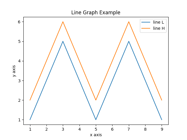
运行以下示例代码以绘制上面的图像。
# Bar chart

import matplotlib.pyplot as plt

x1 = [1, 3, 4, 5, 6, 7, 9]
y1 = [4, 7, 2, 4, 7, 8, 3]

x2 = [2, 4, 6, 8, 10]
y2 = [5, 6, 2, 6, 2]

plt.bar(x1, y1, label="Blue Bar", color='b')
plt.bar(x2, y2, label="Green Bar", color='g')
plt.plot()

plt.xlabel("bar number")
plt.ylabel("bar height")
plt.title("Bar Chart Example")
plt.legend()
plt.show()
散景
可以使用 来呈现 HTML 或交互式库,例如 displayHTML(df)。
下图是使用 bokeh 在地图上绘制字形的示例。
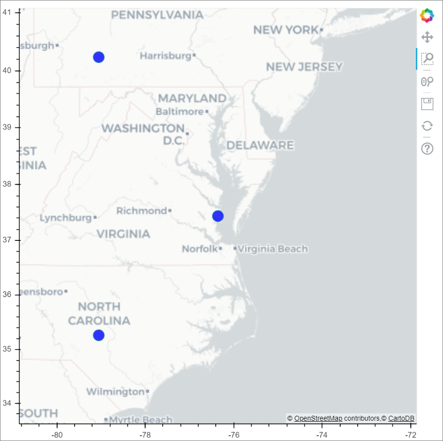
运行以下示例代码以绘制上面的图像。
from bokeh.plotting import figure, output_file
from bokeh.tile_providers import get_provider, Vendors
from bokeh.embed import file_html
from bokeh.resources import CDN
from bokeh.models import ColumnDataSource

tile_provider = get_provider(Vendors.CARTODBPOSITRON)

# range bounds supplied in web mercator coordinates
p = figure(x_range=(-9000000,-8000000), y_range=(4000000,5000000),
           x_axis_type="mercator", y_axis_type="mercator")
p.add_tile(tile_provider)

# plot datapoints on the map
source = ColumnDataSource(
    data=dict(x=[ -8800000, -8500000 , -8800000],
              y=[4200000, 4500000, 4900000])
)

p.circle(x="x", y="y", size=15, fill_color="blue", fill_alpha=0.8, source=source)

# create an html document that embeds the Bokeh plot
html = file_html(p, CDN, "my plot1")

# display this html
displayHTML(html)
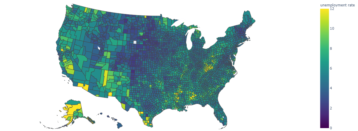
Plotly
你可以使用 displayHTML() 来呈现 HTML 或交互式库,如 Plotly 。
运行以下示例代码以绘制下图。
from urllib.request import urlopen
import json
with urlopen('https://raw.githubusercontent.com/plotly/datasets/master/geojson-counties-fips.json') as response:
    counties = json.load(response)

import pandas as pd
df = pd.read_csv("https://raw.githubusercontent.com/plotly/datasets/master/fips-unemp-16.csv",
                   dtype={"fips": str})

import plotly
import plotly.express as px

fig = px.choropleth(df, geojson=counties, locations='fips', color='unemp',
                           color_continuous_scale="Viridis",
                           range_color=(0, 12),
                           scope="usa",
                           labels={'unemp':'unemployment rate'}
                          )
fig.update_layout(margin={"r":0,"t":0,"l":0,"b":0})

# create an html document that embeds the Plotly plot
h = plotly.offline.plot(fig, output_type='div')

# display this html
displayHTML(h)
Pandas
可以将 pandas 数据帧的 html 输出视为默认输出,笔记本将自动显示样式的 html 内容。
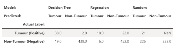
import pandas as pd
import numpy as np

df = pd.DataFrame([[38.0, 2.0, 18.0, 22.0, 21, np.nan],[19, 439, 6, 452, 226,232]],

                  index=pd.Index(['Tumour (Positive)', 'Non-Tumour (Negative)'], name='Actual Label:'),

                  columns=pd.MultiIndex.from_product([['Decision Tree', 'Regression', 'Random'],['Tumour', 'Non-Tumour']], names=['Model:', 'Predicted:']))

df
其他库
除了这些库,Azure Synapse Analytics运行时还包括以下库集,这些库通常用于数据可视化:
有关可用库和版本的最新信息,可以访问 Azure Synapse Analytics Runtime documentation。
R 库 (预览版)
R 生态系统提供了多个图形库,其中打包了许多不同的功能。 默认情况下,Azure Synapse Analytics中的每个 Apache Spark 池都包含一组特选和常用的开源库。 还可以使用 Azure Synapse Analytics 的库管理功能添加或管理其他库和版本。
ggplot2
ggplot2 库广泛使用于数据可视化和探索性数据分析。
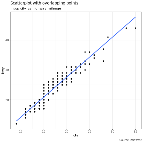
library(ggplot2)
data(mpg, package="ggplot2")
theme_set(theme_bw())

g <- ggplot(mpg, aes(cty, hwy))

# Scatterplot
g + geom_point() +
  geom_smooth(method="lm", se=F) +
  labs(subtitle="mpg: city vs highway mileage",
       y="hwy",
       x="cty",
       title="Scatterplot with overlapping points",
       caption="Source: midwest")
rBokeh
rBokeh 是一个本机 R 绘图库,用于创建由 Bokeh 可视化库支持的交互式图形。
若要安装 rBokeh,可以使用以下命令:
install.packages("rbokeh")
安装后,可以利用 rBokeh 创建交互式可视化效果。
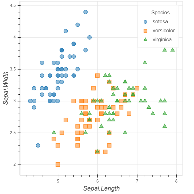
library(rbokeh)
p <- figure() %>%
  ly_points(Sepal.Length, Sepal.Width, data = iris,
    color = Species, glyph = Species,
    hover = list(Sepal.Length, Sepal.Width))
R Plotly
Plotly 的 R 图形库制作具出版质量的交互式图形。
若要安装 Plotly,可以使用以下命令:
install.packages("plotly")
安装后,可以利用 Plotly 创建交互式可视化效果。
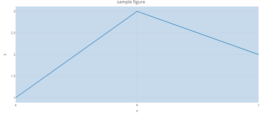
library(plotly)

fig <- plot_ly() %>%
  add_lines(x = c("a","b","c"), y = c(1,3,2))%>%
  layout(title="sample figure", xaxis = list(title = 'x'), yaxis = list(title = 'y'), plot_bgcolor = "#c7daec")

fig
Highcharter
Highcharter 是 Highcharts JavaScript 库及其模块的 R 包装器。
若要安装 Highcharter,可以使用以下命令:
install.packages("highcharter")
安装后,可以利用 Highcharter 创建交互式可视化效果。
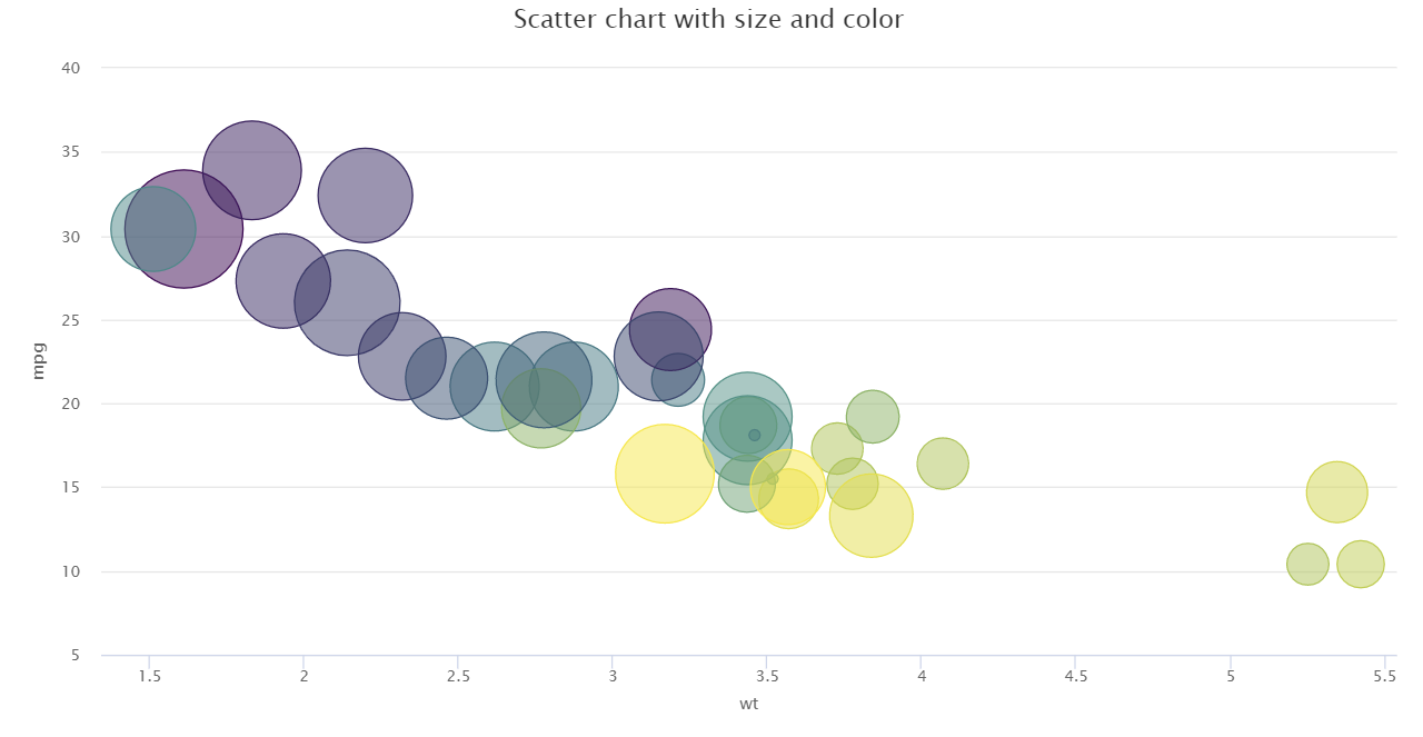
library(magrittr)
library(highcharter)
hchart(mtcars, "scatter", hcaes(wt, mpg, z = drat, color = hp)) %>%
  hc_title(text = "Scatter chart with size and color")
使用 Apache Spark 和 SQL 按需版本连接到 Power BI
Azure Synapse Analytics与Power BI深度集成,使数据工程师能够构建分析解决方案。
Azure Synapse Analytics允许不同的工作区计算引擎在其 Spark 池和无服务器 SQL 池之间共享数据库和表。 使用 共享元数据模型,可以使用 SQL 按需查询 Apache Spark 表。 完成后,可以将 SQL 按需终结点连接到Power BI,以便轻松查询同步的 Spark 表。
后续步骤
- 有关如何设置 Spark SQL DW 连接器的详细信息: Synapse SQL 连接器
- 查看默认库: Azure Synapse Analytics 运行时