本文介绍旧版Azure Databricks可视化效果。 请参阅 Databricks 笔记本和 SQL 编辑器中的 可视化效果,了解在 SQL 编辑器或笔记本中创建可视化效果时当前可视化支持。 有关在 AI/BI 仪表板中使用可视化效果的信息,请参阅 AI/BI 仪表板可视化类型。
Azure Databricks还原生支持Python和R中的可视化库,且允许安装和使用第三方库。
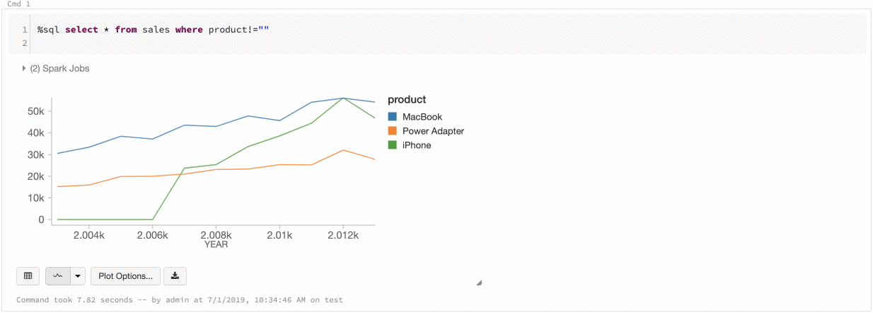
创建旧版可视化效果
要从结果单元格创建旧版可视化效果,请单击 + 并选择“旧版可视化效果”。
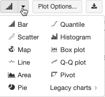
旧版可视化支持一系列丰富的绘图类型:
选择并配置旧版图表类型
若要选择条形图,请单击条形图图标  :
:
若要选择其他绘图类型,请单击条形图“Chart Button”右边的“Button Down”,然后选择“绘图类型”。
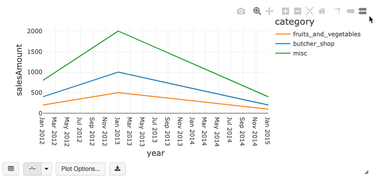
旧版图表工具栏
折线图和条形图都具有内置工具栏,该工具栏支持一组丰富的客户端交互。
若要配置图表,请单击“绘图选项…”。
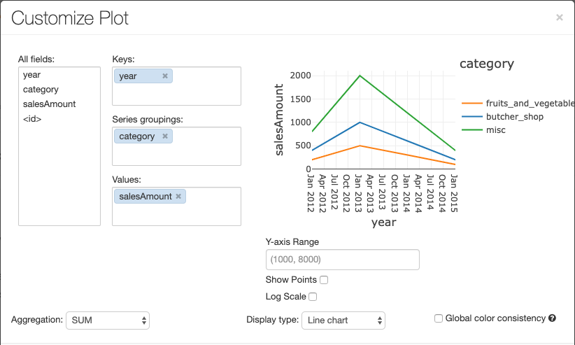
折线图具有多个自定义图表选项:设置 Y 轴范围、显示和隐藏点,以及显示带有对数刻度的 Y 轴。
有关旧图表类型的信息,请参阅:
图表之间的颜色一致性
Azure Databricks支持传统图表中的两种颜色一致性:系列和全局颜色一致性。
如果系列的值相同但顺序不同(例如,A = ,B = ["Apple", "Orange", "Banana"]),则“系列集”颜色一致性会将相同的颜色分配给相同的值。 这些值在绘制之前已排序,因此,两个图例的排序方式相同 (["Apple", "Banana", "Orange"]),并为相同的值分配相同的颜色。 但是,如果系列为 C = ["Orange", "Banana"],它的颜色与集 A 不一致,因为该集是不相同的。 排序算法会将第一种颜色分配给集 C 中的“Banana”,将第二种颜色分配给集 A 中的“Banana”。如果希望这些系列的颜色一致,可以指定图表使用全局颜色一致性。
在“全局”颜色一致性中,无论系列的值是什么,每个值都始终映射到相同的颜色。 若要为每个图表启用此行为,请选中“全局颜色一致性”复选框。
注意
若要实现这种一致性,Azure Databricks 将值直接哈希映射到颜色。 为了避免冲突(两个值的颜色完全相同),哈希处理将对较大的颜色集进行,但这会造成这样的负面影响:无法保证颜色的鲜艳或易于分辨性;如果颜色过多,在一定程度上它们看上去会很相似。
机器学习可视化
除了标准图表类型,旧版可视化效果还支持以下机器学习训练参数和结果:
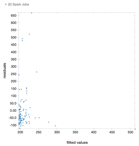
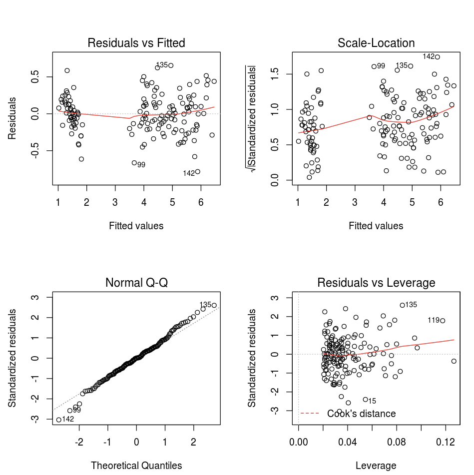
残差
对于线性回归和逻辑回归,可以生成拟合与残差图。 若要获取此绘图,请提供模型和数据帧。
以下示例对城市人口和房屋销售价格数据进行线性回归,然后显示残差与拟合数据之间的关系。
# Load data
pop_df = spark.read.csv("/databricks-datasets/samples/population-vs-price/data_geo.csv", header="true", inferSchema="true")

# Drop rows with missing values and rename the feature and label columns, replacing spaces with _
from pyspark.sql.functions import col
pop_df = pop_df.dropna() # drop rows with missing values
exprs = [col(column).alias(column.replace(' ', '_')) for column in pop_df.columns]

# Register a UDF to convert the feature (2014_Population_estimate) column vector to a VectorUDT type and apply it to the column.
from pyspark.ml.linalg import Vectors, VectorUDT

spark.udf.register("oneElementVec", lambda d: Vectors.dense([d]), returnType=VectorUDT())
tdata = pop_df.select(*exprs).selectExpr("oneElementVec(2014_Population_estimate) as features", "2015_median_sales_price as label")

# Run a linear regression
from pyspark.ml.regression import LinearRegression

lr = LinearRegression()
modelA = lr.fit(tdata, {lr.regParam:0.0})

# Plot residuals versus fitted data
display(modelA, tdata)
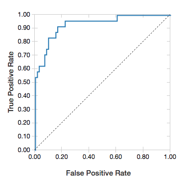
ROC 曲线
对于逻辑回归,可以呈现 ROC 曲线。 若要获取此绘图,请提供模型、输入到 fit 方法的准备数据和参数 "ROC"。
以下示例开发了一个分类器,通过个人的各种属性预测某人一年中的收入是否为<=50K或>50K。 成年人数据集派生自人口统计数据,包括有关 48842 个人及其每年收入的信息。
本部分中的示例代码采用独热编码。
# This code uses one-hot encoding to convert all categorical variables into binary vectors.

schema = """`age` DOUBLE,
`workclass` STRING,
`fnlwgt` DOUBLE,
`education` STRING,
`education_num` DOUBLE,
`marital_status` STRING,
`occupation` STRING,
`relationship` STRING,
`race` STRING,
`sex` STRING,
`capital_gain` DOUBLE,
`capital_loss` DOUBLE,
`hours_per_week` DOUBLE,
`native_country` STRING,
`income` STRING"""

dataset = spark.read.csv("/databricks-datasets/adult/adult.data", schema=schema)

from pyspark.ml import Pipeline
from pyspark.ml.feature import OneHotEncoder, StringIndexer, VectorAssembler

categoricalColumns = ["workclass", "education", "marital_status", "occupation", "relationship", "race", "sex", "native_country"]

stages = [] # stages in the Pipeline
for categoricalCol in categoricalColumns:
    # Category indexing with StringIndexer
    stringIndexer = StringIndexer(inputCol=categoricalCol, outputCol=categoricalCol + "Index")
    # Use OneHotEncoder to convert categorical variables into binary SparseVectors
    encoder = OneHotEncoder(inputCols=[stringIndexer.getOutputCol()], outputCols=[categoricalCol + "classVec"])
    # Add stages.  These are not run here, but will run all at once later on.
    stages += [stringIndexer, encoder]

# Convert label into label indices using the StringIndexer
label_stringIdx = StringIndexer(inputCol="income", outputCol="label")
stages += [label_stringIdx]

# Transform all features into a vector using VectorAssembler
numericCols = ["age", "fnlwgt", "education_num", "capital_gain", "capital_loss", "hours_per_week"]
assemblerInputs = [c + "classVec" for c in categoricalColumns] + numericCols
assembler = VectorAssembler(inputCols=assemblerInputs, outputCol="features")
stages += [assembler]

# Run the stages as a Pipeline. This puts the data through all of the feature transformations in a single call.

partialPipeline = Pipeline().setStages(stages)
pipelineModel = partialPipeline.fit(dataset)
preppedDataDF = pipelineModel.transform(dataset)

# Fit logistic regression model

from pyspark.ml.classification import LogisticRegression
lrModel = LogisticRegression().fit(preppedDataDF)

# ROC for data
display(lrModel, preppedDataDF, "ROC")
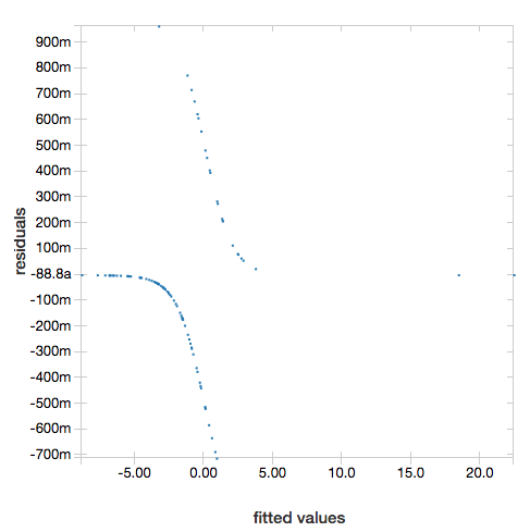
若要显示残差,请省略 "ROC" 参数:
display(lrModel, preppedDataDF)
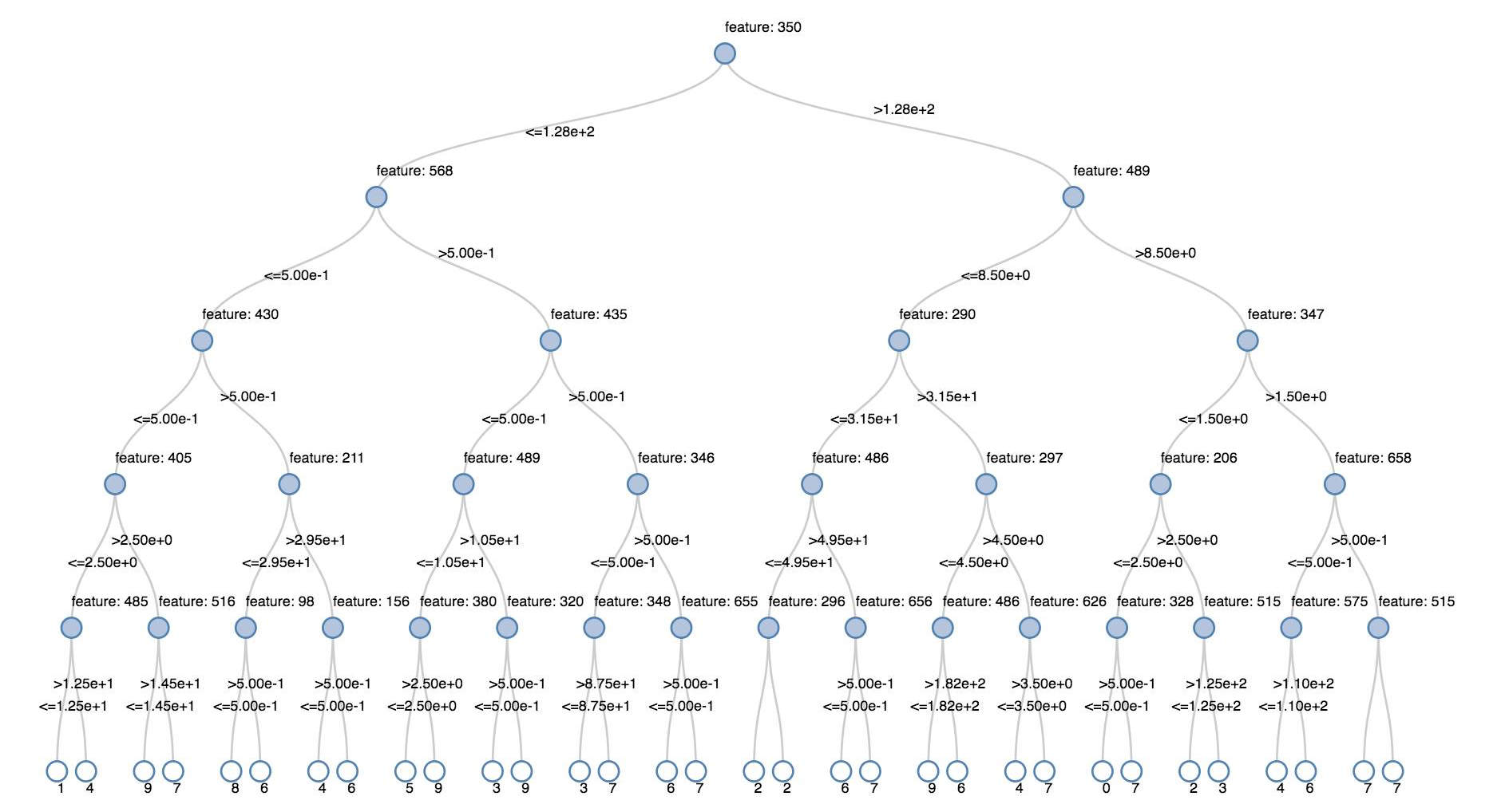
决策树
旧版可视化效果支持呈现决策树。
若要获取此可视化效果,请提供决策树模型。
以下示例对某个树进行训练,以从手写数字图像的 MNIST 数据集中识别数字 (0 - 9),然后显示该树。
Python
trainingDF = spark.read.format("libsvm").load("/databricks-datasets/mnist-digits/data-001/mnist-digits-train.txt").cache()
testDF = spark.read.format("libsvm").load("/databricks-datasets/mnist-digits/data-001/mnist-digits-test.txt").cache()

from pyspark.ml.classification import DecisionTreeClassifier
from pyspark.ml.feature import StringIndexer
from pyspark.ml import Pipeline

indexer = StringIndexer().setInputCol("label").setOutputCol("indexedLabel")

dtc = DecisionTreeClassifier().setLabelCol("indexedLabel")

# Chain indexer + dtc together into a single ML Pipeline.
pipeline = Pipeline().setStages([indexer, dtc])

model = pipeline.fit(trainingDF)
display(model.stages[-1])
Scala(编程语言)
val trainingDF = spark.read.format("libsvm").load("/databricks-datasets/mnist-digits/data-001/mnist-digits-train.txt").cache
val testDF = spark.read.format("libsvm").load("/databricks-datasets/mnist-digits/data-001/mnist-digits-test.txt").cache

import org.apache.spark.ml.classification.{DecisionTreeClassifier, DecisionTreeClassificationModel}
import org.apache.spark.ml.feature.StringIndexer
import org.apache.spark.ml.Pipeline

val indexer = new StringIndexer().setInputCol("label").setOutputCol("indexedLabel")
val dtc = new DecisionTreeClassifier().setLabelCol("indexedLabel")
val pipeline = new Pipeline().setStages(Array(indexer, dtc))

val model = pipeline.fit(trainingDF)
val tree = model.stages.last.asInstanceOf[DecisionTreeClassificationModel]

display(tree)
结构化流数据帧
若要实时可视化流式处理查询的结果,可以在 Scala 和 Python 中display结构化流数据帧。
Python
streaming_df = spark.readStream.format("rate").load()
display(streaming_df.groupBy().count())
Scala(编程语言)
val streaming_df = spark.readStream.format("rate").load()
display(streaming_df.groupBy().count())
display 支持以下可选参数:
-
streamName:流式处理查询名称。 -
trigger(Scala) 和processingTime(Python): 定义流式处理查询的运行频率。 如果未指定,则系统会在上一处理完成后立即检查是否有新数据可用。 为了降低生产成本,Databricks 建议你“始终”设置触发间隔。 默认触发器间隔为 500 毫秒。 -
checkpointLocation:系统写入所有检查点信息的位置。 如果未指定,则系统会在 DBFS 上自动生成一个临时检查点位置。 为了使你的流可以继续从中断的位置处理数据,你必须提供一个检查点的位置。 Databricks 建议你始终在生产环境中指定 选项。
Python
streaming_df = spark.readStream.format("rate").load()
display(streaming_df.groupBy().count(), processingTime = "5 seconds", checkpointLocation = "dbfs:/<checkpoint-path>")
Scala(编程语言)
import org.apache.spark.sql.streaming.Trigger

val streaming_df = spark.readStream.format("rate").load()
display(streaming_df.groupBy().count(), trigger = Trigger.ProcessingTime("5 seconds"), checkpointLocation = "dbfs:/<checkpoint-path>")
有关这些参数的详细信息,请参阅启动流式处理查询。
displayHTML 函数
Azure Databricks 编程语言笔记本(Python、R 和 Scala)使用 displayHTML 函数支持 HTML 图形。你可以为函数传递任意 HTML、CSS 或 JavaScript 代码。 此函数使用 JavaScript 库(例如 D3)支持交互式图形。
有关使用 displayHTML 的示例,请参阅:
注意
displayHTML iframe 是从域 databricksusercontent.com 提供的,iframe 沙盒包含 allow-same-origin 属性。 必须可在浏览器中访问 databricksusercontent.com。 如果它当前被企业网络阻止,则必须将其添加到允许列表。
映像
包含图像数据类型的列被呈现为丰富格式的 HTML。 Azure Databricks 尝试为与 Spark DataFrame 匹配的 列呈现图像缩略图。
对于通过 spark.read.format('image') 函数成功读入的任何图像,可以进行缩略图呈现。 对于通过其他方式生成的图像值,Azure Databricks支持呈现 1、3 或 4 个通道图像(其中每个通道由单个字节组成),并具有以下约束:
-
单通道图像:
mode字段必须等于 0。height、width和nChannels字段必须准确描述data字段中的二进制图像数据。 -
三通道图像:
mode字段必须等于 16。height、width和nChannels字段必须准确描述data字段中的二进制图像数据。data字段必须包含三字节区块形式的像素数据,每个像素的通道顺序为(blue, green, red)。 -
四通道图像:
mode字段必须等于 24。height、width和nChannels字段必须准确描述data字段中的二进制图像数据。data字段必须包含四字节区块形式的像素数据,每个像素的通道顺序为(blue, green, red, alpha)。
示例
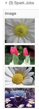
假设某个文件夹包含一些图像:
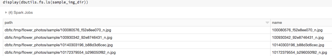
如果将图像读入数据帧,然后显示数据帧,Azure Databricks呈现图像的缩略图:
image_df = spark.read.format("image").load(sample_img_dir)
display(image_df)
Python中的可视化效果
本节内容:
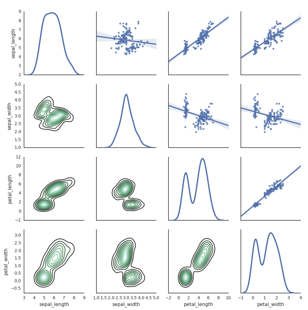
Seaborn
还可以使用其他Python库生成绘图。 Databricks Runtime 包括 seaborn 可视化库。 若要创建 seaborn 绘图,请导入库,创建绘图,然后将该绘图传递给 display 函数。
import seaborn as sns
sns.set(style="white")

df = sns.load_dataset("iris")
g = sns.PairGrid(df, diag_sharey=False)
g.map_lower(sns.kdeplot)
g.map_diag(sns.kdeplot, lw=3)

g.map_upper(sns.regplot)

display(g.fig)
其他Python库
R 中的可视化效果
若要通过 R 为数据绘图,请使用 display 函数,如下所示:
library(SparkR)
diamonds_df <- read.df("/databricks-datasets/Rdatasets/data-001/csv/ggplot2/diamonds.csv", source = "csv", header="true", inferSchema = "true")

display(arrange(agg(groupBy(diamonds_df, "color"), "price" = "avg"), "color"))
可以使用默认 R 绘图 函数。
fit <- lm(Petal.Length ~., data = iris)
layout(matrix(c(1,2,3,4),2,2)) # optional 4 graphs/page
plot(fit)
还可以使用任何 R 可视化包。 R 笔记本以 .png 形式捕获生成的绘图,并以内联方式显示它。
本节内容:
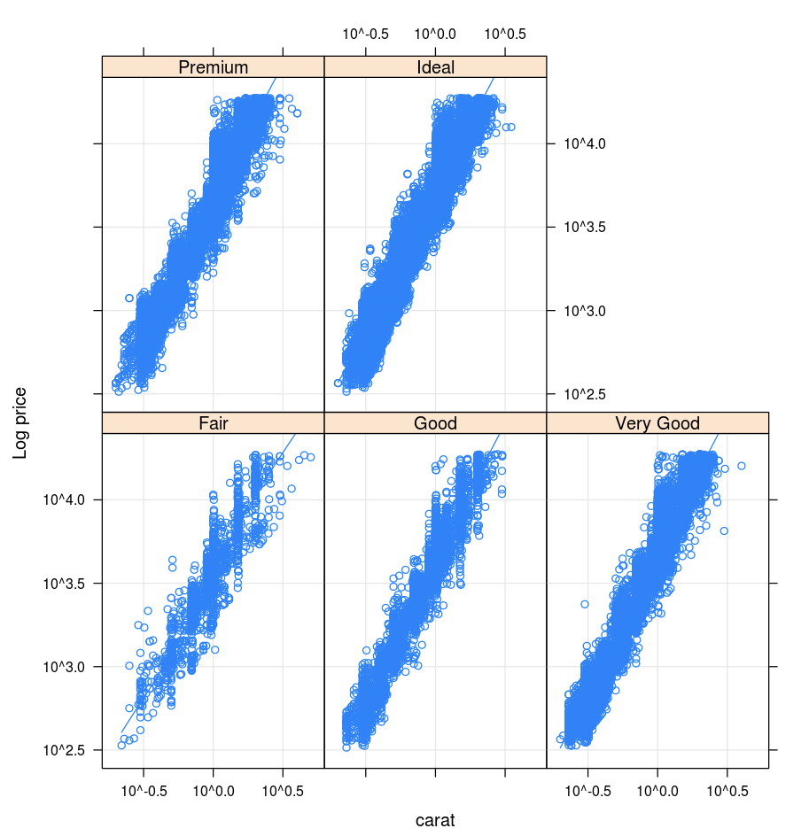
格子
Lattice 包支持 trellis 图形,这些图形显示变量或变量之间的关系,这些关系基于一个或多个其他变量。
library(lattice)
xyplot(price ~ carat | cut, diamonds, scales = list(log = TRUE), type = c("p", "g", "smooth"), ylab = "Log price")
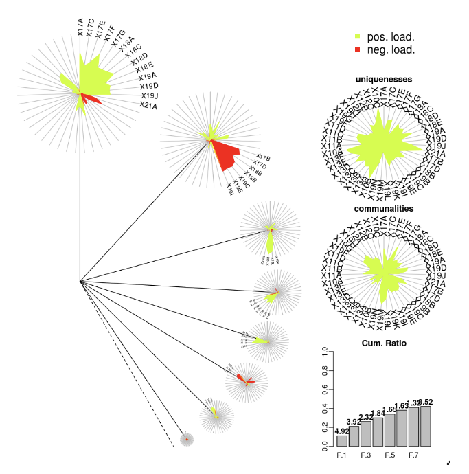
DandEFA
DandEFA 包支持蒲公英图绘制。
install.packages("DandEFA", repos = "https://cran.us.r-project.org")
library(DandEFA)
data(timss2011)
timss2011 <- na.omit(timss2011)
dandpal <- rev(rainbow(100, start = 0, end = 0.2))
facl <- factload(timss2011,nfac=5,method="prax",cormeth="spearman")
dandelion(facl,bound=0,mcex=c(1,1.2),palet=dandpal)
facl <- factload(timss2011,nfac=8,method="mle",cormeth="pearson")
dandelion(facl,bound=0,mcex=c(1,1.2),palet=dandpal)
Plotly (数据可视化工具)
Plotly R 包依赖于 htmlwidgets for R。有关安装说明和笔记本,请参阅 htmlwidgets。
其他 R 库
Scala 中的可视化效果
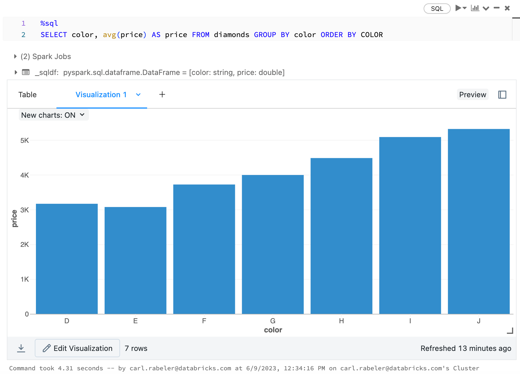
若要通过 Scala 为数据绘图,请使用 display 函数,如下所示:
val diamonds_df = spark.read.format("csv").option("header","true").option("inferSchema","true").load("/databricks-datasets/Rdatasets/data-001/csv/ggplot2/diamonds.csv")

display(diamonds_df.groupBy("color").avg("price").orderBy("color"))
用于深入探索 Python 和 Scala 的笔记本
若要深入了解Python可视化效果,请参阅笔记本:
若要深入了解 Scala 可视化效果,请参阅笔记本: