Note
Access to this page requires authorization. You can try signing in or changing directories.
Access to this page requires authorization. You can try changing directories.
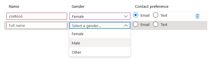
A control for gathering tabular input. All fields within the grid are editable and the number of rows might vary.
UI sample
Schema
{
  "name": "people",
  "type": "Microsoft.Common.EditableGrid",
  "ariaLabel": "Enter information per person",
  "label": "People",
  "constraints": {
    "width": "Full",
    "rows": {
      "count": {
        "min": 1,
        "max": 10
      }
    },
    "columns": [
      {
        "id": "colName",
        "header": "Name",
        "width": "1fr",
        "element": {
          "type": "Microsoft.Common.TextBox",
          "placeholder": "Full name",
          "constraints": {
            "required": true,
            "validations": [
              {
                "isValid": "[startsWith(last(take(steps('grid').people, $rowIndex)).colName, 'contoso')]",
                "message": "Must start with 'contoso'."
              },
              {
                "regex": "^[a-z0-9A-Z]{1,30}$",
                "message": "Only alphanumeric characters are allowed, and the value must be 1-30 characters long."
              }
            ]
          }
        }
      },
      {
        "id": "colGender",
        "header": "Gender",
        "width": "1fr",
        "element": {
          "name": "dropDown1",
          "type": "Microsoft.Common.DropDown",
          "placeholder": "Select a gender...",
          "constraints": {
            "allowedValues": [
              {
                "label": "Female",
                "value": "female"
              },
              {
                "label": "Male",
                "value": "male"
              },
              {
                "label": "Other",
                "value": "other"
              }
            ],
            "required": true
          }
        }
      },
      {
        "id": "colContactPreference",
        "header": "Contact preference",
        "width": "1fr",
        "element": {
          "type": "Microsoft.Common.OptionsGroup",
          "constraints": {
            "allowedValues": [
              {
                "label": "Email",
                "value": "email"
              },
              {
                "label": "Text",
                "value": "text"
              }
            ],
            "required": true
          }
        }
      }
    ]
  }
}
Sample output
{
  "colName": "contoso",
  "colGender": "female",
  "colContactPreference": "email"
}
Remarks
The only valid controls within the columns array are the TextBox, OptionsGroup, and DropDown.
The
$rowIndexvariable is only valid in expressions contained within children of the grid's columns. It's an integer that represents the element's relative row index and the count begins at one and increments by one. As shown in the schema's"columns":section, the$rowIndexis used for validation.When validations are performed using the
$rowIndexvariable, it's possible to get the current row's value by combining thelast()andtake()commands.For example:
last(take(<reference_to_grid>, $rowIndex))The
labelproperty doesn't appear as part of the control but is displayed on the final tab summary.The
ariaLabelproperty is the accessibility label for the grid. Specify helpful text for users who use screen readers.The
constraints.widthproperty is used to set the overall width of the grid. The options are Full, Medium, Small. The default is Full.The
widthproperty on children of columns determines the column width. Widths are specified using fractional units such as 3fr, with total space being allotted to columns proportional to their units. If no column width is specified, the default is 1fr.
Next steps
- For an introduction to creating UI definitions, see Getting started with CreateUiDefinition.
- For a description of common properties in UI elements, see CreateUiDefinition elements.