Note
Access to this page requires authorization. You can try signing in or changing directories.
Access to this page requires authorization. You can try changing directories.
Switch services using the Version drop-down list. Learn more about navigation.
Applies to: ✅ Azure Data Explorer
Create interactive graph visualizations using Plotly from graph data.
The function plotly_graph_fl() is a user-defined function (UDF) that allows you to customize a plotly template to create an interactive graph visualization.
Prerequisites
- The Python plugin must be enabled on the cluster. This is required for the inline Python used in the function.
The function accepts separate nodes and edges tables with customizable column mappings and appearance settings, and returns a single cell table containing plotly JSON. Optionally, you can render the data in an Azure Data Explorer dashboard tile. For more information, see Plotly (preview).
The function is useful for visualizing network relationships, cybersecurity attack paths, organizational structures, or any connected data that can be represented as a graph. The resulting visualization includes hover information, node sizing based on connectivity, and customizable color schemes using Python's NetworkX library for graph layout calculations and Plotly for rendering the interactive visualization.
Syntax
plotly_graph_fl(edges, nodes, [node_id_column], [source_id_column], [target_id_column], [colorscale_id], [diagram_title])
Learn more about syntax conventions.
Parameters
| Name | Type | Required | Description |
|---|---|---|---|
| edges | tabular | ✔️ | A table containing edge data with source and target node identifiers. |
| nodes | tabular | ✔️ | A table containing node data with unique node identifiers and optional properties. |
| node_id_column | string |
The name of the column containing unique node identifiers in the nodes table. The default value is "nodeId". |
|
| source_id_column | string |
The name of the column containing source node identifiers in the edges table. The default value is "sourceId". |
|
| target_id_column | string |
The name of the column containing target node identifiers in the edges table. The default value is "targetId". |
|
| colorscale_id | string |
The Plotly color scale to use for node colors. Available options include "Viridis", "Plasma", "Inferno", "Magma", "Cividis", "YlGnBu", etc. The default value is "Cividis". |
|
| diagram_title | string |
The title to display at the top of the graph visualization. The default value is "Simple Graph for educational purposes". |
Function definition
You can define the function by either embedding its code as a query-defined function, or creating it as a stored function in your database, as follows:
Define the function using the following let statement. No permissions are required.
Important
A let statement can't run on its own. It must be followed by a tabular expression statement. To run a working example of plotly_graph_fl(), see Example.
let plotly_graph_fl = (
    edges:(*), nodes:(*),
    node_id_column:string="nodeId",
    source_id_column:string="sourceId", target_id_column:string="targetId",
    colorscale_id:string="Cividis", diagram_title:string="Simple Graph for educational purposes") {
let pythonCodeBlueprint = ```
import numpy as np
import pandas as pd
import plotly.graph_objects as go
import networkx as nx

# Configuration constants from parameters with defaults
NODE_OR_EDGE_COLUMN = kargs.get("node_or_edge_column", "tableName")
NODE_ROW = kargs.get("node_row", "V")
NODE_ID_COLUMN = kargs.get("node_id_column", "nodeId")
EDGE_ROW = kargs.get("edge_row", "E")
SOURCE_ID_COLUMN = kargs.get("source_id_column", "sourceId")
TARGET_ID_COLUMN = kargs.get("target_id_column", "targetId")
COLORSCALE_ID = kargs.get("colorscale_id", "YlGnBu")  # see https://plotly.com/python/builtin-colorscales/
DIAGRAM_TITLE = kargs.get("diagram_title", "Network Graph Visualization")


def is_valid_value(value):
    """
    Check if a value is valid (not None, not empty string, not all NaN).

    Args:
        value: Value to check

    Returns:
        bool: True if value is valid, False otherwise
    """
    if value is None or (isinstance(value, str) and value == ''):
        return False

    # Handle arrays/series safely
    if hasattr(value, '__len__') and not isinstance(value, str):
        try:
            na_result = pd.isna(value)
            return not (hasattr(na_result, 'all') and na_result.all()) and not na_result
        except (TypeError, ValueError):
            return True

    return not pd.isna(value)


def create_properties_dict(row):
    """
    Create a properties dictionary from a pandas Series, filtering out invalid values.

    Args:
        row (pd.Series): Row containing properties

    Returns:
        dict: Filtered properties dictionary
    """
    return {k: v for k, v in row.items() if is_valid_value(v)}


def build_graph(dataframe):
    """
    Build a NetworkX graph from a dataframe containing nodes and edges.

    Args:
        dataframe (pd.DataFrame): DataFrame with node and edge data

    Returns:
        nx.Graph: Constructed graph
    """
    graph = nx.Graph()

    # Separate and process nodes and edges efficiently
    nodes_df = dataframe[dataframe[NODE_OR_EDGE_COLUMN] == NODE_ROW]
    edges_df = dataframe[dataframe[NODE_OR_EDGE_COLUMN] == EDGE_ROW]

    # Add nodes
    if not nodes_df.empty:
        for _, row in nodes_df.iterrows():
            graph.add_node(row[NODE_ID_COLUMN], size=1,
                          properties=create_properties_dict(row))

    # Add edges
    if not edges_df.empty:
        for _, row in edges_df.iterrows():
            graph.add_edge(row[SOURCE_ID_COLUMN], row[TARGET_ID_COLUMN],
                          weight=1, properties=create_properties_dict(row))

    return graph


def create_edge_traces(graph, positions):
    """
    Create Plotly traces for graph edges and their midpoint markers.

    Args:
        graph (nx.Graph): NetworkX graph
        positions (dict): Node positions from layout algorithm

    Returns:
        tuple: (edge_trace, mnode_trace) - Plotly scatter traces
    """
    edge_x, edge_y = [], []
    mnode_x, mnode_y, mnode_txt = [], [], []

    # Process all edges efficiently
    for source, target, edge_data in graph.edges(data=True):
        x0, y0 = positions[source]
        x1, y1 = positions[target]

        # Add edge coordinates (with None separator for line breaks)
        edge_x.extend([x0, x1, None])
        edge_y.extend([y0, y1, None])

        # Create hover text for edge midpoint
        properties = edge_data.get('properties', {})
        valid_props = {k: v for k, v in properties.items() if is_valid_value(v)}

        prop_text = '<br>'.join(f'{key}: {value}' for key, value in valid_props.items())
        text = f'source: {source} destination: {target}<br>Properties: {prop_text}'

        # Add midpoint coordinates and text
        mnode_x.append((x0 + x1) * 0.5)
        mnode_y.append((y0 + y1) * 0.5)
        mnode_txt.append(text)

    # Create traces
    edge_trace = go.Scatter(
        x=edge_x, y=edge_y,
        line=dict(width=0.5, color='#888'),
        hoverinfo='none', mode='lines'
    )

    mnode_trace = go.Scatter(
        x=mnode_x, y=mnode_y, text=mnode_txt,
        mode="markers", hoverinfo='text', opacity=0.5,
        marker=dict(color='LightSkyBlue', size=2, line_width=1)
    )

    return edge_trace, mnode_trace


def create_node_trace(graph, positions):
    """
    Create Plotly trace for graph nodes.

    Args:
        graph (nx.Graph): NetworkX graph
        positions (dict): Node positions from layout algorithm

    Returns:
        go.Scatter: Plotly scatter trace for nodes
    """
    nodes_list = list(graph.nodes())
    num_nodes = len(nodes_list)
    inv_num_nodes = 1.0 / num_nodes if num_nodes > 0 else 0

    # Extract coordinates and calculate metrics
    node_x = [positions[node][0] for node in nodes_list]
    node_y = [positions[node][1] for node in nodes_list]

    node_adjacencies = []
    node_text = []
    node_sizes = []

    for node in nodes_list:
        num_connections = len(graph[node])
        node_adjacencies.append(num_connections)
        node_sizes.append(10 + num_connections * inv_num_nodes)

        # Create hover text
        node_properties = graph.nodes[node].get('properties', {})
        valid_props = {k: v for k, v in node_properties.items() if is_valid_value(v)}

        prop_text = '<br>'.join(f'{key}: {value}' for key, value in valid_props.items())
        text = f'# of connections: {num_connections}<br>Properties: {prop_text}'
        node_text.append(text)

    return go.Scatter(
        x=node_x, y=node_y, text=node_text,
        mode='markers', hoverinfo='text',
        marker=dict(
            colorscale=COLORSCALE_ID,
            color=node_adjacencies, size=node_sizes,
            line=dict(width=2, color='#888')
        )
    )


def create_plotly_figure(graph):
    """
    Create a complete Plotly figure from a NetworkX graph.

    Args:
        graph (nx.Graph): NetworkX graph to visualize

    Returns:
        go.Figure: Complete Plotly figure
    """
    # Calculate layout
    positions = nx.layout.spring_layout(graph)

    # Create traces
    edge_trace, mnode_trace = create_edge_traces(graph, positions)
    node_trace = create_node_trace(graph, positions)

    # Create figure
    return go.Figure(
        data=[edge_trace, node_trace, mnode_trace],
        layout=go.Layout(
            title=f'<br>{DIAGRAM_TITLE}<br>',
            showlegend=False, hovermode='closest',
            margin=dict(b=20, l=5, r=5, t=40),
            annotations=[dict(
                text="Created using plotly, networkx and the python plugin of Kusto",
                showarrow=False, xref="paper", yref="paper",
                x=0.005, y=-0.002
            )],
            xaxis=dict(showgrid=False, zeroline=False, showticklabels=False),
            yaxis=dict(showgrid=False, zeroline=False, showticklabels=False)
        )
    )


# Main execution
graph = build_graph(df)
figure = create_plotly_figure(graph)
plotly_obj = figure.to_json()
result = pd.DataFrame(data=[plotly_obj], columns=['plotly'])
```;
let E = view() { edges };
let V = view() { nodes };
union withsource=tableName E, V
| evaluate python(
//
typeof(plotly:string),
pythonCodeBlueprint,
// Parameter configuration for graph visualization
// Customize these values to adapt the visualization to your data schema and preferences
bag_pack(
    // Data schema mapping - configure these based on your data structure
    'node_or_edge_column', 'tableName',    // Column that distinguishes nodes from edges (source table name)
    'node_row', 'V',                       // Value in discriminator column identifying node records
    'node_id_column', node_id_column,            // Column containing unique node identifiers
    'edge_row', 'E',                       // Value in discriminator column identifying edge records
    'source_id_column', source_id_column,        // Column containing source node IDs for edges
    'target_id_column', target_id_column,        // Column containing target node IDs for edges
    // Visualization appearance settings
    'colorscale_id', colorscale_id,            // Plotly colorscale: YlGnBu, Viridis, Plasma, Inferno, Magma, Cividis, etc.
    'diagram_title', diagram_title    // Title displayed at the top of the graph visualization
))
};
// Write your query to use the function here.
Example
To use a query-defined function, invoke it after the embedded function definition.
let plotly_graph_fl = (
edges:(*), nodes:(*),
node_id_column:string="nodeId",
source_id_column:string="sourceId", target_id_column:string="targetId",
colorscale_id:string="Cividis", diagram_title:string="Simple Graph for educational purposes") {
let pythonCodeBlueprint = ```
import numpy as np
import pandas as pd
import plotly.graph_objects as go
import networkx as nx
# Configuration constants from parameters with defaults
NODE_OR_EDGE_COLUMN = kargs.get("node_or_edge_column", "tableName")
NODE_ROW = kargs.get("node_row", "V")
NODE_ID_COLUMN = kargs.get("node_id_column", "nodeId")
EDGE_ROW = kargs.get("edge_row", "E")
SOURCE_ID_COLUMN = kargs.get("source_id_column", "sourceId")
TARGET_ID_COLUMN = kargs.get("target_id_column", "targetId")
COLORSCALE_ID = kargs.get("colorscale_id", "YlGnBu") # see https://plotly.com/python/builtin-colorscales/
DIAGRAM_TITLE = kargs.get("diagram_title", "Network Graph Visualization")
def is_valid_value(value):
"""
Check if a value is valid (not None, not empty string, not all NaN).
Args:
value: Value to check
Returns:
bool: True if value is valid, False otherwise
"""
if value is None or (isinstance(value, str) and value == ''):
return False
# Handle arrays/series safely
if hasattr(value, '__len__') and not isinstance(value, str):
try:
na_result = pd.isna(value)
return not (hasattr(na_result, 'all') and na_result.all()) and not na_result
except (TypeError, ValueError):
return True
return not pd.isna(value)
def create_properties_dict(row):
"""
Create a properties dictionary from a pandas Series, filtering out invalid values.
Args:
row (pd.Series): Row containing properties
Returns:
dict: Filtered properties dictionary
"""
return {k: v for k, v in row.items() if is_valid_value(v)}
def build_graph(dataframe):
"""
Build a NetworkX graph from a dataframe containing nodes and edges.
Args:
dataframe (pd.DataFrame): DataFrame with node and edge data
Returns:
nx.Graph: Constructed graph
"""
graph = nx.Graph()
# Separate and process nodes and edges efficiently
nodes_df = dataframe[dataframe[NODE_OR_EDGE_COLUMN] == NODE_ROW]
edges_df = dataframe[dataframe[NODE_OR_EDGE_COLUMN] == EDGE_ROW]
# Add nodes
if not nodes_df.empty:
for _, row in nodes_df.iterrows():
graph.add_node(row[NODE_ID_COLUMN], size=1,
properties=create_properties_dict(row))
# Add edges
if not edges_df.empty:
for _, row in edges_df.iterrows():
graph.add_edge(row[SOURCE_ID_COLUMN], row[TARGET_ID_COLUMN],
weight=1, properties=create_properties_dict(row))
return graph
def create_edge_traces(graph, positions):
"""
Create Plotly traces for graph edges and their midpoint markers.
Args:
graph (nx.Graph): NetworkX graph
positions (dict): Node positions from layout algorithm
Returns:
tuple: (edge_trace, mnode_trace) - Plotly scatter traces
"""
edge_x, edge_y = [], []
mnode_x, mnode_y, mnode_txt = [], [], []
# Process all edges efficiently
for source, target, edge_data in graph.edges(data=True):
x0, y0 = positions[source]
x1, y1 = positions[target]
# Add edge coordinates (with None separator for line breaks)
edge_x.extend([x0, x1, None])
edge_y.extend([y0, y1, None])
# Create hover text for edge midpoint
properties = edge_data.get('properties', {})
valid_props = {k: v for k, v in properties.items() if is_valid_value(v)}
prop_text = '<br>'.join(f'{key}: {value}' for key, value in valid_props.items())
text = f'source: {source} destination: {target}<br>Properties: {prop_text}'
# Add midpoint coordinates and text
mnode_x.append((x0 + x1) * 0.5)
mnode_y.append((y0 + y1) * 0.5)
mnode_txt.append(text)
# Create traces
edge_trace = go.Scatter(
x=edge_x, y=edge_y,
line=dict(width=0.5, color='#888'),
hoverinfo='none', mode='lines'
)
mnode_trace = go.Scatter(
x=mnode_x, y=mnode_y, text=mnode_txt,
mode="markers", hoverinfo='text', opacity=0.5,
marker=dict(color='LightSkyBlue', size=2, line_width=1)
)
return edge_trace, mnode_trace
def create_node_trace(graph, positions):
"""
Create Plotly trace for graph nodes.
Args:
graph (nx.Graph): NetworkX graph
positions (dict): Node positions from layout algorithm
Returns:
go.Scatter: Plotly scatter trace for nodes
"""
nodes_list = list(graph.nodes())
num_nodes = len(nodes_list)
inv_num_nodes = 1.0 / num_nodes if num_nodes > 0 else 0
# Extract coordinates and calculate metrics
node_x = [positions[node][0] for node in nodes_list]
node_y = [positions[node][1] for node in nodes_list]
node_adjacencies = []
node_text = []
node_sizes = []
for node in nodes_list:
num_connections = len(graph[node])
node_adjacencies.append(num_connections)
node_sizes.append(10 + num_connections * inv_num_nodes)
# Create hover text
node_properties = graph.nodes[node].get('properties', {})
valid_props = {k: v for k, v in node_properties.items() if is_valid_value(v)}
prop_text = '<br>'.join(f'{key}: {value}' for key, value in valid_props.items())
text = f'# of connections: {num_connections}<br>Properties: {prop_text}'
node_text.append(text)
return go.Scatter(
x=node_x, y=node_y, text=node_text,
mode='markers', hoverinfo='text',
marker=dict(
colorscale=COLORSCALE_ID,
color=node_adjacencies, size=node_sizes,
line=dict(width=2, color='#888')
)
)
def create_plotly_figure(graph):
"""
Create a complete Plotly figure from a NetworkX graph.
Args:
graph (nx.Graph): NetworkX graph to visualize
Returns:
go.Figure: Complete Plotly figure
"""
# Calculate layout
positions = nx.layout.spring_layout(graph)
# Create traces
edge_trace, mnode_trace = create_edge_traces(graph, positions)
node_trace = create_node_trace(graph, positions)
# Create figure
return go.Figure(
data=[edge_trace, node_trace, mnode_trace],
layout=go.Layout(
title=f'<br>{DIAGRAM_TITLE}<br>',
showlegend=False, hovermode='closest',
margin=dict(b=20, l=5, r=5, t=40),
annotations=[dict(
text="Created using plotly, networkx and the python plugin of Kusto",
showarrow=False, xref="paper", yref="paper",
x=0.005, y=-0.002
)],
xaxis=dict(showgrid=False, zeroline=False, showticklabels=False),
yaxis=dict(showgrid=False, zeroline=False, showticklabels=False)
)
)
# Main execution
graph = build_graph(df)
figure = create_plotly_figure(graph)
plotly_obj = figure.to_json()
result = pd.DataFrame(data=[plotly_obj], columns=['plotly'])
```;
let E = view() { edges };
let V = view() { nodes };
union withsource=tableName E, V
| evaluate python(
//
typeof(plotly:string),
pythonCodeBlueprint,
// Parameter configuration for graph visualization
// Customize these values to adapt the visualization to your data schema and preferences
bag_pack(
// Data schema mapping - configure these based on your data structure
'node_or_edge_column', 'tableName', // Column that distinguishes nodes from edges (source table name)
'node_row', 'V', // Value in discriminator column identifying node records
'node_id_column', node_id_column, // Column containing unique node identifiers
'edge_row', 'E', // Value in discriminator column identifying edge records
'source_id_column', source_id_column, // Column containing source node IDs for edges
'target_id_column', target_id_column, // Column containing target node IDs for edges
// Visualization appearance settings
'colorscale_id', colorscale_id, // Plotly colorscale: YlGnBu, Viridis, Plasma, Inferno, Magma, Cividis, etc.
'diagram_title', diagram_title // Title displayed at the top of the graph visualization
))
};
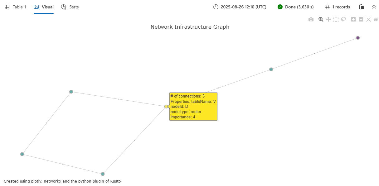
let nodes = datatable (nodeId:string, nodeType:string, importance:int)[
'A', 'server', 5,
'B', 'database', 3,
'C', 'workstation', 1,
'D', 'router', 4,
'E', 'firewall', 5,
'F', 'workstation', 1
];
let edges = datatable (sourceId:string, targetId:string, connectionType:string)[
'A', 'B', 'sql',
'A', 'D', 'network',
'B', 'C', 'query',
'C', 'D', 'network',
'D', 'E', 'security',
'E', 'F', 'network'
];
plotly_graph_fl(edges, nodes,
node_id_column="nodeId",
source_id_column="sourceId",
target_id_column="targetId",
colorscale_id="Viridis",
diagram_title="Network Infrastructure Graph")
| render plotly
Output
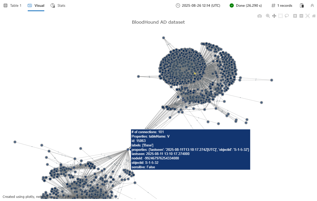
Example 2: BloodHound AD dataset visualization
This example demonstrates visualization of a larger, more complex graph using the BloodHound Active Directory dataset. The BloodHound AD graph contains security relationships and potential attack paths in an Active Directory environment. For more information about this and other available graph datasets, see Graph sample datasets and examples.
Important
For this example to run successfully, you must first run the Function definition code to store the function.
let G = graph('BloodHound_AD');
let E = G
    | graph-to-table edges with_source_id=sourceId with_target_id=targetId;
let V = G
    | graph-to-table nodes with_node_id=nodeId;
plotly_graph_fl(E, V, node_id_column="nodeId", source_id_column="sourceId", target_id_column="targetId", diagram_title="BloodHound AD dataset")
| render plotly
The output is a Plotly JSON string that can be rendered using '| render plotly' or in an Azure Data Explorer dashboard tile. For more information on creating dashboard tiles, see Visualize data with Azure Data Explorer dashboards.
The function returns a single-column table with the plotly column containing the JSON representation of the interactive graph visualization. When rendered in a Kusto environment that supports Plotly visualizations, this displays as an interactive network graph showing:
- Nodes represented as colored circles, with size proportional to their connectivity
- Edges drawn as lines connecting related nodes
- Interactive hover tooltips showing node and edge properties
- Customizable color schemes based on the specified color scale
- A spring-force layout that automatically positions nodes for optimal visualization
The visualization includes node properties (such as nodeType and importance from the example) and edge properties (such as connectionType) in the hover tooltips, making it easy to explore the relationships and attributes within your graph data.