Note
Access to this page requires authorization. You can try signing in or changing directories.
Access to this page requires authorization. You can try changing directories.
Switch services using the Version drop-down list. Learn more about navigation.
Applies to: ✅ Azure Data Explorer
Kusto Explorer is a free desktop application that provides built-in graph visualization capabilities. When your KQL query ends with the make-graph operator or uses the graph() function, Kusto Explorer automatically renders the results as an interactive graph visualization.
Prerequisites
- Kusto Explorer installed on your Windows desktop
- Access to a Kusto cluster with graph data
Automatic graph rendering
Kusto Explorer automatically detects and visualizes graph data when:
- Your query ends with the
make-graphoperator - Your query ends with the
graph()function
Example with make-graph operator
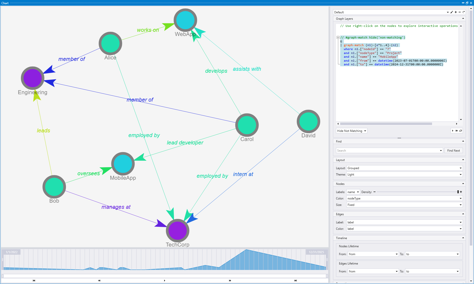
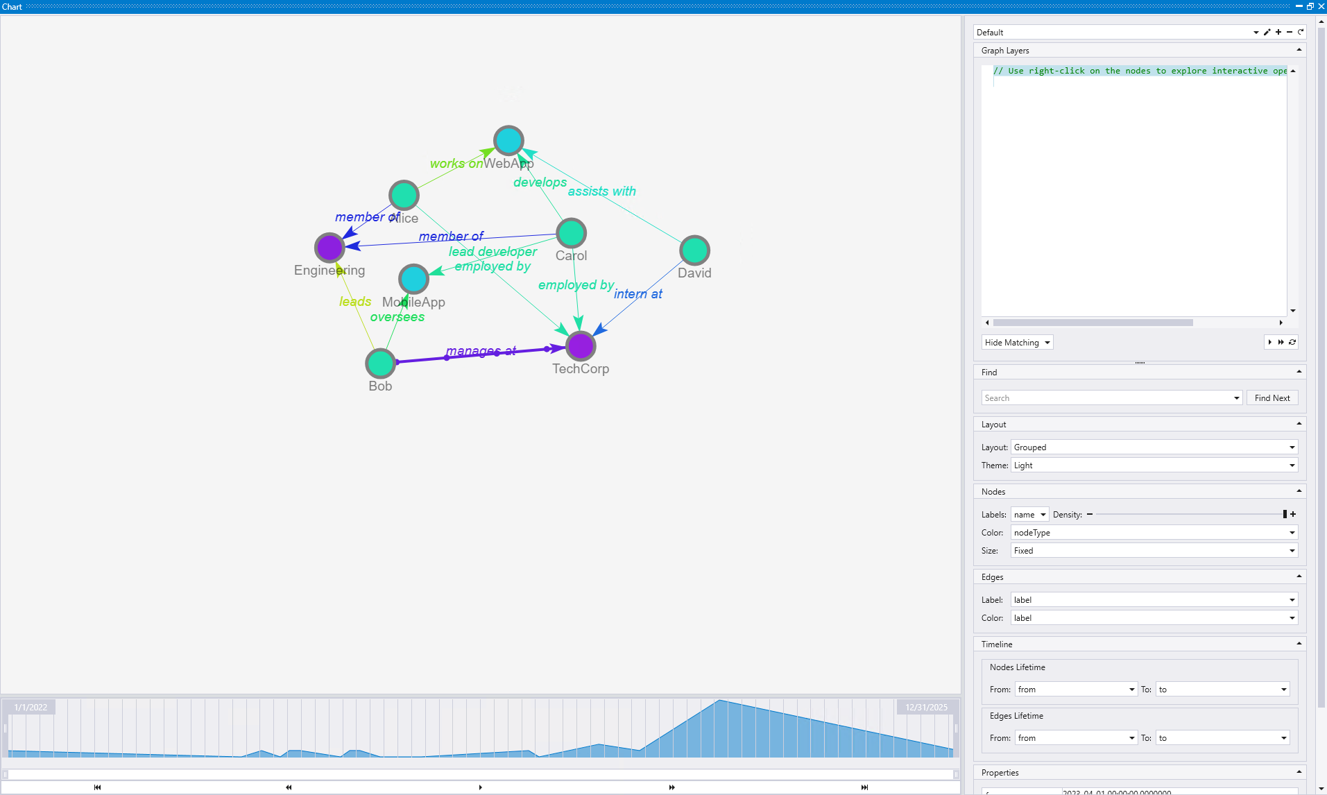
This example demonstrates TechCorp's organizational dynamics over 2023-2024, showing how team composition and project assignments evolve over time. Alice (engineer) joins early but leaves mid-2024, Bob (manager) arrives in March to lead the Engineering department, Carol (developer) joins in June and becomes lead developer on MobileApp, and David (intern) has a short tenure. Two overlapping projects run concurrently: WebApp (March 2023 - August 2024) and MobileApp (July 2023 - December 2024).
// Create a temporal graph with node/edge lifetimes and labels
let nodes = datatable(nodeId:string, nodeType:string, name:string, from:datetime, to:datetime)[
    "1", "Person", "Alice", datetime(2023-01-01), datetime(2024-12-31),
    "2", "Person", "Bob", datetime(2023-03-15), datetime(2024-12-31),
    "3", "Person", "Carol", datetime(2023-06-01), datetime(2024-12-31),
    "4", "Person", "David", datetime(2023-09-01), datetime(2024-03-31),
    "5", "Company", "TechCorp", datetime(2022-01-01), datetime(2025-12-31),
    "6", "Project", "WebApp", datetime(2023-03-01), datetime(2024-08-31),
    "7", "Project", "MobileApp", datetime(2023-07-01), datetime(2024-12-31),
    "8", "Department", "Engineering", datetime(2022-01-01), datetime(2025-12-31)
];
let edges = datatable(sourceId:string, targetId:string, label:string, from:datetime, to:datetime)[
    "1", "5", "employed by", datetime(2023-02-01), datetime(2024-06-30),
    "2", "5", "manages at", datetime(2023-04-01), datetime(2024-12-31),
    "3", "5", "employed by", datetime(2023-06-15), datetime(2024-12-31),
    "4", "5", "intern at", datetime(2023-09-15), datetime(2024-03-15),
    "1", "8", "member of", datetime(2023-02-01), datetime(2024-06-30),
    "2", "8", "leads", datetime(2023-04-01), datetime(2024-12-31),
    "3", "8", "member of", datetime(2023-06-15), datetime(2024-12-31),
    "1", "6", "works on", datetime(2023-03-15), datetime(2024-06-30),
    "3", "6", "develops", datetime(2023-07-01), datetime(2024-08-31),
    "4", "6", "assists with", datetime(2023-10-01), datetime(2024-03-15),
    "2", "7", "oversees", datetime(2023-08-01), datetime(2024-12-31),
    "3", "7", "lead developer", datetime(2023-08-15), datetime(2024-12-31)
];
edges
| make-graph sourceId --> targetId with nodes on nodeId
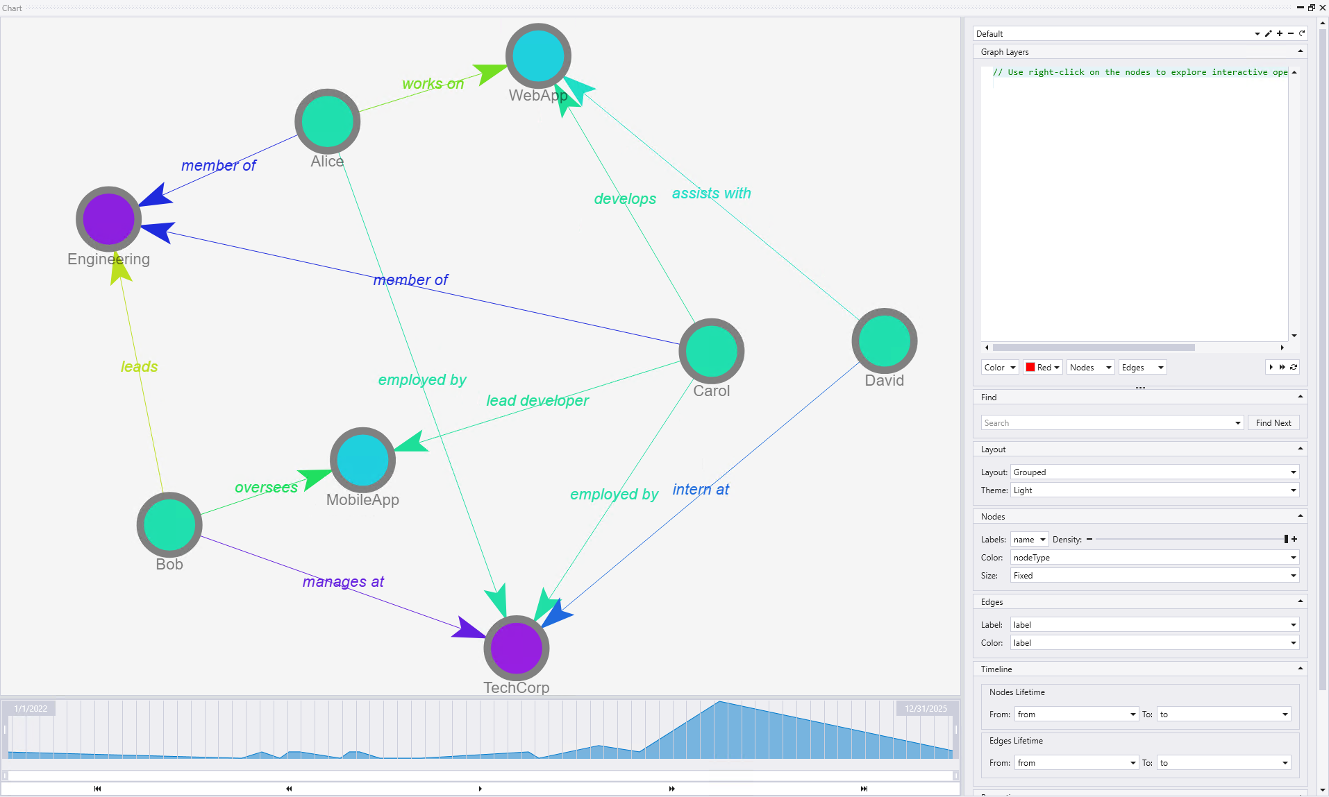
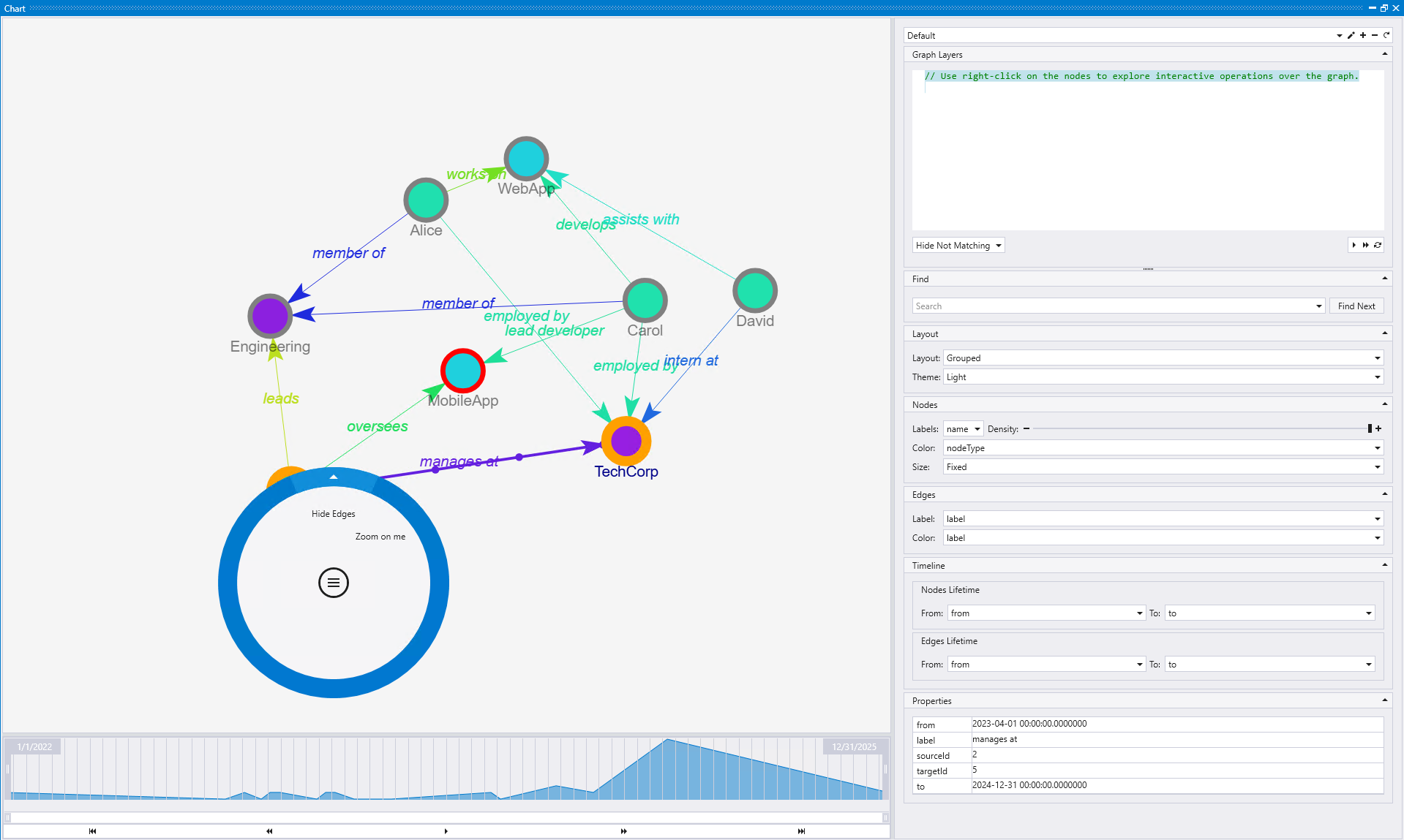
The visualization clearly shows the organizational structure with TechCorp (purple node) at the center, connected to employees Alice, Bob, Carol, and David (green nodes) through various employment relationships. The graph displays two projects - WebApp and MobileApp (cyan nodes) - with labeled edges showing how employees interact with these projects ("develops", "oversees", "works on", "assists with"). The Engineering department (purple node) connects to team members, and the temporal timeline at the bottom allows navigation through different time periods to see how relationships evolve. The Graph Layers panel on the right provides controls for customizing the visualization, including node labeling, coloring, and timeline navigation.
Example with graph function
This example demonstrates how to visualize a persisted graph using the graph() function. The BloodHound Active Directory dataset contains 1,495 Active Directory objects representing a typical enterprise AD deployment with users, computers, groups, and security relationships.
// Query using the graph function
graph("BloodHound_AD")
This query loads the entire BloodHound Active Directory graph, which Kusto Explorer will automatically render as an interactive visualization. The graph shows security relationships and potential attack paths in an Active Directory environment, making it useful for security assessments and privilege escalation analysis.
For detailed information about this dataset and other available sample graphs, see Graph sample datasets and examples.
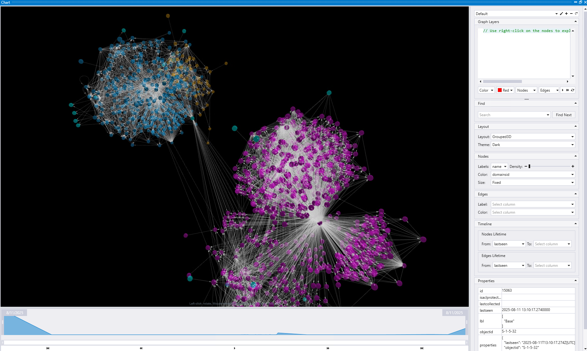
The visualization shows the complex structure of an Active Directory environment with distinct clusters of related objects. The blue cluster on the left represents one group of AD objects (likely computers or organizational units), while the purple clusters on the right show different types of security principals and groups. The interconnecting edges reveal the security relationships and potential attack paths between these entities. The Graph Layers panel on the right provides interactive controls to explore the data, including search functionality, node/edge customization options, and timeline controls for temporal analysis.
Example with database entity graph
Kusto Explorer provides a powerful capability to visualize the entity relationships within a KQL database. This feature helps you understand the database schema, data dependencies, and relationships between different database objects.
To generate the entity graph:
- In the Connections panel, right-click on the database name
- Select Show Entities Graph from the context menu
- Kusto Explorer automatically executes a statement and renders the database entities as an interactive graph
This automatically generates and executes a query that analyzes the database schema and creates a visualization showing:
- Tables as the foundation data entities
- Graph models representing persistent graph structures
- Functions including user-defined and system functions
- Materialized views for data aggregation and optimization
- External tables for data export and external connectivity
- Dependencies shown as labeled edges indicating relationships between entities
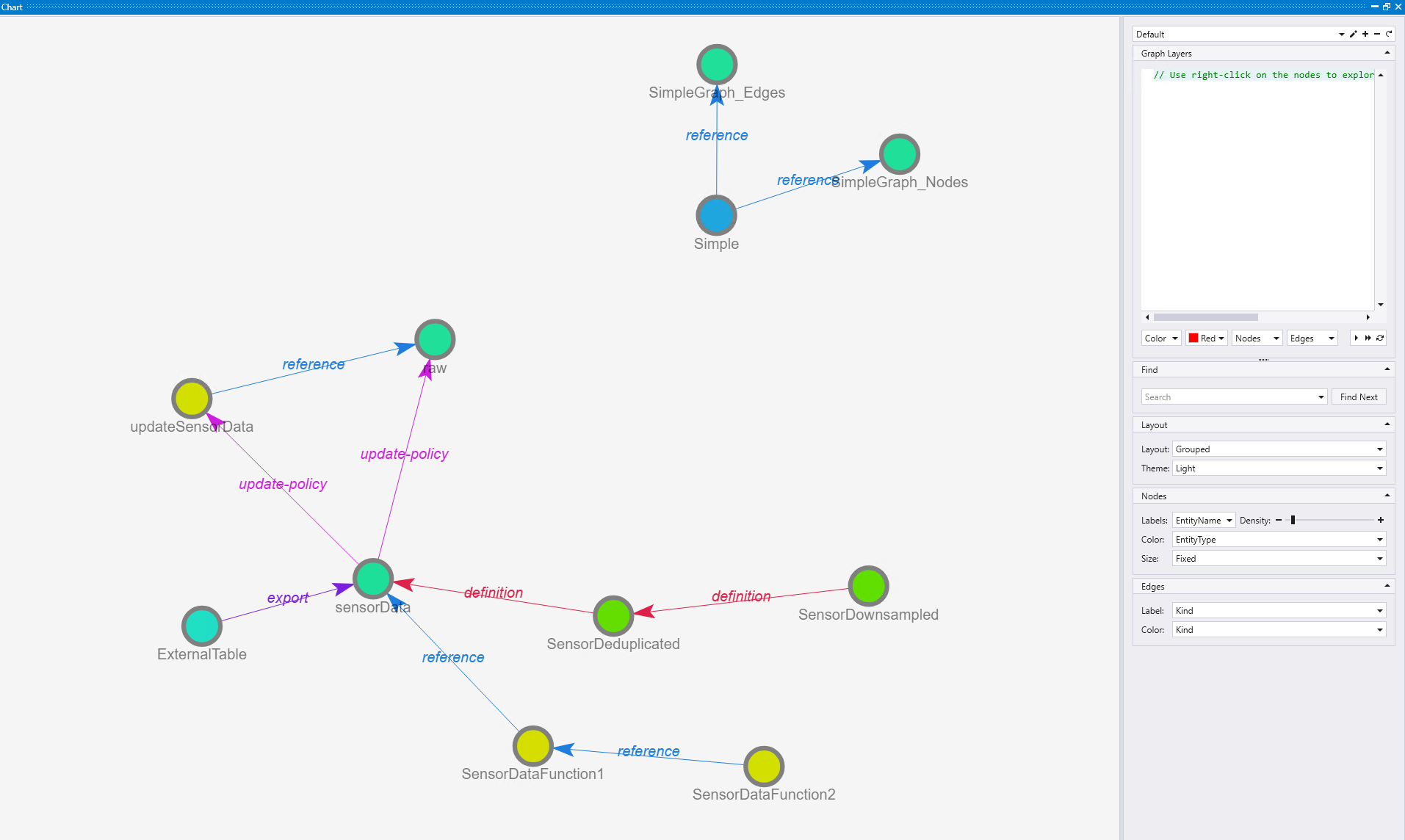
The visualization reveals the database architecture at a glance, showing the complete data flow and dependencies. In this example, you can trace the data processing pipeline step by step:
Data ingestion and transformation
First, a raw table populates the sensorData table using an update policy that triggers the updateSensorData function whenever new data arrives.
Data optimization with materialized views
Next, there are materialized views for data optimization - one for deduplication (SensorDeduplicated) defined on the sensorData table, and another for downsampling of timeseries data (SensorDownsampled) that runs on top of the SensorDeduplicated view.
Function dependencies
The system also includes function dependencies where SensorDataFunction1 (yellow node) references the sensorData table, and SensorDataFunction2 (yellow node) uses SensorDataFunction1, creating a chain of function dependencies.
Data export
Additionally, there's a continuous export operation defined that exports data from the sensorData table to an external table called ExternalTable (cyan node).
Graph modeling
Finally, the "Simple" graph model (blue node) depends on two underlying tables, with reference relationships clearly marked.
Visualization insights
The purple edges indicate various relationship types like "definition", "reference", "export", and "update-policy". This capability to track interdependencies between functions is particularly valuable for debugging performance issues, understanding data lineage, and optimizing query execution paths. Database administrators and developers can use this comprehensive view to understand data flow, identify bottlenecks, and maintain database integrity.
Interactive graph features
When Kusto Explorer renders a graph, it provides several interactive features through the Graph Layers panel on the right side of the interface. The features described below are demonstrated using the TechCorp organizational graph shown earlier:
Interactive node actions
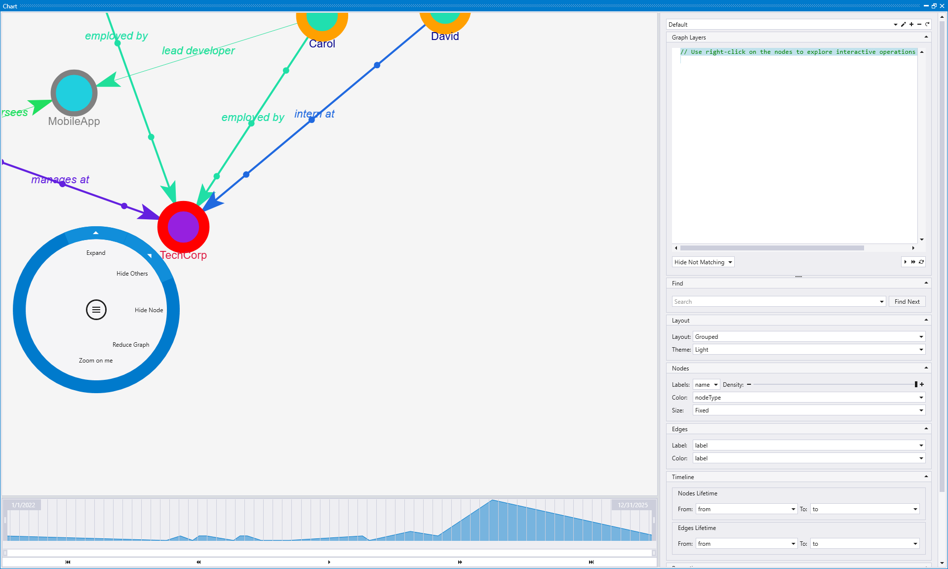
You can interact with graph nodes in two ways: write KQL graph queries manually, or simply right-click on any node to execute several predefined actions. Each action provides a different way to explore and manipulate the graph visualization:
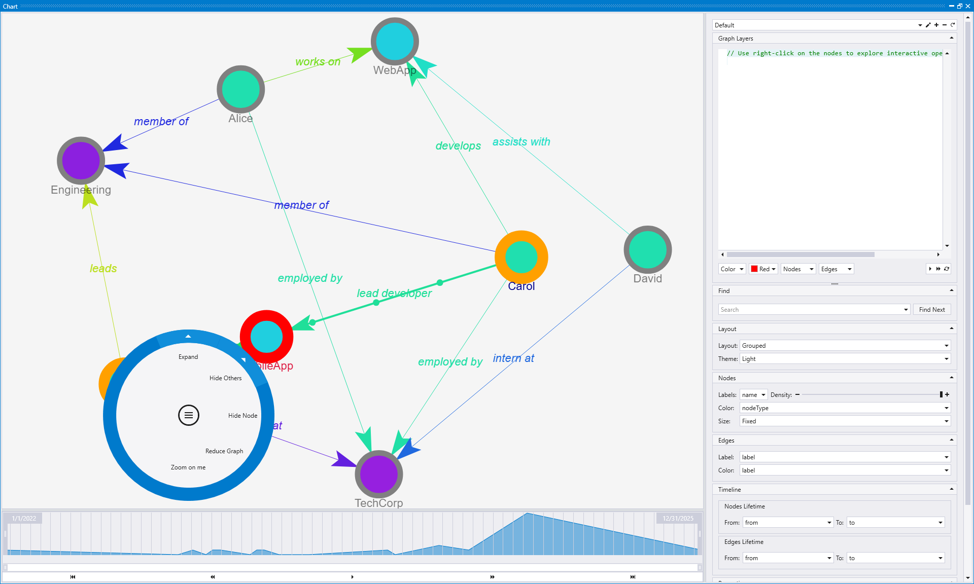
Expand
The Expand action generates a statement that allows you to selectively visualize graphs which start or end at the interesting node, revealing connected nodes and relationships.
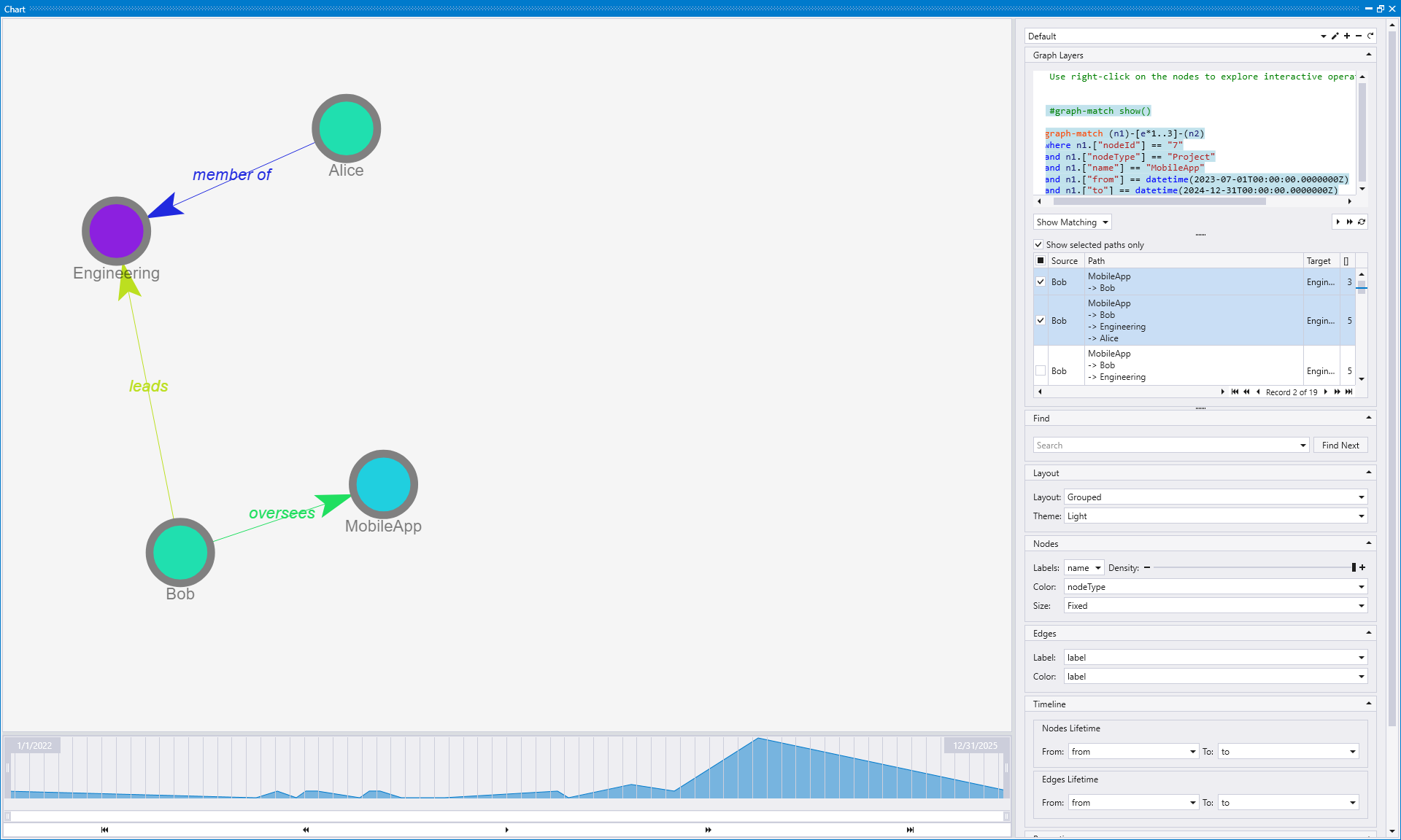
When you right-click on a node and select "Expand", Kusto Explorer first presents you with options to customize the expansion:
- Select expansion levels: Choose how many levels (hops) you want to expand from the selected node (1 level, 2 levels, 3 levels, or 4 levels)
- Select paths of interest: After choosing the levels, you can select specific paths or relationship types that you want to include in the expansion
This two-step process allows for precise control over graph exploration. Rather than expanding everything connected to a node, you can focus on specific relationship patterns and limit the expansion depth to avoid overwhelming visualizations. This is particularly useful for exploring large graphs where you want to focus on the immediate neighborhood of a specific entity without being overwhelmed by the entire graph structure.
Hide Others
The Hide Others action hides all other nodes except the selected one and its direct connections, creating a focused view of the selected node's immediate environment.
When you right-click on a node and select "Hide Others", you can choose how many levels should be left in the graph:
- Leave only me: Shows only the selected node, hiding all others
- Leave 1 more level: Shows the selected node plus nodes that are 1 hop away
- Leave 2 more levels: Shows the selected node plus nodes that are 1-2 hops away
- Leave 3 more levels: Shows the selected node plus nodes that are 1-3 hops away
- Leave 4 more levels: Shows the selected node plus nodes that are 1-4 hops away
This action is ideal when you want to isolate a specific node and examine only its relationships within a defined radius. It effectively filters out the visual noise from the rest of the graph, allowing you to concentrate on understanding how the selected node connects to its neighbors at various distances.
Hide Node
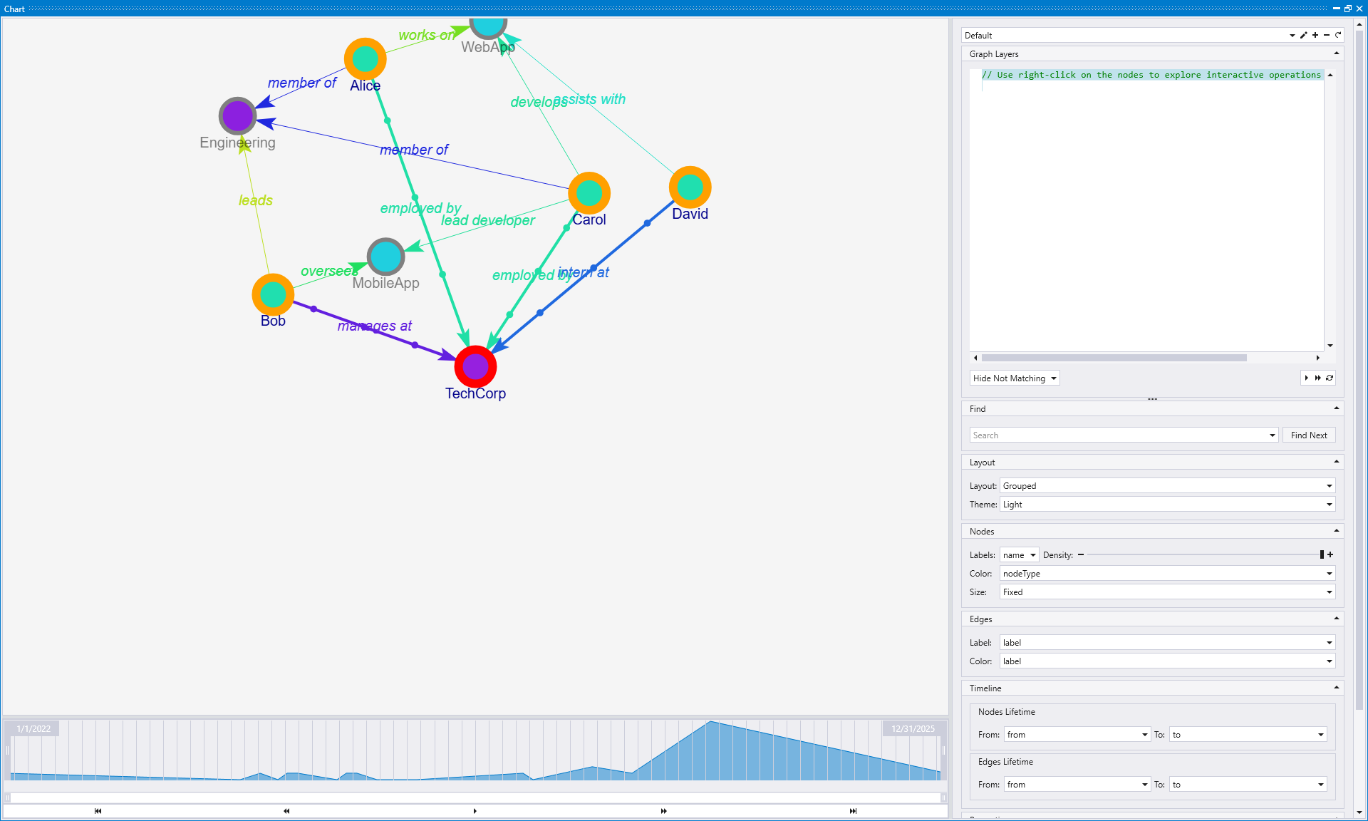
The Hide Node action removes the selected node from the current view along with all edges connected to it.
When you click on a node you want to hide, it removes both the node itself and all edges connected to it from the visualization. This creates a cleaner graph by eliminating dangling connections that would otherwise point to nowhere. For example, if you hide the MobileApp node, all relationships like "lead developer", "oversees", and other connections to that project are also removed from the view.
Use this action when you want to temporarily remove a node that might be cluttering your visualization or when you want to see how the graph looks without a particular entity. This is especially useful for removing central hub nodes that have many connections, allowing you to better see the relationships between other nodes without the visual distraction of orphaned edges.
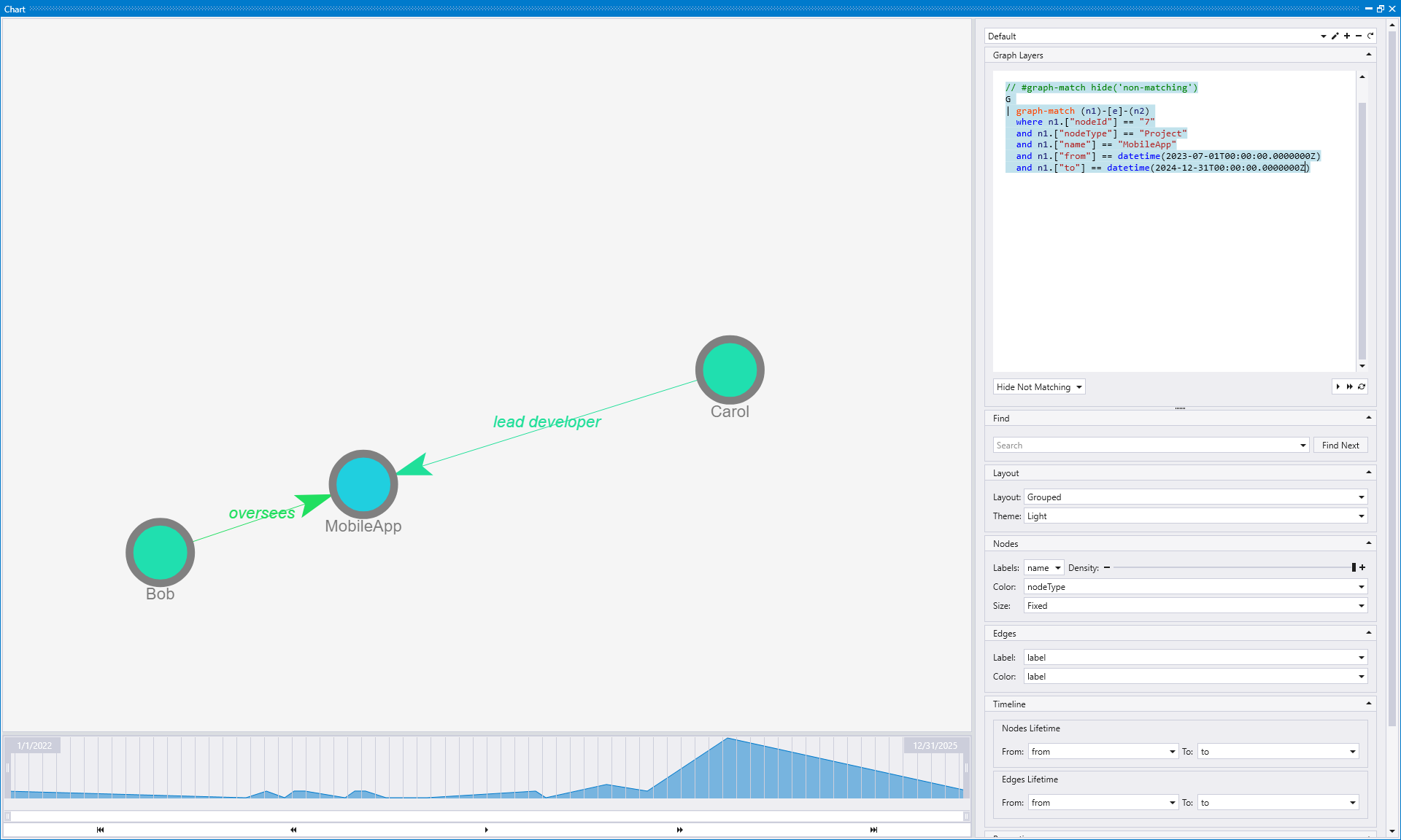
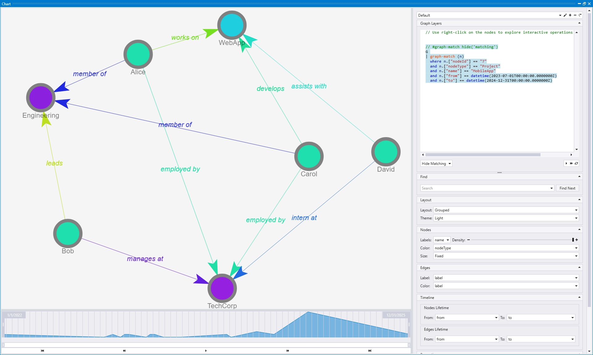
Reduce Graph
The Reduce Graph action simplifies the graph by automatically generating a statement that shows nodes within a specific range of hops from the selected node.
When you click "Reduce Graph" on a node (such as the MobileApp node), Kusto Explorer automatically generates a statement that reduces the graph to show all nodes which are 1 to 4 hops away from the selected node. This default behavior helps manage complex graphs by focusing on the most relevant neighborhood around your point of interest.
You can customize the generated statement to adjust the hop range according to your needs. For example, you can modify the statement to show only nodes that are 1 to 2 hops away, creating an even more focused view:
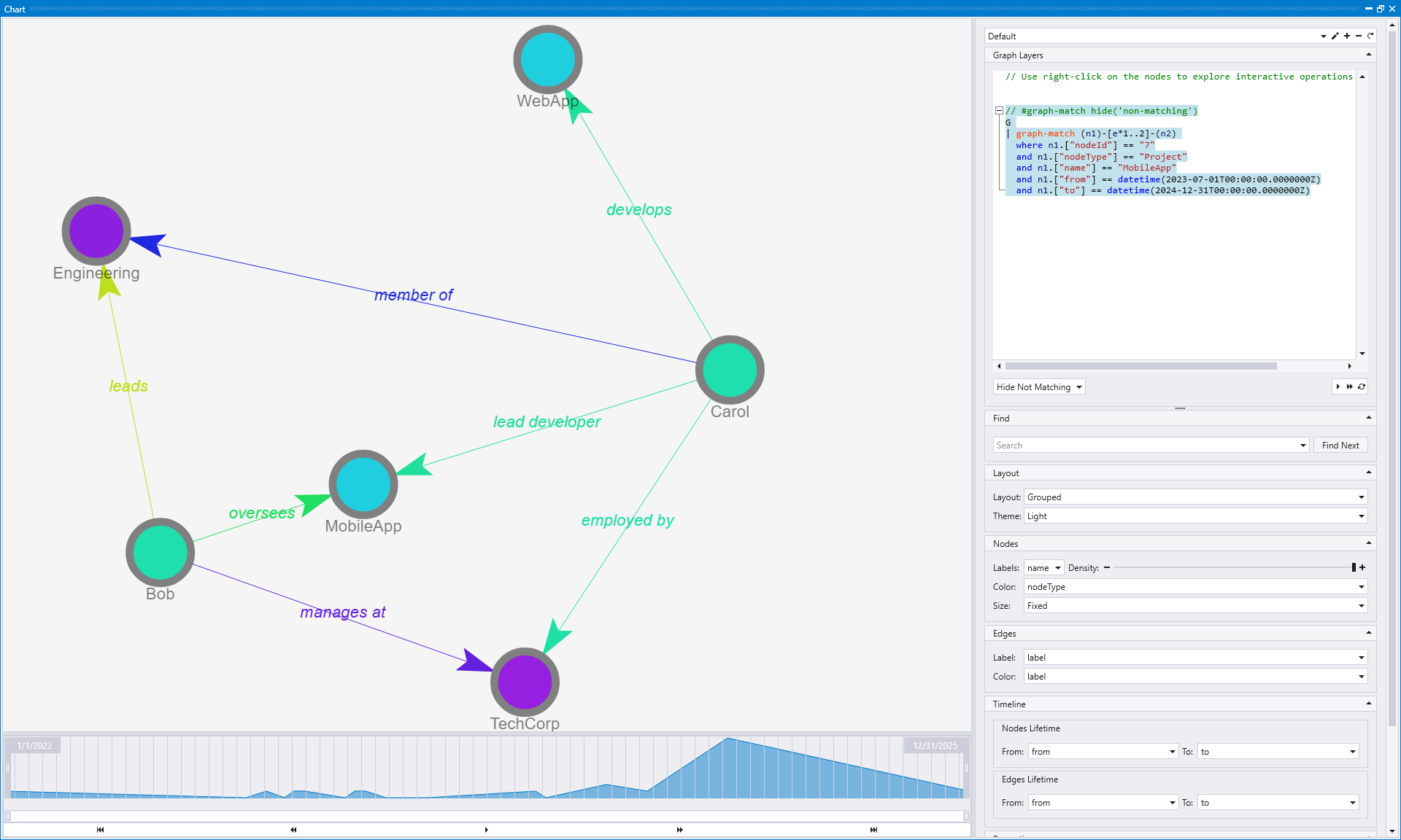
This action is particularly valuable when working with large, dense graphs where you want to focus on the most significant relationships and entities within a specific distance from your selected node. The ability to customize the hop range gives you precise control over the level of detail in your reduced graph visualization.
Zoom on me (Node)
The Zoom on me action is very helpful to focus visually on a specific node. It centers and zooms the view to focus specifically on the selected node, making it the focal point of the visualization.
When you right-click on a node and select "Zoom on me", Kusto Explorer automatically adjusts both the zoom level and centers the view so that the selected node becomes the primary focus. This visual transformation makes it much easier to examine the node's properties and relationships without distractions from other parts of the graph.
This action is particularly useful for navigation in large graphs where you might lose track of a specific node or when you want to focus your analysis on a particular entity and its immediate connections. The zoom and centering functionality ensures that the selected node is prominently displayed and easy to examine in detail.
These interactive actions provide quick graph exploration without requiring manual KQL query writing, making it easy to focus on specific parts of complex graphs or discover hidden relationships in your data.
Interactive edge actions
In addition to node actions, you can also interact with graph edges by right-clicking on them. Edge actions provide complementary functionality for exploring and manipulating connections within your graph visualization.
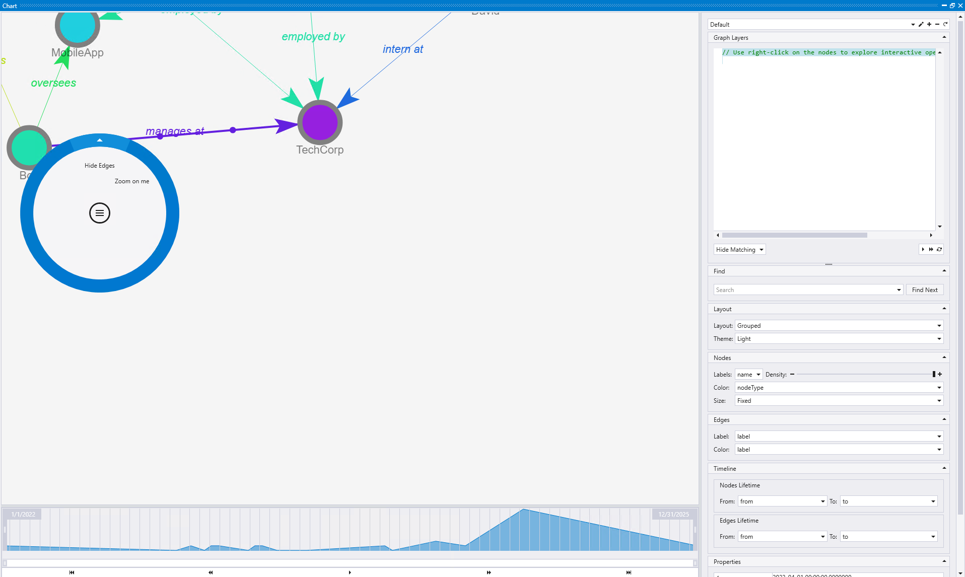
Hide Edges
The Hide Edges action provides multiple options for removing edges and related nodes from the current view. This allows you to simplify the visualization by removing specific relationships that might be cluttering the graph.
When you right-click on an edge and select "Hide Edges", you can choose from several hiding options:
- Hide Edges Only: Removes only the selected edges while keeping all connected nodes visible
- Hide Edges and Source Nodes: Removes the edges and their source nodes from the visualization
- Hide Edges and Target Nodes: Removes the edges and their target nodes from the visualization
- Hide Edges and Nodes: Removes both the edges and all connected nodes (source and target)
The edges that are hidden are determined by the edge Label configuration in the Edges section of the Graph Layers panel on the right. You can specify which edge labels should be affected by the hide operation, allowing you to hide all edges with a specific relationship type rather than just individual connections.
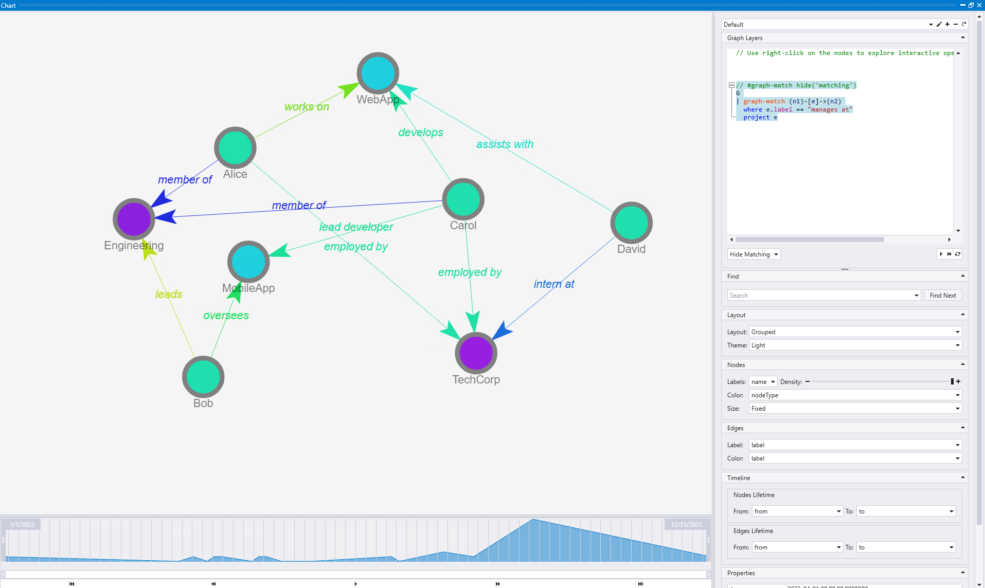
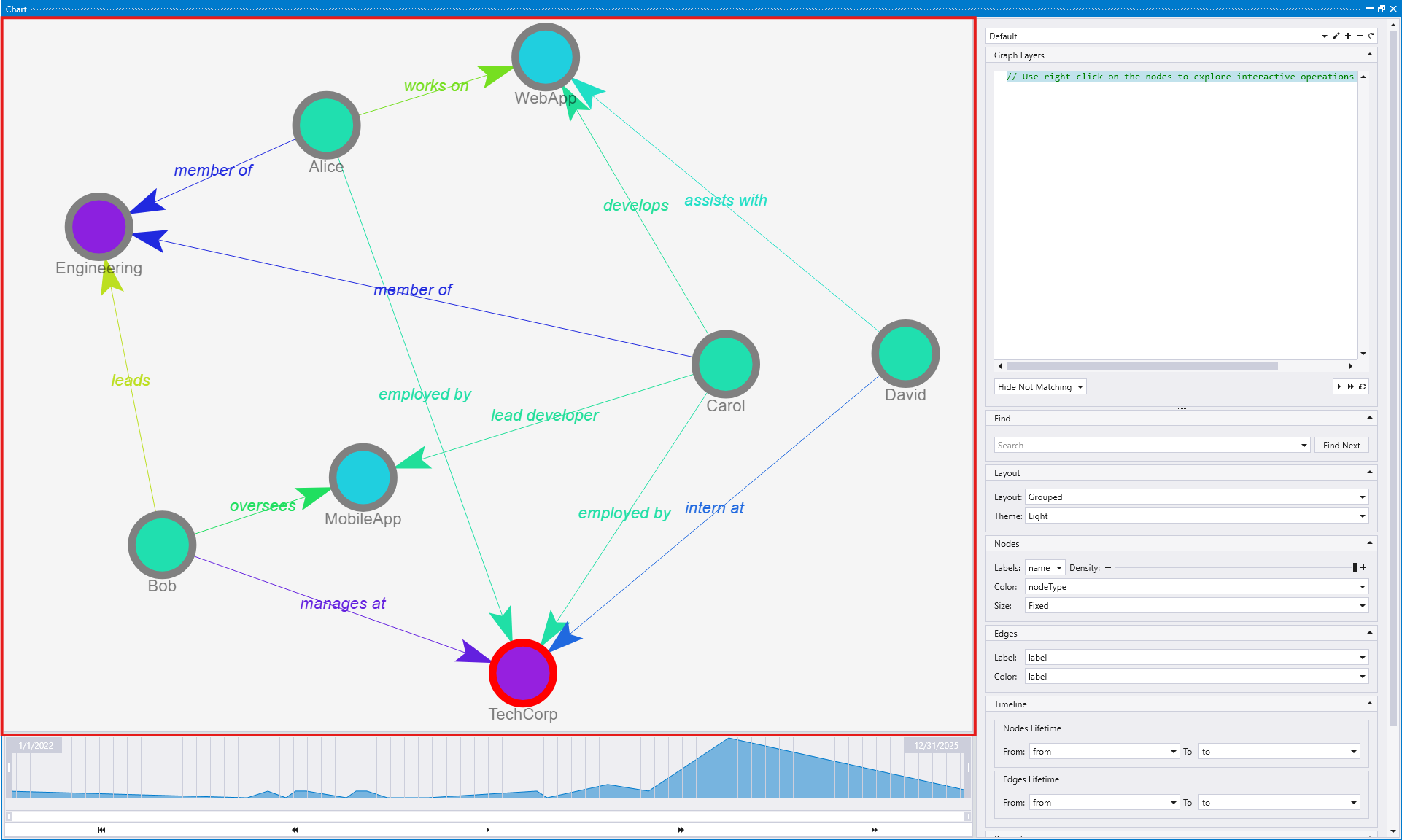
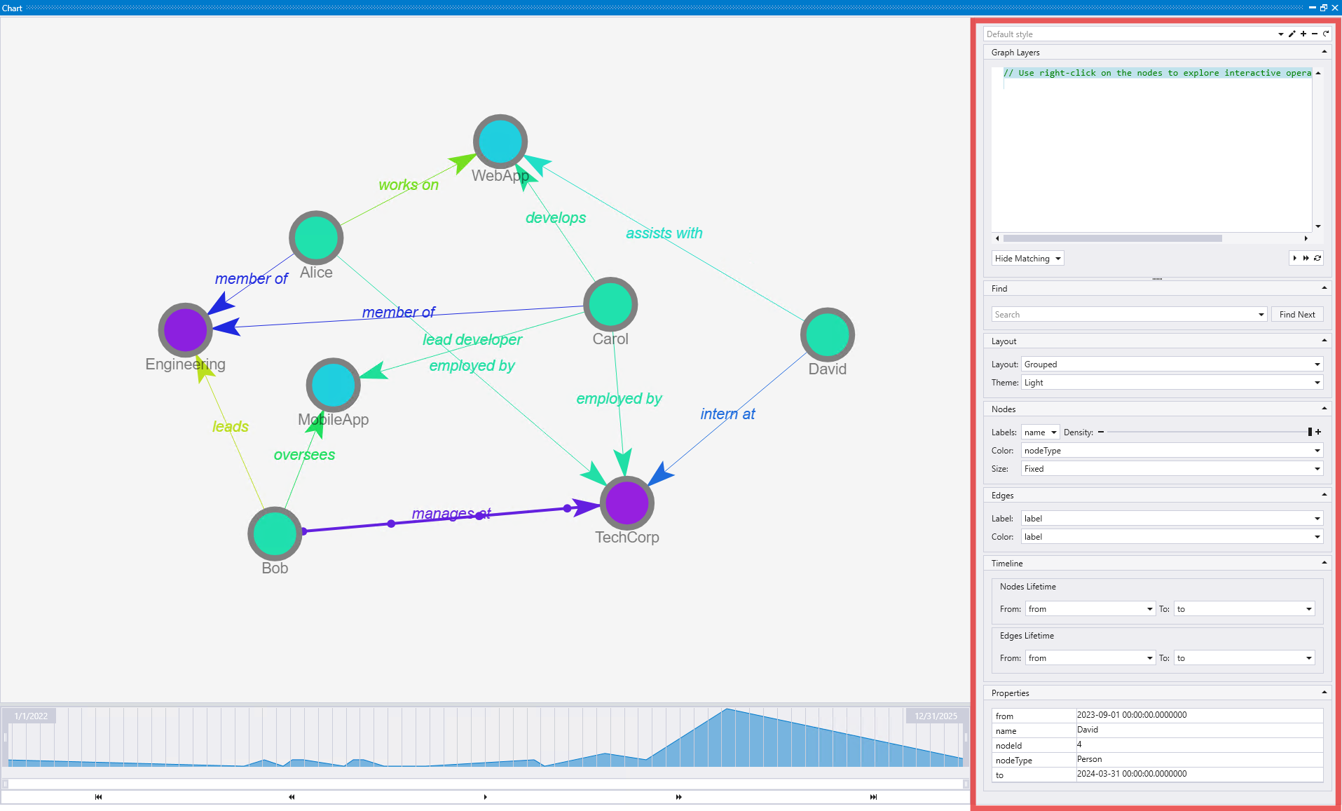
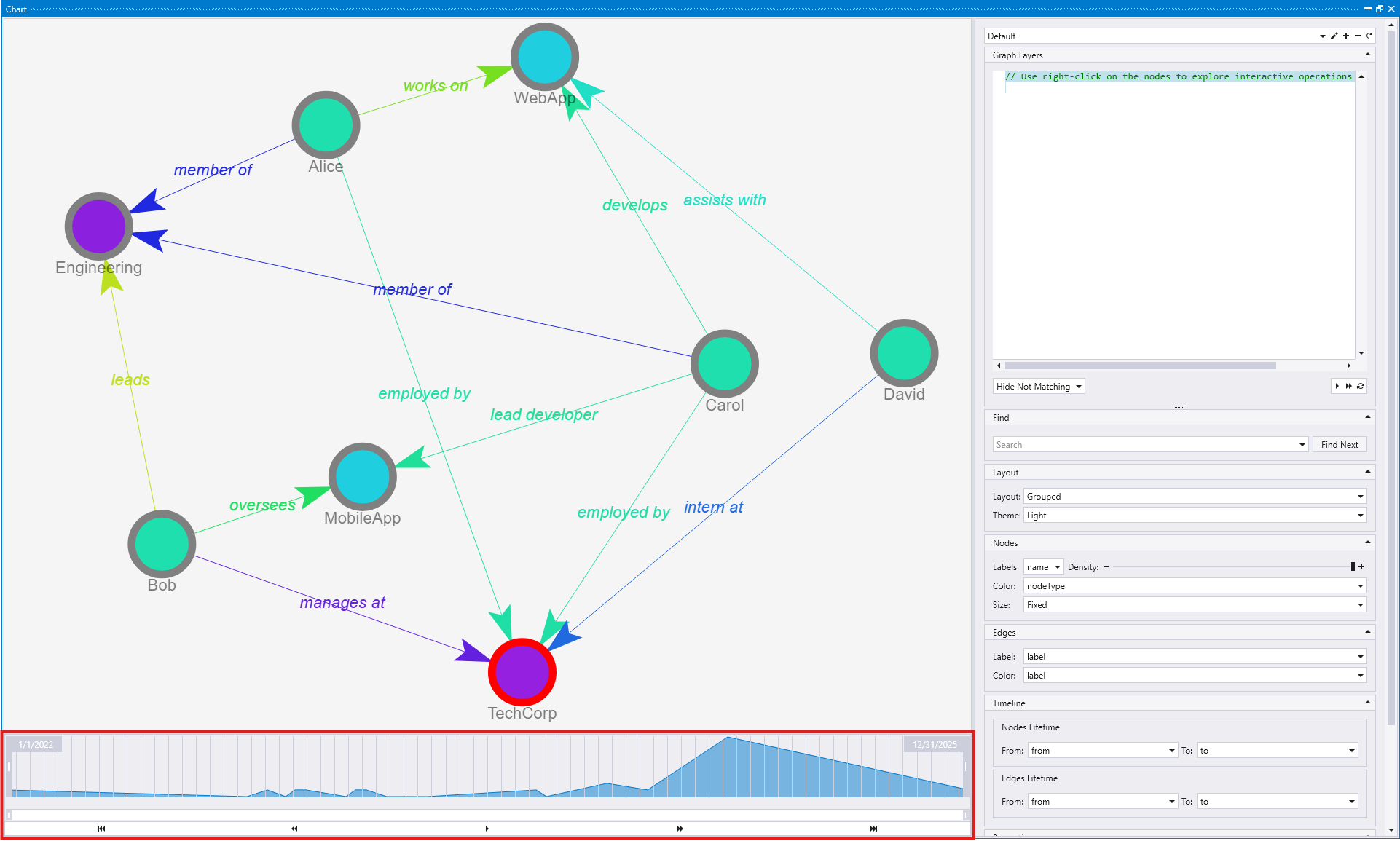
The first image shows what happens after clicking "Hide Edges Only". In this case, the "manages at" edge between Bob and TechCorp is removed from the visualization, but both the source node (Bob) and target node (TechCorp) remain visible along with their other connections.
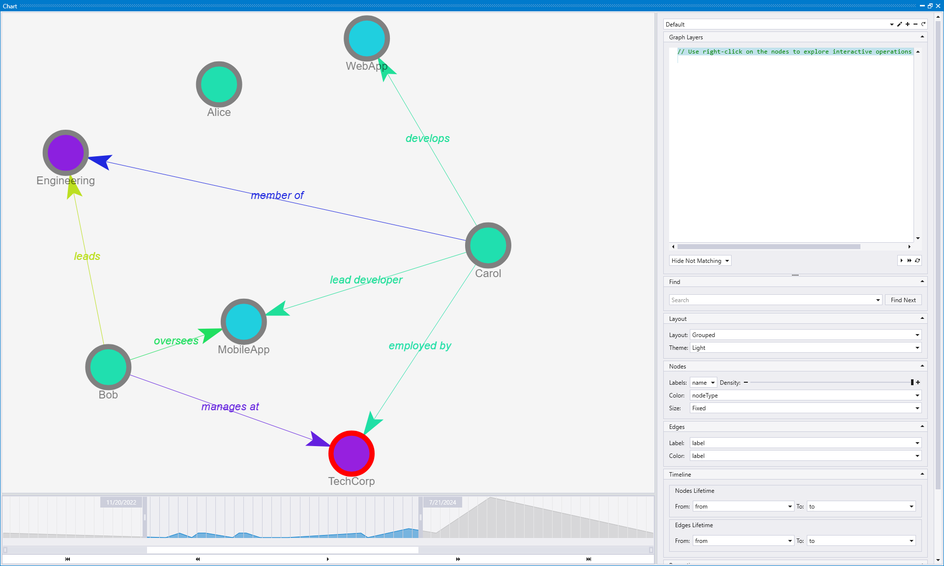
The second image demonstrates the result of clicking "Hide Edges and Nodes". In this case, not only is the "manages at" edge removed, but both the source node (Bob) and target node (TechCorp) are also removed from the visualization, along with all edges connected to those nodes. This creates a much more dramatic simplification of the graph structure.
This functionality is particularly useful when you want to focus on specific types of relationships by removing others, or when certain edge types are not relevant to your current analysis. The ability to hide edges based on their labels provides powerful filtering capabilities for complex graphs with multiple relationship types.
Zoom on me (Edge)
The Zoom on me action for edges centers the visualization of the graph on the selected edge, making the relationship the focal point of the view.
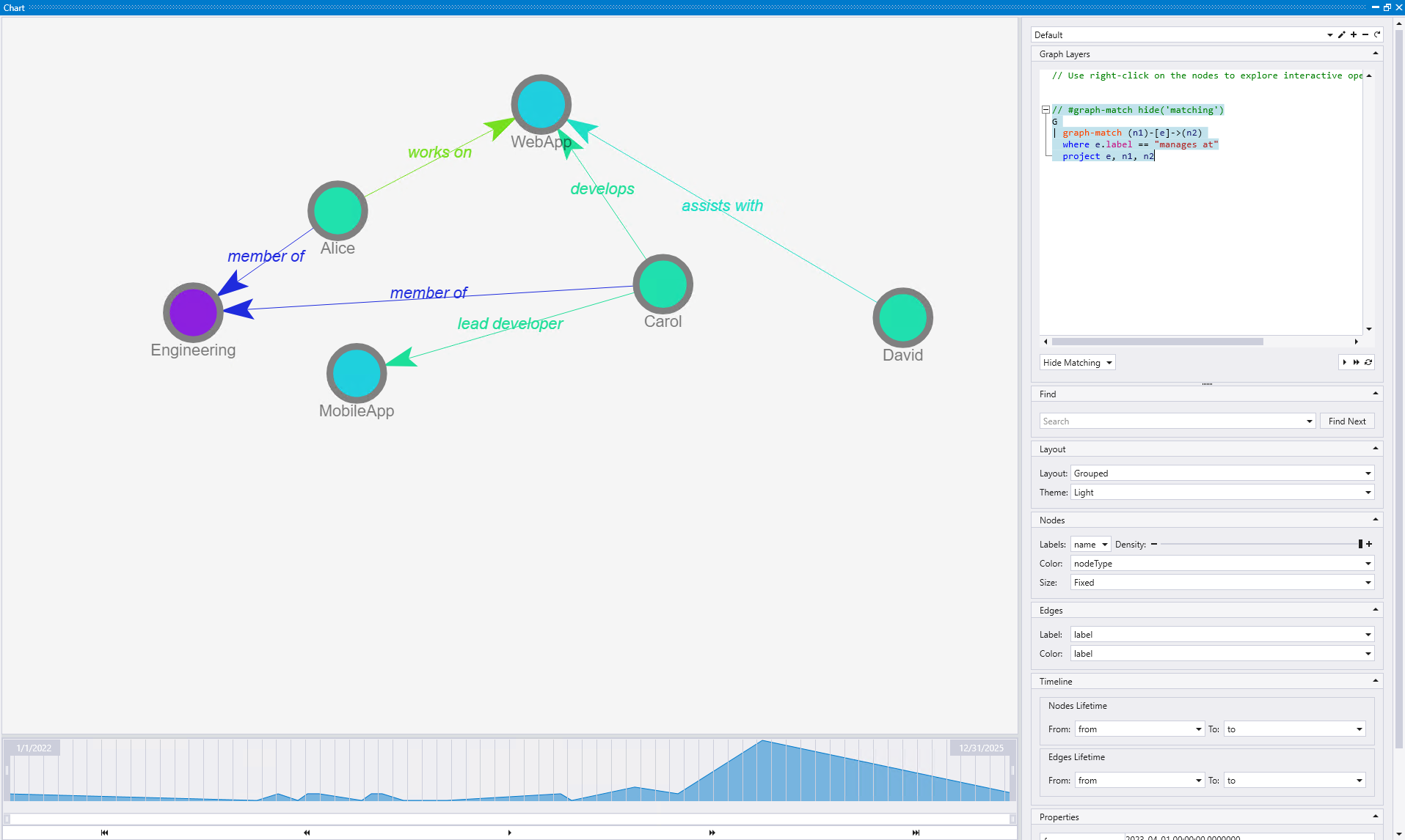
The first image shows an edge (the "manages at" relationship between Bob and TechCorp) that is positioned close to the border of the visualization, making it harder to focus on and examine.
When you right-click on this edge and select "Zoom on me", Kusto Explorer automatically adjusts the view to center the selected edge in the visualization. This repositioning makes it much easier to examine the relationship details and the properties of both connected entities.
The second image demonstrates how the same "manages at" edge is now centered in the view, providing a much clearer focus on this specific relationship and its connected nodes (Bob and TechCorp).
This action is particularly valuable when working with dense graphs where specific relationships might be positioned at the edges of the view or partially obscured. It helps you focus on important connections and examine edge properties, labels, and the context of how two specific entities are related without having to manually navigate or zoom to find the relationship.
These edge-focused interactive actions complement the node actions, providing comprehensive control over graph exploration and allowing you to manipulate both entities and relationships according to your analysis needs.
Graph styling
The Graph Layers panel provides comprehensive styling and configuration options for customizing your graph visualization. This panel offers a rich set of controls that allow you to modify the appearance, behavior, and interactive features of your graph.
Style selection
The Style dropdown at the top allows you to define and manage multiple styles for a graph. When you select or create a style, all subsequent configurations (nodes, edges, layout, etc.) will be stored based on that specific style. This enables you to quickly switch between different visualization configurations for the same graph data, making it easy to create multiple views optimized for different analysis purposes.
Graph Layers
The Graph Layers section provides a notebook-like experience where you can run a sequence of operations on the graph. Each operation starts with a graph object "G" and there can be multiple operations, where each one is built on top of the result of the previous step. This allows you to create complex graph transformations and filtering operations that are applied sequentially, similar to how you would work with cells in a Jupyter notebook.
When adding a new operation to the Graph Layers, you can choose from various operation types:
- Hide Not Matching: Hides nodes and edges that don't match specified criteria, keeping only elements that meet your filtering conditions
- Color: Applies color coding to nodes or edges that are currently visible based on properties or conditions. You can use categorical colors for discrete values (node types, departments) or gradient colors for numeric properties (rankings, metrics). This operation only colors elements that are already visible and doesn't show previously hidden elements.
- Color And Show: Combines coloring with visibility control, making elements visible (unhiding them) and applying colors based on specified criteria. This operation turns the visibility of matching elements to on and colors them simultaneously.
- Hide Matching: Hides nodes and edges that match specified criteria, removing elements that meet your filtering conditions from the visualization
- Show Matching: Shows only nodes and edges that match specified criteria, making this the primary visible content in your graph
Each operation can be configured with specific parameters and conditions, and operations are executed in sequence from top to bottom. This layered approach allows you to build complex filtering and styling logic by combining multiple operations, where each step refines the results of the previous operations.
Find
The Find section provides a powerful search capability that searches through the properties of all nodes and edges in your graph visualization. You can enter search terms to locate particular entities or relationships based on their property values. After entering your search term and pressing Enter, the search will highlight matching elements in the graph. You can then click Find Next to navigate through all the search results sequentially, making it easy to examine each match in large graphs and focus on specific elements of interest.
Layout
The Layout section controls how the graph should be rendered and provides theme options:
- Layout algorithms: Choose between different layout options such as:
- Grouped: Organizes nodes into logical clusters
- Grouped3D: Provides a three-dimensional grouped layout
- Circular: Arranges nodes in a circular pattern
- Theme: Select your preferred visual theme, with options like:
- Light: Standard light background theme
- Dark: Dark background theme for users who prefer darker interfaces
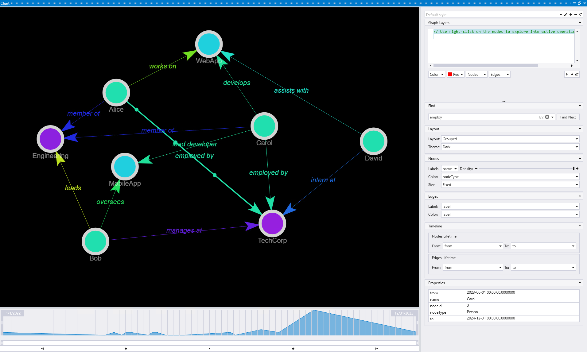
The Grouped layout with Dark theme organizes nodes into logical clusters based on their relationships and properties, making it easier to identify different groups within your graph data while providing a dark interface that some users prefer.
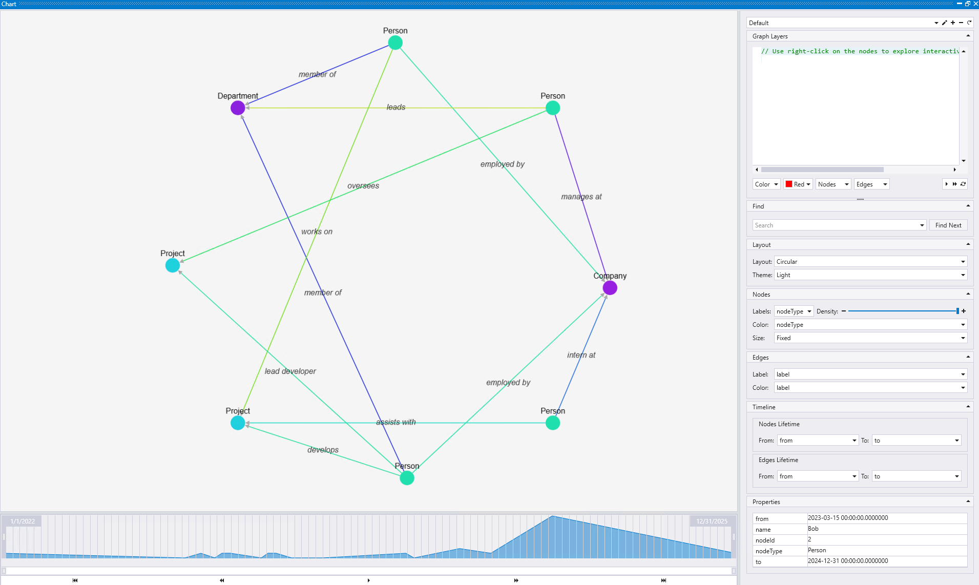
The Circular layout with Light theme arranges nodes in a circular pattern, providing a symmetrical view that can be particularly useful for understanding the overall structure and balance of relationships in your graph.
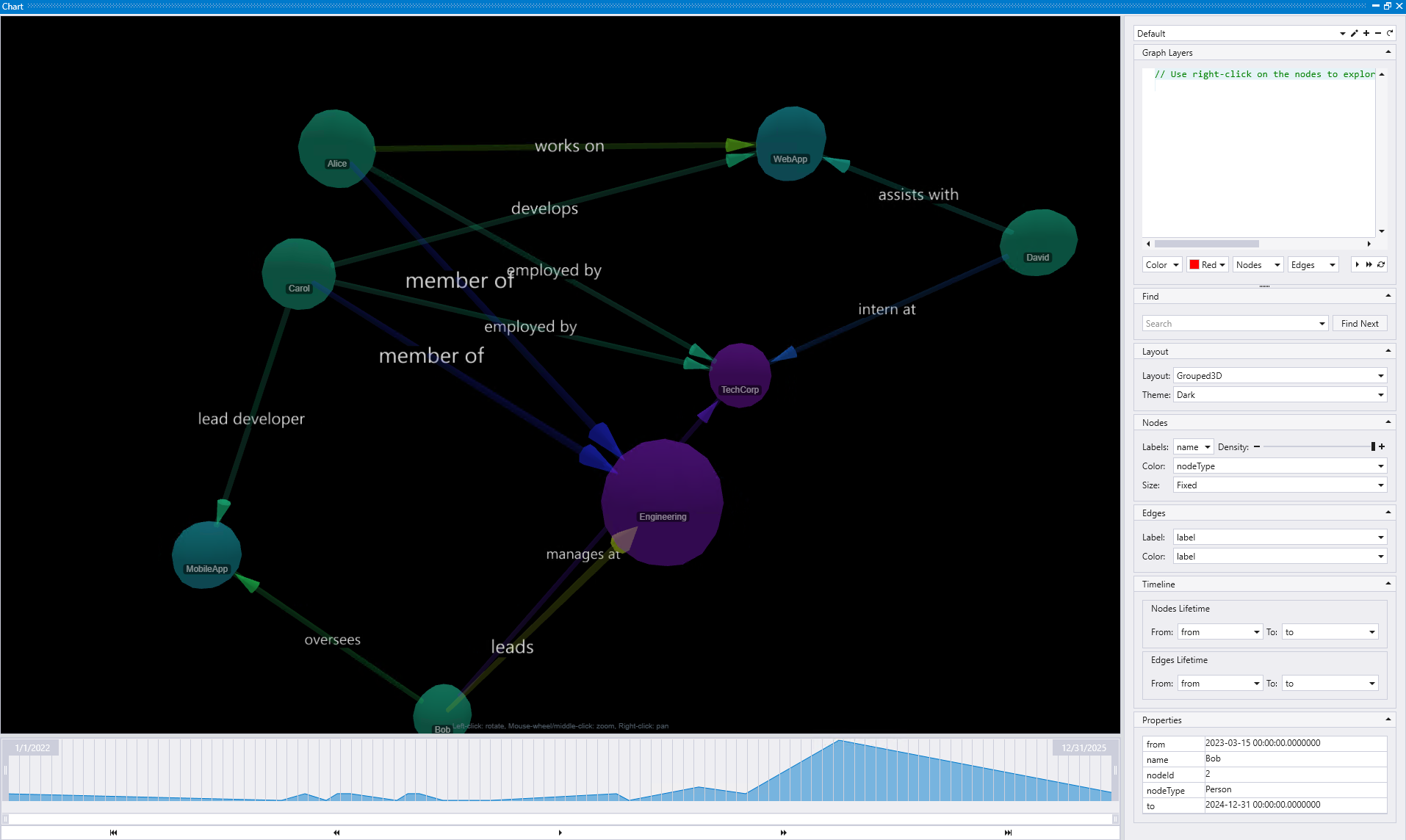
The Grouped 3D layout with Dark theme provides a three-dimensional perspective of grouped nodes, offering additional depth and spatial organization that can help visualize complex hierarchical relationships within your graph data.
Nodes
The Nodes section provides comprehensive control over node appearance and behavior:
- Labels: Define which property should be displayed as the label on each node
- Density: Control whether more or fewer node labels should be shown in the visualization
- Color: Set node colors based on a specific property of the node, allowing for categorical or value-based color coding
- Size: Configure node sizing with several options:
- Fixed: All nodes have the same size
- Incoming/Outgoing edges: Size based on the number of incoming or outgoing connections
- Numeric property: Size based on a specific numeric property value
Edges
The Edges section controls the appearance of connections between nodes:
- Labels: Define what text should be displayed on the edge
- Color: Set edge colors based on a specific property of the edge, useful for distinguishing different types of relationships
Timeline
The Timeline section is crucial for temporal graph analysis and determines when nodes and edges appeared and disappeared. It provides separate configuration for nodes and edges:
Nodes Lifetime:
- From: Specifies when nodes first appeared in the timeline
- To: Specifies when nodes disappeared or became inactive
Edges Lifetime:
- From: Specifies when edges first appeared in the timeline
- To: Specifies when edges disappeared or became inactive
This configuration is particularly useful for the timeline visualization shown in the lower portion of the interface, allowing you to see how your graph evolves over time. For detailed information about using timeline functionality, see the Timeline view section
Properties
The Properties section displays detailed information about the nodes and edges you have selected in the graph. This provides a detailed view of all attributes and metadata associated with the selected graph elements, making it easy to inspect and understand the data behind your visualization.
These styling and configuration options work together to provide a powerful and flexible graph visualization environment that can be tailored to your specific analysis needs and visual preferences.
Timeline view
The Timeline view provides a powerful capability to visualize how your graph evolves over time by playing back the creation, modification, and deletion of nodes and edges based on temporal properties in your data. This feature is particularly valuable for understanding the historical development of relationships, tracking changes in network structures, and analyzing temporal patterns in your graph data.
Timeline controls
The timeline interface provides several interactive controls for navigating through time and focusing on specific periods of interest:
Playback controls:
- Play/Pause: Automatically plays through the timeline, showing how the graph evolves chronologically. You can pause at any point to examine the graph state at that specific time
- Step forward/backward: Navigate through the timeline one step at a time, allowing for detailed examination of each temporal change in the graph structure
- Jump to beginning: Instantly return to the earliest time point in your dataset, showing the initial state of the graph
- Jump to end: Move directly to the latest time point, displaying the final state of the graph with all temporal changes applied
Period selection: You can select specific time periods on the timeline by clicking and dragging to create temporal selections, which automatically updates the graph to show only the nodes and edges that existed during that timeframe. This allows you to focus on critical periods, compare different time windows, and see how the graph structure evolved, with real-time updates as you adjust the marked period boundaries.
Known limitations
- Graph function compatibility: The combination of rendering graphs using the
graph()function and configuring statements in the "Graph layers" panel is currently not supported. When using thegraph()function, the layer configuration options may not work as expected with the visualization. - Large graph performance: This visualization is not designed for large graphs. The number of nodes and edges that can be effectively visualized depends on the hardware capabilities of the client machine, including available memory and processing power. Performance may degrade significantly with graphs containing thousands of nodes or edges.