Note
Access to this page requires authorization. You can try signing in or changing directories.
Access to this page requires authorization. You can try changing directories.
Learn about line charts in Azure Databricks and how to migrate from the legacy Line charts. Azure Databricks has three types of line charts: Line and legacy charts Line (v2) and Line (v1).
Comparison: Line chart types with time-series data
Line has custom plot options: setting a Y-axis range, showing or hiding markers, and applying log scale to the Y-axis and a built-in toolbar that supports a rich set of client-side interactions.
In addition, Line, Line (v2), and Line (v1) charts treat time-series data in different ways:
| Line and Line (v2) | Line (v1) |
|---|---|
| Date and timestamp are supported. Line (v2) formats a date to local time. |
Date and timestamp are treated as text. |
| Key can only be date, timestamp, or number. | Key can be of any type. |
X-axis is ordered:
|
X-axis is categorical:
|
Notebook example: Migrate to Line from legacy line charts
The notebook in this example converts the date as string into timestamp (including time zone) using unix_timestamp.
To migrate to Line from Line (v1) or Line (v2):
Click
 next to the bar chart
  and select Line.
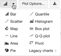
For a Line (v1) chart, if the key column is not a date, timestamp, or number, you must parse the column to a date, timestamp, or number explicitly as demonstrated in the following notebook.
Timestamp conversion notebook
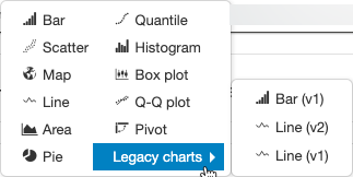
Use legacy line charts
To use legacy line charts, select them from the Legacy Charts drop-down menu.