Note
Access to this page requires authorization. You can try signing in or changing directories.
Access to this page requires authorization. You can try changing directories.
In this article, you learn how to create and customize visuals from query results by using the UI, such as the one found in Azure Data Explorer Dashboards. You can further manipulate these visuals and pin them in a dashboard. You don't need to rerun the query to add or modify these visuals. This feature is especially useful for heavy queries.
For a full list of available visuals, see Visualization. For visuals that are only available in the web UI or dashboards, see Dashboard-specific visuals.
Prerequisites
- A Microsoft account or a Microsoft Entra user identity. You don't need an Azure subscription.
- An Azure Data Explorer cluster and database. Use the publicly available help cluster or create a cluster and database.
Add a visual to a query
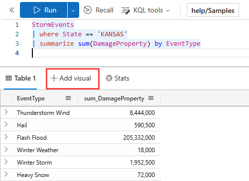
Run a query in the Azure Data Explorer web UI. For example, you can use the following query:
StormEvents
| where State == 'KANSAS'
| summarize sum(DamageProperty) by EventType
In the results grid, select + Add visual.
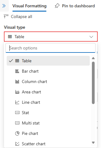
A pane opens on the right side, with the Visual Formatting tab selected.
Select the Visual type from the dropdown. For a list of available visualizations, see Visualizations.
Set customization properties
The following table describes the available customization properties, categorized alphabetically by section, and specifies which visuals support the given property.
| Section | Property | Description | Visual types |
|---|---|---|---|
| Colors | Color palette | Determines the set of colors to use for the heatmap. | Heatmap |
| Conditional formatting | Hide or Show | A toggle option to turn off or turn on conditional formatting. For more information, see Apply conditional formatting. | Anomaly chart, Area chart, Bar chart, Column chart, Multi Stat, Scatter chart, Table, Time chart |
| Data | Y columns | The columns that provide data for the vertical axis. | Anomaly chart, Area chart, Bar chart, Column chart, Line chart, Scatter chart, Time chart |
| X column | The column that provides data for the horizontal axis. | Anomaly chart, Area chart, Bar chart, Column chart, Line chart, Scatter chart, Time chart | |
| Series columns | The columns used to categorize data into different series. | Anomaly chart, Area chart, Bar chart, Column chart, Line chart, Scatter chart, Time chart | |
| Category column | The column that determines the data categories. | Funnel chart, Heatmap, Pie chart | |
| Label column | Assigns labels to each slot using the designated column. | Multi Stat | |
| Value column | The column that provides data for the visualization. | Funnel chart, Multi stat | |
| Value | The numeric column that serves as the primary variable for the heatmap. | Heatmap | |
| Numeric column | The column that provides the numeric value for the data category. | Pie chart | |
| Define location by | Determines the method used to define the location: Infer, Latitude and longitude, or Geo point. | Map | |
| Data series colors | Color palette | Customizes the colors presented in the visualization. | Anomaly chart, Area chart, Bar chart, Column chart, Line chart, Pie chart, Scatter chart, Time chart, Time series chart |
| Display options | Order by | How to order the results in the chart: Name, Size, or None. | Pie chart |
| Top N | Option to only show sections for the top n values in the chart. | Pie chart | |
| General | Display orientation | Determines the orientation of the display: Horizontal or Vertical. | Multi Stat |
| Text size | Determines the size of the text: Recommended, Small, or Large. | Multi Stat, Stat | |
| Visual format | Determines the format for the chart. For area, bar, and column charts, the format can be standard, stacked, or stacked 100%. For pie charts, the format can be pie or donut. | Area chart, Bar chart, Column chart, Pie chart | |
| Layout | Slot configuration | Customizes the grid layout with options ranging from 1 column by 1 row (1 slot) to 5 columns by 5 rows (25 slots). | Multi Stat |
| Legend | Hide or Show | Hides or shows a legend explaining data series in the chart. | Anomaly chart, Area chart, Bar chart, Column chart, Multi Stat, Scatter chart, Time chart |
| Size | Hide or Show | Toggles sizing for the map points on or off. | Map |
| Size column | The column used to determine the size of the map point. | Map | |
| URLs | Apply link on column | When enabled, selecting a value in this column directs to the URL specified in the URL column. | Table |
| URL column | The column that contains URL values. | Table | |
| X Axis | Label | Sets a custom label for the horizontal axis. | Anomaly chart, Area chart, Bar chart, Column chart, Multi Stat, Scatter chart, Time chart |
| Vertical line value | Specifies a value on the horizontal axis for vertical reference lines. | Anomaly chart, Area chart, Bar chart, Column chart, Multi Stat, Scatter chart, Time chart | |
| X axis scale | Adjusts the scale of the horizontal axis to linear or logarithmic. | Anomaly chart, Area chart, Bar chart, Multi Stat, Scatter chart, Table, Time chart | |
| Y Axis | Label | Sets a custom label for the vertical axis. | Anomaly chart, Area chart, Bar chart, Column chart, Multi Stat, Scatter chart, Time chart |
| Maximum value | Defines the maximum value on the vertical axis. | Anomaly chart, Area chart, Bar chart, Column chart, Multi Stat, Scatter chart, Time chart | |
| Minimum value | Defines the minimum value on the vertical axis. | Anomaly chart, Area chart, Bar chart, Column chart, Multi Stat, Scatter chart, Time chart | |
| Reference lines | Marks a value on the chart as a reference line for visual guidance. | Anomaly chart, Area chart, Bar chart, Column chart, Multi Stat, Scatter chart, Time chart |
Change an existing visualization
Use the visual formatting pane to change an existing visualization.
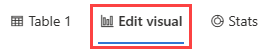
Visual created with UI
If you add a visual through the UI, you can change this visual by selecting the Edit visual tab in the results grid.
Visual created in query
If you create a visual by using the render operator, select Visual in the results grid to edit the visual.

Important
The visual formatting pane changes the visual representation, but doesn't modify the original query.
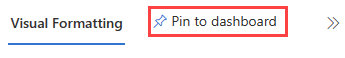
Pin to dashboard
After you format your visual, pin it to a new or existing dashboard.
From the visual formatting pane, select Pin to dashboard.
The pin to dashboard dialog opens. Enter a Tile name for this visual and select a new or existing dashboard.
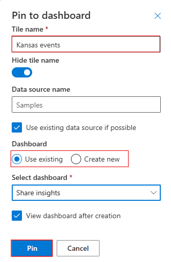
Select Pin.