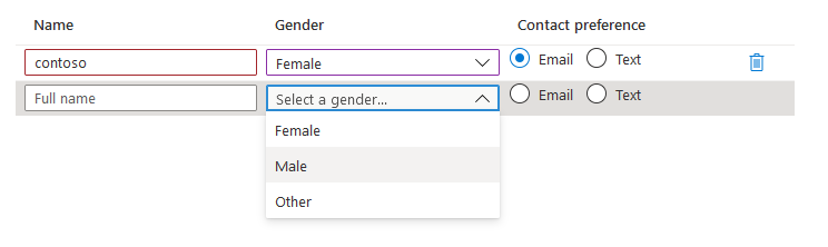
用于收集表格输入的控件。 网格中的所有字段都是可编辑的,行数可能会有所不同。
UI 示例
架构
{
  "name": "people",
  "type": "Microsoft.Common.EditableGrid",
  "ariaLabel": "Enter information per person",
  "label": "People",
  "constraints": {
    "width": "Full",
    "rows": {
      "count": {
        "min": 1,
        "max": 10
      }
    },
    "columns": [
      {
        "id": "colName",
        "header": "Name",
        "width": "1fr",
        "element": {
          "type": "Microsoft.Common.TextBox",
          "placeholder": "Full name",
          "constraints": {
            "required": true,
            "validations": [
              {
                "isValid": "[startsWith(last(take(steps('grid').people, $rowIndex)).colName, 'contoso')]",
                "message": "Must start with 'contoso'."
              },
              {
                "regex": "^[a-z0-9A-Z]{1,30}$",
                "message": "Only alphanumeric characters are allowed, and the value must be 1-30 characters long."
              }
            ]
          }
        }
      },
      {
        "id": "colGender",
        "header": "Gender",
        "width": "1fr",
        "element": {
          "name": "dropDown1",
          "type": "Microsoft.Common.DropDown",
          "placeholder": "Select a gender...",
          "constraints": {
            "allowedValues": [
              {
                "label": "Female",
                "value": "female"
              },
              {
                "label": "Male",
                "value": "male"
              },
              {
                "label": "Other",
                "value": "other"
              }
            ],
            "required": true
          }
        }
      },
      {
        "id": "colContactPreference",
        "header": "Contact preference",
        "width": "1fr",
        "element": {
          "type": "Microsoft.Common.OptionsGroup",
          "constraints": {
            "allowedValues": [
              {
                "label": "Email",
                "value": "email"
              },
              {
                "label": "Text",
                "value": "text"
              }
            ],
            "required": true
          }
        }
      }
    ]
  }
}
示例输出
{
  "colName": "contoso",
  "colGender": "female",
  "colContactPreference": "email"
}
备注
列数组内的有效控件只有 TextBox、OptionsGroup 和 DropDown。
$rowIndex变量只在网格列的子级中包含的表达式中有效。 它是一个整数,表示元素的相对行索引,计数从 1 开始,以 1 为增量递增。 如架构的"columns":部分所示,$rowIndex用于验证。在使用
$rowIndex变量执行验证时,可以通过合并使用last()和take()命令来获取当前行的值。例如:
last(take(<reference_to_grid>, $rowIndex))label属性不会作为控件的一部分出现,而是会显示在最终的选项卡摘要上。ariaLabel属性是网格的可访问性标签。 请为使用屏幕阅读器的用户指定有用的文本。constraints.width属性用于设置网格的整体宽度。 选项为“完全”、“中等”、“小型” 。 默认值为“完整”。列的子级的
width属性确定列的宽度。 宽度是使用分数单位(如“3fr”)指定的,而总空间则按各列的单位所占比例分配到各列。 如果未指定列宽,则默认值为“1fr”。
后续步骤
- 有关创建 UI 定义的简介,请参阅 CreateUiDefinition 入门。
- 有关 UI 元素中的公用属性的说明,请参阅 CreateUiDefinition 元素。