Note
Access to this page requires authorization. You can try signing in or changing directories.
Access to this page requires authorization. You can try changing directories.
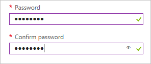
A control that can be used to provide and confirm a password.
UI sample
Schema
{
  "name": "element1",
  "type": "Microsoft.Common.PasswordBox",
  "label": {
    "password": "Password",
    "confirmPassword": "Confirm password"
  },
  "toolTip": "",
  "constraints": {
    "required": true,
    "regex": "^[a-zA-Z0-9]{8,}$",
    "validationMessage": "Password must be at least 8 characters long, contain only numbers and letters"
  },
  "options": {
    "hideConfirmation": false
  },
  "visible": true
}
Sample output
"p4ssw0rd"
Remarks
- This element doesn't support the
defaultValueproperty. - For implementation details of
constraints, see Microsoft.Common.TextBox. - If
options.hideConfirmationis set totrue, the second text box for confirming the user's password is hidden. The default value isfalse.
Next steps
- For an introduction to creating UI definitions, see Getting started with CreateUiDefinition.
- For a description of common properties in UI elements, see CreateUiDefinition elements.